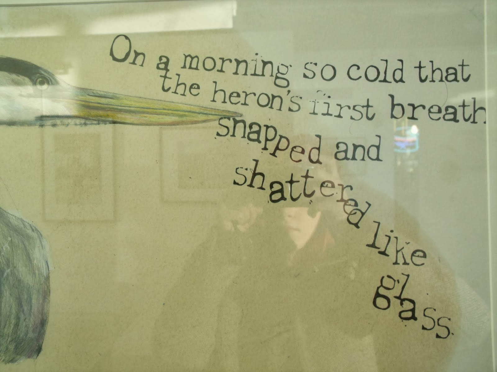
Artwork Type
I found these cheery little pieces in a gallery around and about Leeds, I liked the hand-rendered style of type, the unevenness of the stem widths and the lack of regularity to the X height, ascender and descender lengths give the letters a broken feel. Their character is certainly odd, the inconsistency in their design and the lack of order to their layout creates an uncomfortable and strange sensation whilst reading. The Pigeon type appears to be a brush script whilst the heron looks like lead type (and the patchy quality of the letters make it look like it has been printed) and both are unsymmetrical and uneven.


No comments:
Post a Comment