Wednesday, 26 November 2014

OUGD504: SB4- Audience, Message, Tone of Voice

For the final brief in our 503 module we're asked to produced a printed ad campaign for our websites and to include some element of interactive or augmented design. 

To begin with we needed to produce a design board explaining our audience, message or tone that the ad campaign will need to take and to establish that I decided to look into existing ad campaigns for bee conservation projects to analyse their use of colour, type, language and imagery to communicate tone; as well as examples of creative print campaigns and current printed ad trends.


Design Board


Existing Bee/Ad Campaigns

The Great British Bee Count

Hosted by Friends of the Earth the Great British Bee Count set out this year to get people aware and  involved in bee conservation and to count the different species of bees spotted over the summer. They produced 'bee bingo' leaflets for people to cross off bee species as they saw them and an app for people to ass their findings to the survey. At the end of the summer they produced an info graphic poster documenting the results.


Keep Britain Buzzing

A campaign to make people plant more seeds from the UK Soil Association containing leaflets, seed packs and small posters.


After looking at these printed examples I wanted to look as how websites can advertise themselves through printed mediums, however no matter what I search I can only come up with adverts used on websites, in banners etc, so instead I've decided to focus my research into print campaigns I find interesting and beautiful as well as interactive and creative print based designs.


Tuesday, 25 November 2014

OUGD503: Feathr Brief- Digital Development and Submission

As far as developing this design went- it was a pretty straight forward process. I had a very clear image of how I wanted the final design to look and so all I had to do digitally was outline my sketches and align everything neatly. 

I had wanted to add some dog based items for decoration but decided against this as I feel the strength of this design comes from it's simplicity and bold lines and adding too much detail would ruin this.


For the motto I wanted to use a friendly hand drawn looking font, but something that remained a san serif and not script like. Just like with the line work the font needed to be bold, simple and friendly as an overly detailed font choice would've ruined the design; it needed to match the illustration as much as possible. Looking on Behance I found the profile of one James Lafuente, and his creation Parker. 


Although the font Parker can only be used in all caps, and I had initially wanted something in all lower case, I really felt like Parker was suitable for the design. The soft edges and bold lines accompanied the drawings well and didn't over power the image despite it's all caps design.


I submitted my design and chose the style of repeated tile it would use and overall, I like it, I really do. The one problem I found whilst browsing the vote section of the Feathr competition was that a lot of people had opted for complex patterns and very detailed designs which look great as single tiles but, in my opinion, produce quite blurry eyed epileptic feel when repeated across an entire wall. If I were to walk past these designs too quickly it would make my eyes feel very funny. 


So for my design I felt it was important to me to produce a large simple tile that when repeated produced a nice looking pattern but also one that wasn't 'too much' for the wall. It has to be interesting yes, artistic, certainly, but also not over the top, and that I feel I've achieved with my Pug Coat of Arms. It would work on a feature wall or covering an entire room. The neutral black and white colours means it could work in many different ways with many different types of rooms.

I like it, I just sincerely hope others do too.


I also did what I hate doing the most, forceful self promotion, I really want to win this thing so I need to push people. Hopefully it will work out, I may not win, but as long as someone loves my design then I'm pretty successful. 

Click here to vote for A lot in a Little Package


Thursday, 20 November 2014

Preparing Work for Print

Consider colour- CMYK over RGB
C- Cyan
M- Magenta
Y- Yellow
K- Key (black)
Subtractive colour, ink on paper

RGB- additive colour, light via monitor projector etc

Offset Lithography most likely to be used in commercial/large prints
Digital Printing
Screen Printing

Use of colour when working in software- Illustrator/Photoshop extra. CMYK is used to define pour as it is when created during the printing process. 


We need to think of colour as ink. (Ha, that rhymes)

Registration Colour- used in printers marks.

CMYK Colours


Creating a swatch/CMYK colour.


Pick colours then use 'add used colours' to make swatches out of all the colours used in a design.


Using tints- how to use the same CMYK value colour at a different percentage to increase the usability of a colour.


Colour Books- different colour libraries that can be used by different printers though the most common is CMYK uncoated. 


Process colours
A process colour is printed using a combination of the fur process inks: C, M, Y, K. By default, Illustrator creates new swatches as process colours.

Global Swatches
S global colour is automatically updated throughout your artwork when you edit it. All spot colours are global; however, process colours can be either global or local, You can identify global colours swatches by the global colour icon (when the panel is in list view) or a triangle by the lower corner (when the panel is in thumbnail view)

Spot Colours
A spot colour is an ink that is used instead of, or in addition to, CMYK process inks. You can identify spot colour swatches by the spot colour icon (when the panel is in list view) r a dot in the lower corner (when the panel is in thumbnail view)

Tuesday, 18 November 2014

OUGD503: Feathr Brief

Project Rational

More Fucking. Less Fighting
More Reading. Less Watching
More Good Shit. Less Shit Shit
More Art. Less Decoration

Feathr released a competition to design wallpaper that is artistic rather than decorative. The brief is a fairly open one with no requirements other than making a design for the wall that will become a repeat pattern. They call out for any style and any kind of designer.


I knew I really wanted to do this brief, however I spent about two weeks drumming my fingers and uselessly staring at a blank piece of paper- I had no ideas.


I wanted to produce a modernised version of the family coat of arms. I felt this was appropriate as throughout history coats of arms have decorated the walls of high born homes so why shouldn't the people of today cover their walls in it as well. The theme I based the designs on was pugs- they’re incredibly popular creatures in all forms of design, as well as being a dumpy adorable little legged creature, in great contrast to the graceful and sleek stags and lions that usually adorn family crests. 


To begin with I needed to get down how to draw a pug, and many reference pictures and a few more 'awww' later I got the gist of how the side of a pug's face looks (as well as how a pug would look as a loaf of bread, [top left] which I think is the achievement of the century)


I then went on to sketching the basic shape of the coat of arms (COA) and what would be included within it.


If you can't read my writing it says: Motto, Side on pug face, front facing pug face, side on pugs, pattern, detail and name.

I then switched back to perfecting my side on pug drawings, and gauging the kind of style these images would need; detailed and realistic or simple and cartoony.
After drawing my first pug (on the left) I was pretty damn pleased with myself, I asked for some feedback from the girls I share my table with- 'it's really creepy' 'yeah, something about its eyes' wasn't there response I was looking for. And so I produced the second third and fourth drawing making it simpler as I went, only then did I get a smile as a response instead of internal flinching.


It was agreed that with making this thing cute simpler was better and so I went on to develop the simple stubby armed pug with different expressions and some forward facing faces.


The next lot of feedback I received suggested that I maybe make the stubby armed pug a little more detailed and play around with the crouching pug as it was very cute. And so I did, I lengthened the arms but kept the simplified face, drew a pug sitting down and begging (as opposed to standing like the classical COA design)


After agreeing that the crouching digs looked best I mocked up the simplest shape of them with the shield used in all COA designs. It was also put forwards to me that the front facing pugs looked like teddy bears- I ignored this and carried on anyway as they were wrong and the designs most definitely looked like dog faces. I also drew out a banner and found a suitable motto for the design from a pug lovers website stating that this was the official, unofficial motto for the breed. 

Multum in Pravo: a lot in a little package. 


I also drew out some extras for the embellishments; dog collar and lead, dog bed, tennis ball etc, to surround the COA with for final details. I then scanned all my final sketches in preparation for digital development. 


OUGD503: Penguin Brief- Research

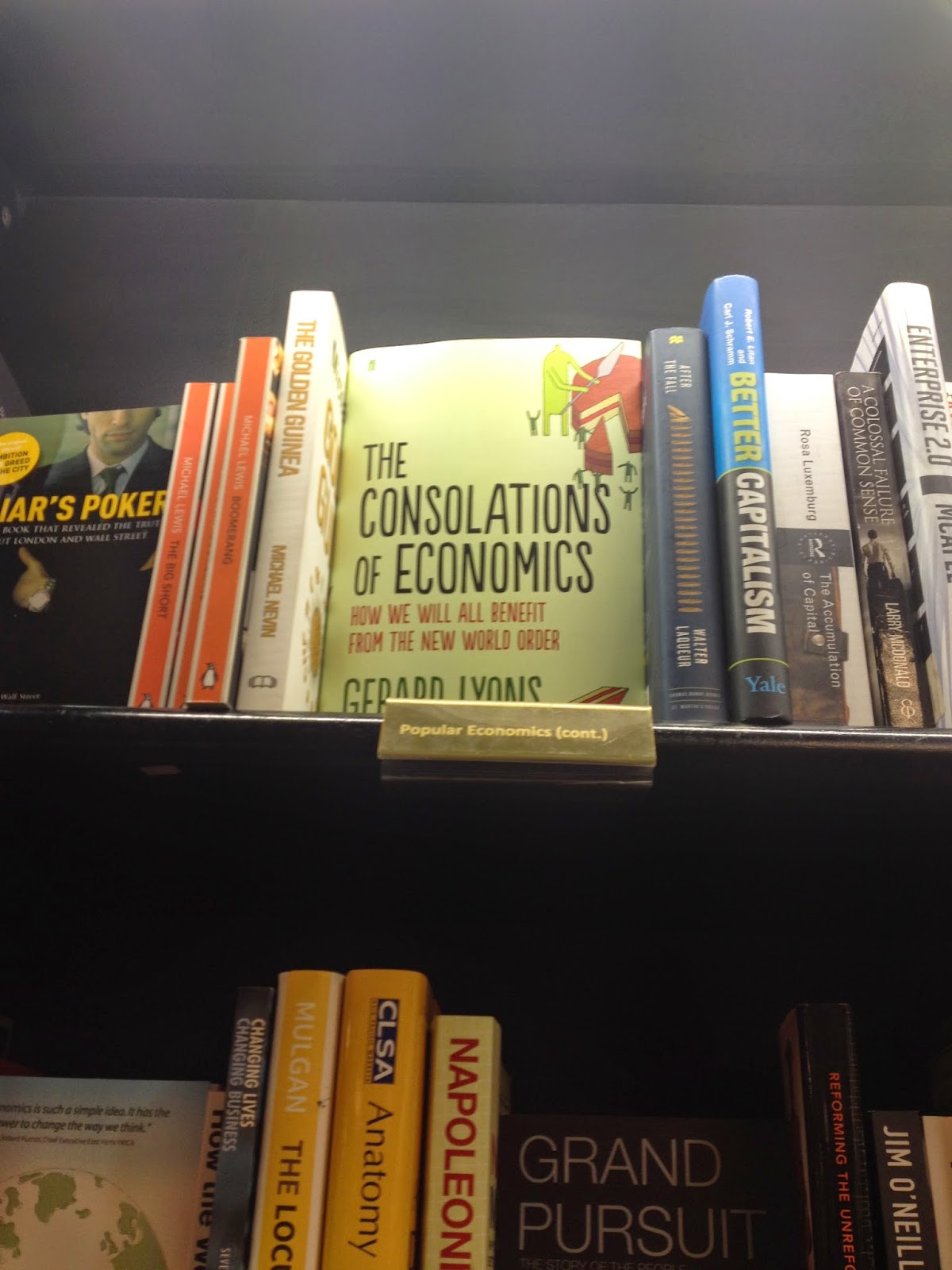
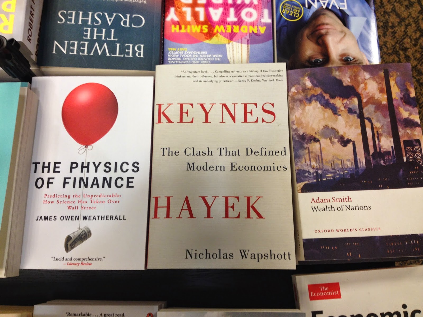
For this brief so far I've come up with some ideas, scrapped those, come up with a few more and then gotten stumped. So I decided; as a way to inspire myself, to go and look at examples of economic non fiction books currently in production. It made me realise that covers for this genre are so much better than I had imagined with styles of all types. I took some pictures of my favourites to inspire me later on in my ideas process. 

I had honestly expected really dull and simple or tacky covers but found an annoyingly good composition of designs. My relaxed demeanour towards this brief was suddenly shattered- I need to think of a really good idea and put more pressure on myself. 

To fit in with the current covers on the shelves I feel a simple and clean design is preferred over a messy over complicated ones. The styles that particularly caught my eye were ones that used clean lines, simple shapes and roughly three colours max. 

Either way- I need to go back to the sketch book once more.


Very bold shapes, very dramatic text.


I enjoyed the use of illustration with this design- simple use of detail.


I adore the simplicity of this design- it isn't trying to be something it's not.


Looooverly hand rendered style type- makes it more personal.


I think its a rhino… either way I enjoy the use of type, one bold colour and silhouette.


Simple, one stab you in the face cover, foiled type- you just want to touch that eye candy.


Love the bold vectorised illustration, strong sense of movement with this design.


Makes me think of a Saul Bass poster.


Wonderful visualisation of the title.