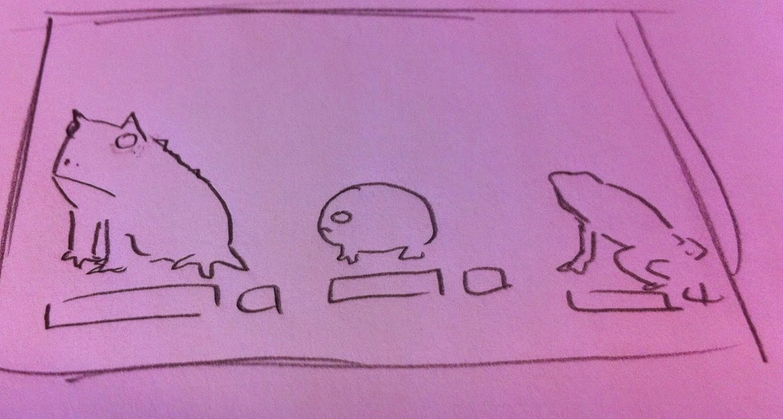
After our research we began to consider the look of the game and how it would play and flow. We sketched out a few ideas for the look of the environments, the shop and the home screen.
Visuals wise I was tasked with designing the animals, home screen, shopping screens and iconography.
 |
| Basic sketch of shop look/layout |
 |
| Basic environment sketch showing levels/layers in the game |
 |
| sketch showing interaction with page/notifications |
Visuals wise I was tasked with designing the animals, home screen, shopping screens and iconography.
For the animal illustrations I wanted to produce something that would stand out against a backdrop, and although I wanted the images to be simplified versions of the animals (to make it easier for later animation and potential programming if the game were ever to be developed) they still needed to have enough detail so players could recognise individual species.
I make them stand out strong by using bold, thick lines for the main body and thinner lines for the detail (so as not to swamp the image) I focused on illustrating key features and patterns so the species would differ from similar types of animal. I also chose to have each animal from a side view as this better suited the format and play of the game (with players scrolling sideways through 2D landscapes).
The icons had to be simple yet fun. Soft edges and rounded corners to make them less imposing. For the main page icons these were very simple, home buttons, move buttons, basic iconography. I made sure these all had rounded edges fitting in with the style of the rest of the game.
For certain icons such as the ones used in the shopping sections of the game I used circles as my base, not only to make buttons easy to tap but also to link back to a rounded eco system and the shape of the earth.
The look of the shop was also based on a circular 'wheel' look, from icons to the way players will scroll through the species.


No comments:
Post a Comment