Showing posts with label Layout. Show all posts

Friday, 4 April 2014

OUGD404: What is a Book: Grids

For this session we were asked to bring in a double page spread in order to identify the grids within it. We did this by layering the page with tracing paper and drawing lines around all the elements within the page such as, columns of text/body copy, images, headers, even page numbers. The final product was a grid far more complex than I had initially thought, an eight column grid across an A3 page. 


In the following session we were then asked to take our grids and outline/highlight the elements within the picture, the text, the images and the headers etc. In order to gauge where their placement on this confusing set of lines was. From here we then took the design elements and attempted to redesign the layouts on smaller thumb nailed grids (purely as an exercise to prepare us for thumb nailing our own page designs)


Tuesday, 1 April 2014

OUGD404: What is a Book? Grid Research

To be fully prepared for designing our own grids and layouts for the book we'd be producing we were set the task of looking into different types of grids and the context they'd be suited for.

Grids exist as a tool for the Graphic Designer, they give order to a layout, they speed up the design process by highlighting where content should be placed and give structure to content. However a grid is only a guideline and not a dictated rule. The highlight for the designer is to know when to use the grid to structure the design and when to break the grid to keep the layout from becoming too rigid. For the audience the evidence of a grid should be present but the extent of the grid should remain unknown.


Single Column Grid
A simple grid system consisting of a single column surrounded by margins. The single column grid is for the adventurous or explorative designer, the blank space means no commitment to layout has been made and the designer is free to experiment with grids and layout using rulers, guidelines and text boxes.


Multi Column Grid
Multi-column grids allow for more flexibility and ease when it comes to using a combination of image and text, the grid becomes more flexible with each new column added. Multi-Columns also work well for handling complex hierarchies as the grid can be divided into sections or 'zones' for specific content. Most image/text will tend to overlap columns, yet remained structured. A key note when using multi-columns is the use of white space, not every inch of the page needs to be filled with content and images and text need to be balanced out by white space. 


Modular Grid
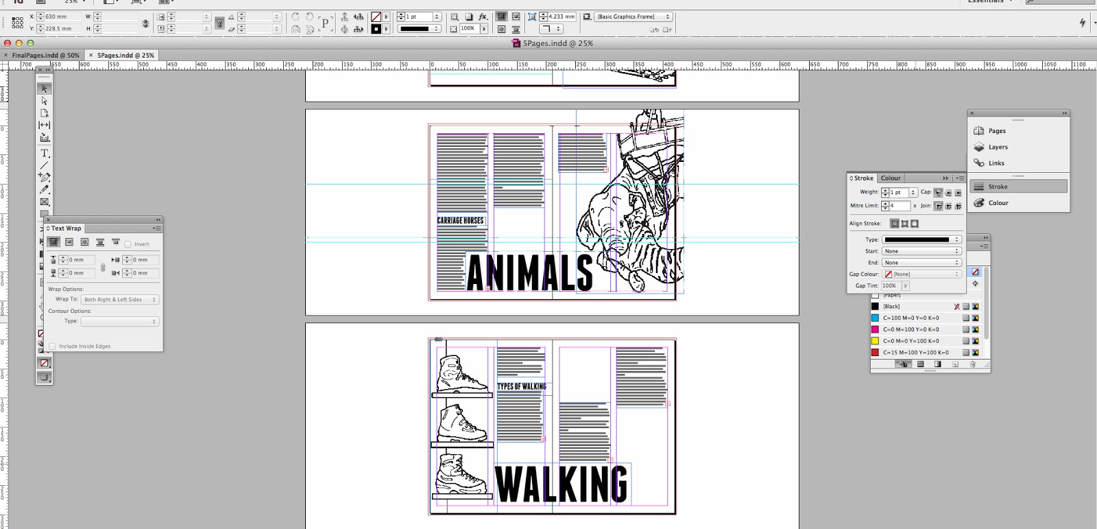
Modular grids not only have columns, the also have rows; vertical and horizontal lines dividing the space. This means that when it comes to adding image and text the balance of content to space can be easily monitored. The horizontal lines present in modular grids also give nice, tidy cropping points for text and the verticals allow text to be aligned either horizontally or vertically, giving an extra dimension to page layout.


Further Research

Other Grids

Rule of Thirds: a grid format which divides a page into thirds with two equally spaced vertical and/or horizontal lines so that important compositional elements can be placed along these lines or intersections. This method is also commonly used in photography.

Baseline: the anchor or layout elements, vertical lines are added to a baseline grid in order to produce a modular one. A baseline grid is created by taking the document's font's point size and using the measurement to space horizontal lines evenly down the page.


The Golden Ratio 
An almost magical ratio that appears in design, art, architecture and throughout the natural world. It can describe the proportions of a beautiful face, of a strong composition or even mathematically fit with the ever decreasing segments of an ammonite shell. It can also calculate the distance between one note and the next in order to create perfect harmony. Numerically the golden ratio is described as 1 : 1.618, but physically it appears as a perfect square on a page with a rectangle left over that can also fit within it a perfect square with a rectangle left over which can also fit within it a perfect square with a rectangle left over etc etc etc. 


Grid Anatomy
  1. Margins: The space that separates the content from the edge of the page.
  2. Flowlines: Alignments that break the space into horizontal bands.
  3. Columns: Vertical divisions of space on a page.
  4. Rows: A series of flowlines that create horizontal divisions of space on a page.
  5. Gutters: Space that separates rows and columns or two facing pages.
  6. Modules: Individual units of space created from intersecting rows and columns.
  7. Spatial Zones: Groups of modules that cross multiple rows and columns.


Wednesday, 22 January 2014

OUGD405: SB3- Page Layout

5 Double Page Spread

Using the information gathered in our research project and presentation we were now to organise and lay  it out across 5 double page spreads.  The intention had been to use our '100' theme to assist in dividing the information, present facts on one page, stats on another etc. However, due to the way I conducted my research I already had five nice little topics to work with.

Tracks
Animals
Runners
Walking
and Others

The only problem I could see was layout concept. I wanted my design to be informed rather than pure visual but applying a concept that fit all five would be difficult so I pulled it back and decided to base the layout of each page based of how each vehicle/method of transport moves. For tracks I considered a two column style to mirror the tracks, the same with the runners I made sure to have parallel running paragraphs. For walking and Animals I tried to re create the feel of footsteps and the sway that comes with walking and finally for 'Other' I looked at the Sedan's handles and represented this with parallel paragraphs also. 

However, before I could start sketching ideas I went through my photographs and selected the 'eye grabbing' image I would be using on each page. It may seem like a bit of a cheat, but when it comes to layout I've always relied on large text and large images to help structure the rest of the design (as I mentioned briefly in SB3 context post) also it allows me to get a feel for how the eye will travel across the page, using large imagery and headers guarantees a smooth 'flow'. 

So I ended up choosing these three images from my photos and sourced the other two from the internet to produce my key illustrations.


Sketches

So I began, with images in mind and illustrations being produced, to sketch ideas for my layout. I started with rough sketches, moved onto cleaner versions and then finally produced final sketches of all the pages along with bullet pointed bits of information I could see eventually going into the page.


Sketches Round 1


Sketches Round 2


 Sketches with assumed info.


Illustrations
Producing these was methodical and rather enjoyable, Illustrator, photographs and a Wacom tablet. It's easy to create nice looking doodles when your outlining a photo. 


Using In Design/Design Choices

Having used In Design before I was already pretty confident with most of the programmes features and honestly- although I'm sure many people say this. There were very few dramas when it came to the layout, all I did was follow the plan. 

(when it came to adding in the text there were a few sizing options, but honestly I love In Design because it's a frickin' piece of cake.)


The header font I chose, Franchise, is one I found just before Christmas whilst making a 'quote' poster. A few creative blogs argued that the font is a wonderful high-impact san serif, suitable for non-fiction works and campaign posters. I personally however chose it because it felt like a well designed Impact. The power and presence of the chunky typeface, however, the smooth and dignified corners Impact wishes he owned. It gives the page an eye grabbing feature without the sharpness of the glyphs corners poking you in the eye. It's also a bit taller than impact, and we know taller is always better. 


Interim Crit


I had been (if only slightly) concerned with the similarity of each page, and worried they didn't differ enough from each other (especially with Runner, Other and Tracks all relying on the same parallel paragraphs concept) also I was slightly concerned that the tone of the illustrations didn't lend much to the tone of the title font- although they both have thick lines I worried that the illustrations came off childish. I was also a little miffed about 'Other' page design, it just didn't click with the eye like the rest of my pages, and being honest with myself, despite the balance of text to image being right, they still felt a little dull. So I posed questions to the fellows of the Graphic design Level Four society. 


And they responded with gusto.


I was really, really pleased with the feedback I got, it was the first time that I didn't seem to get a 60/40 split in opinion or lots of people contradicting each other's ideas. I moved forward with set goals in mind- Play about with colour, Find another word for 'other'- a lot of people felt this was the reason the 'Other' page lacked something. 


Final Designs


How'd it go?

Well, I'm pretty confident with the programme In Design, so I found production enjoyable and easy, and I was very pleased with my designs (I know it sounds bad, but especially when I began comparing it to others, perhaps that's big headed but for me I think it's a relief that I consider my work on the same level everyone else's now). This crit was the first one where people made me happier about my work and not angry/disappointing- so that's a bonus.