Showing posts with label armadilla. Show all posts

Sunday, 22 May 2016

OUGD603: Armadilla- Evaluation

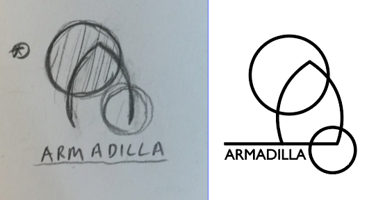
It was good to have another opportunity to work on a branding brief, I worked on this brief- as much as I could, in the same manner as I worked on my Smart Grid Consultancy brief. Working conceptually, not doing things for the sake of looking good and justifying my actions. This was a little harder when in a group but I still applied it where I could. I love what we've produced, I think the whole brand looks spot on and certainly beats the existing one, so I look forwards to sending the company the idea and seeing if they would like us to develop it further and help implement it.

As much as I like what has been produced for this brief there were some issues. We left the brief very late and so when we started it was already a rush, I felt with three of us it would be easy to accomplish, I was wrong. There was a definitive lack of balance when it came to work load and I felt some did far more than others, in fact there were several instances of specific members bringing up changes in designs or issues with layouts and logos far beyond the time when it would be appropriate and yet failing to accomplish their own tasks. If it hadn't been for two of us pushing through and taking up the slack nothing would've been produced. It's just another lesson for myself in the long run- don't work with friends. They make great friends and poor colleagues. 

On a positive note what we did manage to achieve technically understaffed and in such a short space of time was admirable. The catalogue took the greatest amount of work from conception to binding and I found myself pitching in to lighten the work load, but I think it's the strongest part of this brief and it takes the stationary I produced to the next level when you see them all together. I think my stationary worked well, and I had fun experimenting with a conceptual grid, something I hadn't tried before, it made something as simple as text placement mean something and I think this made the whole design stronger. 

If I were to repeat this brief again I would give the whole group more time and perhaps make a few adjustments to the members. I believe if we had, had more time and fully committed members this could've been a really fun brief, hopefully if the company asks us to develop it, it will be.

OUGD603: Armadilla- Finals


Wednesday, 18 May 2016

OUGD603: Armadilla- The Catalogue


When we discussed producing a product catalogue we wanted a high quality magazine bind and aimed to get our final designs professionally printed and so I contacted a local printers who also provide the style of binding that we aimed to achieve.


Unfortunately, they never responded and so we had to resort to printing and binding the book ourselves. We didn't want a simple stitch bind, and aimed to get the professional spine we sought after. In my opinion a stitch bind or staple bind would look ok, but to properly represent the high quality product and to aim towards a higher end range of clients then a more complicated binding would be needed.


The way we would achieve the spine is to split the catalogue into two booklets, bind these together and then print a cover separately and wrap it around the bound pages.


This was a bit more ambitious than simply printing and stitching and so we spent a good amount of time calculating what pages needed to go where, how to separate the books and how to set up the files for printing.


We also needed to figure out the new width of the cover- including spine, to wrap around the final catalogue. So we spent time mocking up a 'test' booklet measuring the width of the spine and adding extra space to the cover so it properly covered the pages.


OUGD603: Armadilla- Stationary


The layout needed to be simple. For each element I would be free and light with the sketches and then apply a more strict set of guidelines for the digitisation. I wanted to make certain that geometric shapes were apparent in each design element and not only use colour and type to link the brand together but geometric clusters of text too. That being said I was sure to stick to my guidelines but allowed for room to breath to keep the designs light and positive tone. The joy of an Armadilla pod is, yes it uses strong shapes but the manage to make them feel natural, as if the pods chose that shape. I wanted to reflect this within my layouts to give the stationary a similar look, whilst at the same time keeping the feel professional By balancing space and content, whilst being restrictive with freedom I think I achieved this.


OUGD603: Armadilla- Group Meeting and Feedback

We met up again as a group to go through our ideas and discuss the next stage of the brief. We chose our logo and made some key design decisions including type faces and colour selection. The main concept throughout our design was to link the brand back to the product.


The initial colour pallet I selected focused on shades of brown, taken from images of the pods, however it was decided that to make the brand brighter and convey a more positive tone it would be better to choose a brighter colour. We were keen to keep the pallet inspired by the product and so selected this blue chosen because it's bright, light and positive whilst also being inspired by the product with a hint of environmentalism within it. Using green to represent eco is a concept used often, we wanted to still hint at the natural world but in a more unique way.


We had decided prior to our individual digital development that geometric sans serif fonts were the best choice for our type to represent the pods geometric elements, such as the iconic window. Although I experimented with wide strong typefaces such as univers to represent strength and stability the rest of the group were more keen to use a softer and more approachable type. We settled on Bryant Moo as our main typeface. It still retains the geometric characteristics whilst feeling softer and lighter. It gives the whole logo a sense of airiness which, when paired with the sky blue, makes the design refreshing and light. 


After collectively making decisions we discussed what the design needed ti be applied to and organised separate jobs. I offered to take the key branding elements- business cards and stationary, whilst also offering a hand with the product catalogue (which was the main task of Abbie). With Lucy making tweaks to the existing website and producing a flyer.


Friday, 6 May 2016

OUGD603: Armadilla- Digital Development

I began the digital development by selecting a type face. I wanted to use a clean san serif preferably a geometric one to best represent the shape of the pods and also to reflect the modern stylising of the products and the current website. I chose fonts that were wide and extended suggesting reliability and strength. The font I ended up selecting for the designs was Gill Sans.


With my font chosen I produced simple line vector versions of my sketched out designs and paired them up with the type, making a few experiments and changes to layout but keeping the design fairly simple. I didn't want to push the layouts too far as the logo will be used for commercial purposes but I aimed to produce something unique and interesting. 


I selected a simple colour pallet using the different shades from the wood as my inspiration. I wanted to display a very natural looking set of colours to tie the design back to the companies ecological and environmental principles.


As a quick experimentation I used the colour pallet alongside various shapes just to see how the logos can work in different ways. As for now I will wait until our group meets again before I push any of these designs further to make sure I'm heading in a good direction.


Thursday, 28 April 2016

OUGD603: Armadilla- Group Meetup

We had our first group meet up and discussion today. What we aimed to achieve from this meeting was to define each of our strongest ideas so we can go away and develop them further before next Tuesday. The ideas shown below were selected as my strongest and so I will take these designs and adapt them digitally and develop them further before our next meeting.


It was mentioned that my group really liked the abstract shapes. It was difficult for all of us to break away from the iconic shape of the armadilla pod and so we all used it in some way, though they felt these designs used them in a more unique arrangement.


Although they liked, and personally I preferred these three in a row designs it was discussed that there should be a reason behind having three pods lined up next to each other and if we could establish this the concept would be stronger. I mentioned that the company sells three different sized pods and so quickly readapted the design to reflect this. I will digitally develop both but it seems the three different sized pods will be the more appropriate design.


Each of us ended up producing something to this effect, a basic pod design, similar to the current logo but arranged in a much better way. I want to adapt this design even though it wasn't highlighted as one of the strongest ideas, it just seems like too obvious of an idea to not even see where it could go.

Wednesday, 27 April 2016

OUGD603: Armadilla- Initial Ideas

For the first part of this brief the main element that is needed is to produce a logo. So individually each of us went away to come up with some ideas and initial logo designs. My first set of ideas were based around the pods themselves. With the design being a very iconic and easily identifiable shape it was easy to adapt it to a variety of different designs. 


For the first set of designs I experimented with type, making the arch and circles a key component of the type's shape. This is a far more subtle way to feed the shapes into the design but one that still makes them obvious.


Many more of my designs focused on playing around with the images, I used the circle and arch in abstract ways and in more literal ones. 


Another route I explored was the animal which inspired the shapes of the pods- the armadillo. I tried shaping text into a more curved dome feel reflecting the animal's body shape. 


Whilst looking through pictures of armadillos I found these Alexander McQueen armadillo boots. I absolutely love the look and shape of them so I tried using that sheer drop shape in a couple more sketches and ideas.


Not only was I inspired by the front of the pod but also the shape from the side, I made a couple extra sketches with shaped type and a dramatic curve reflecting the look of the pods.