Showing posts with label logo. Show all posts

Wednesday, 27 April 2016

OUGD603: Charity Promotion- Cards For Causes presents Ruff Edges- Ideas and Sketches


For the new and different charity promotion brief I decided to come up with an overarching name for the company selling cards and prints for charity. The name I settled on is 'cards for causes' meaning that I can use Ruff Edges as a named collection of cards and prints with the potential of adding new collections that work with different charities later on after university when I fully expand the business. 


For the cards for causes logo I was inspired by various 'quirky' companies who make more unique and design focused cards, gift wrap and prints. I really love the handwriting based logos, they give the companies a better sense of individuality and personality. This in turn makes the products feel hand crafted and hand drawn which lends itself to unique prints and speciality cards. 


I experimented with different types of my own handwriting trying to find an appropriate style. I wanted to logo to be personal to me and so I didn't deviate too much from my natural handwriting. 


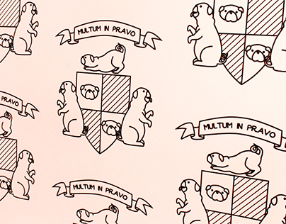
For the Ruff Edges design I was inspired by a dog themed wallpaper I produced last year and the dog featured elmwood logo, and attempted to make a coat of arms based logo.


Because the new logo will feature on the back of the cards and prints this means it can be more ornate and detailed than typical logos. I was keen to make it beautiful and something that would look really appealing and eye catching on the back of the card.


Friday, 25 September 2015

OUGD603: You be You- Initial Ideas


My first idea was based around a photograph or a mirror. The offset squares represent the vision of self skewed due to self esteem and various issues addressed within the app. The overlay of another square is the support provided by another who 'is just as askew as you'. Not only do these overlaid squares represent support but also the stages of 'straightening oneself out'. Going from someone thrown off balance by problems and difficulties and using the app to re centre yourself.


This idea is a more literal representation, the life ring is a symbol of safety. Saving someone from drowning within their own issues and problems is the suggested concept. The app acts as a life ring offering safety and salvation to the audience who use it.


The third idea was based around growth and new life, the application is designed to help the user grow and progress as a person and deal with troubles and issues. A plant as a visual also connotes the idea of nurturing and new beginnings and that it represents a seedling it also shares the feeling of vulnerability making it an accessible and gentle visual.

Friday, 27 February 2015

OUGD503: Joe Pointon Project Return

After being stuck for a few months and unsure where to go I picked back up with the Joe Pointon music production logo. I wanted to create a design based on his name, make it something personal to him, so I chose to work on the 'point' from Pointon.


After playing around with a few experiments these were the designs I ended up producing.


The concept behind it all is, one, a play on Pointon. Point demonstrates effectiveness, on target and a direct approach- I've shown this through the dots inside the o's. Also the o's look like targets, on target music production, any composition will be on target with what the client requested.


Two, the close connection he would have with his clients is represented through the strike in the surname; linking one person to another, concept to production, film to music. 


And three, playing on the all-rounder style of his composition. He had previously explained that he doesn't produce music for any specific setting/client/genre and I wanted to show this through the icon (the triangle). The idea is reaching all areas and having no boundaries, triangles are also the strongest geometric shape making him the strongest choice for a client.


From here I will now be working on the scamps and layouts for the website, I wanted to make certain that the brand and concept was secure before I began to tackle it in a digital format. I've sent this to him with the suggestion of producing some business cards- these will be simple to do now I have the fundamentals of his image, so we'll see what the reaction is and where I go from here.