Showing posts with label presidential campaign. Show all posts

Sunday, 22 May 2016

OUGD603: Presidential Campaign- Evaluation

Let's start by saying this: I didn't win and quite frankly I was pretty devastated. I think as a whole I did a good job and I really did put a lot of work and effort into this brief so, despite now thinking that I maybe wouldn't have been so great at the job it's still a massive blow to my pride and confidence that I came last out of two people.

That over, how well did I think this brief went? On reflection I can see some areas where I went wrong and needed improving and I can see what I got right. Although I can see how important it was to get my message across to students and discuss my manifesto I can also see how having a very over complicated set of 6 posters (especially with the restrictions in budget) can make for a broken and scattered message. If this had been a campaign on a much larger scale then multiple posters in a similar style would've been appropriate but with our campus, and students potentially only seeing one or two posters on their routes around the college, too much variety makes for a muddled message. Also on the design- I expressed how I wanted my manifesto to be at the forefront and I still think this is a good idea, though not one that is really appropriate for my target market. It was slightly naive of me to expect students to stop and look at the slogan posters long enough, or get close enough to see the smaller 'vote Roz for president' at the bottom of the design. As good or bad as the designs may be, if audiences only catch a glance and the main message in their face isn't 'vote for Roz' they probably aren't going to remember to vote for Roz. I also think I overestimated how much people pay attention to manifestos and policies, of course in an ideal world students would've stopped and read everything, but it's not their job to stop and read, it's my job to make them want to stop and read and I don't think I quite got it.

Like I said before if I had a larger budget, or perhaps if this were a larger scale campaign then maybe my tactics would've worked. If I was already known as a figure then perhaps it would've been smart to push my values and my manifesto, however in a small institution where only people in my class know me it seems I should've been promoting myself, not just my opinions.

That being said I managed to acomplish a great deal in a short space of time, from research to production the whole process took two weeks, a time scale that, when I set it, I didn't believe I could get everything finished and yet I did, even with the usual problems setting me back. I managed to spend an entire week campaigning, talking to students, and arguing my case, even if I didn't win I am still proud of what I managed to achieve and if nothing else it was all a valuable experience.


Friday, 22 April 2016

OUGD603: Presidential Campaign- Final Designs


OUGD603: Presidential Campaign- T-shirts

A part of our presidential campaign packs included three blank white t-shirts, with fabric binder and pigment being free for students in the college it seemed silly not to use them as another touch point to spread my campaign's message.

I decided to use the 'vote for Roz' poster as the base for my shirts. The format worked well and took up a good amount of the space available on the tee, this helped grab attention and also meant I could make the message as large as possible. The biggest hiccough was trying to get the right colours and mixing pigments. I took printed swatches to help me when I was mixing though I can't say that mixing colours is my greatest strength. The orange came out well and looked almost identical to the original colour. The pink and the blue however, came out not so well. The pink was passable but I got nervous adding anymore white and red to the mixture as I had ruined several pots of colour previously by going over board with the pigments. Fabric pigments are a lot bolder than mixing paint for paper screen printing and so it was very easy to over estimate and mess the colour up completely. However the final result was a pink similar to the original colour and served it's purpose. 

I never ended up using the blue, there was a severe shortage of white pigment when I was mixing colours and so the result was too dark and no where near bold enough. Instead of wasting a t-shirt with a completely mismatched colour I chose to two of the shirts in the orange I mixed successfully.


This was the first time I had screen printed onto fabric and so I was very thankful to have a friendly printed textiles student nearby who didn't seem to mind when I asked her question after question. 


The final shirts surprisingly came out really well. I'm happy to have learnt a new skill and extended my screen printing abilities. I intend to wear these throughout campaign week and up until voting day to act as a mobile advertisement. It would be really lovely if I could get a few others to wear them too, but we'll see how that goes.

OUGD603: Presidential Campaign- Digital Presence


Another outreach point for my campaign is the online presence. I wanted to create a facebook page where I could drive publicity and keep students up to date with my campaign and what I was doing. I had an issue with this though, having three colours aligned with my campaign brand meant I need to consider how to use all three in elements such as the banner and profile picture. For the profile pictures I came up with the solution to create three pictures each featuring the different colours. My aim is to change the picture daily not only so I can cycle through the colours but also to keep my page popping up on people's feed.


For the banner I looked into creating a simple pattern with all the colours involved. I tried a few things and different layouts and quite frankly I hated them all. I really don't like the banner I ended up using. With such an awkward ratio it was difficult to translate the look and feel with all colours involved and it not look unprofessional. The banner I chose was the bets of a bad bunch. It certainly is bright and eye catching but I personally am not happy with it.


The final page can be found HERE


OUGD603: Presidential Campaign- Further Application and Budgeting

Once I had developed the look and feel of my campaign through the posters I decided to translate it onto other materials. I definitely wanted to produce leaflets so I could have yet another touch point that would show off and explain my manifesto so I used a similar 'Vote Roz for President' layout to make the manifesto points the main feature. I then included a more detailed version of my manifesto summary for the back.


When I began planning and designing this campaign I had intended to spend a fair bit of money on this campaign and so planned to print out leaflets, booklets and posters, however when we were briefed, a week before the campaigns went live, we were informed that we had an incredibly tight budget indeed- £10 plus ten free printed posters on a printer of unknown quality. Well this made things a little tighter. I spent a fair bit of time planning out my budget splitting it between posters, leaflets and sweets to use when directly engaging students. 

I wanted to make sure my message was spread throughly across the college and I certainly didn't want to loose any of my 'making the most of...' slogan posters or the drive it home 'vote for Roz posters' so I really had to think how I could maximise my output on a minimum budget. I had shot myself in the foot slightly with monetary restrictions, with 6 different posters and 3 different flyers I really needed a larger amount of posters than most candidates to get the full message across.


I did manage to create a few money saving changes. By using my own stock for posters and leaflets this meant I would have reduced prices in the digital print room. And by creating my booklet and publishing it digitally on issuu meant I could still create this component for free.


The look of the booklet was fairly simple, acting as another touch point within the campaign it simply used the already existing aesthetic. That being said I chose to take some time planning the flow of the book and the content to be used on each page.


So far I think the booklet is my favourite element in the campaign looks wise. I'm not particularly strong when it comes to editorial, however I am pleased with the final design of it. It maintains that positive and bright tone of voice and fits in nicely with the other elements of the campaign. 


OUGD603: Presidential Campaign- Digital Development


A key feature my posters need is to be eye catching, they need to stand out from the many crowded noticeboards that are littered across the university. Having been inspired by my silly scarf earlier I looked back to the extremely bright colours and selected a vibrant colour pallet from the various threads. I feel that bright and bold colours will have the impact I'm looking for and stand out well, the selection of colours are also very bright and happy adding to the positive tone conveyed in the main message.


Although in my sketches I had wanted centred text when translating the idea into a digital format the message lost a lot of impact, there wasn't enough emphasis on the 'manifesto' points of the slogan (leeds, you, each other). I changed these sections of type from solid to outline to draw more attention to them but the type still looked lost and floating in the middle of the design.


To counter this I upped the point size massively and further increased the size of the manifesto points making them the key focus of the design. Although I did refrain from increasing them further due to spacing issues and maintaining a good balance of type to blank space. I went ahead and made some adjustments to the detailed body copy, separating them into columns so as to make better use of the space and bring a sense of balance to the design.


After looking through the final three manifesto posters I became concerned that I may have relied too much on the message and not enough on myself. The 'Vote for Roz' copy was rather tucked away in the design and difficult to read from a distance. However, I didn't want to loose my manifesto as the heart of my campaign and I felt it was important to keep my slogan front and centre. So I created a second set of posters simply with 'Vote Roz for President' to push the message directly. Though, to keep these posters closely tied with the campaign as a whole I used the same bright colour scheme and style of typography creating uniformity across all the designs.

OUGD603: Presidential Campaign- Initial Ideas and Sketches


When I first began coming up for visuals to my own campaign, I struggled. For some reason I leapt to using a scarf I owned as a platform and inspiration for my designs. I figured, it's about me, I wear this scarf a lot, makes sense (dumb I know). However I was very quick to realise how this simply didn't translate as an idea, the digitised versions of the scarf were very chaotic and overwhelming, there was certainly no place for any type without the whole design becoming a crowded mess so I quickly threw away that idea and began experimenting with lots of different sketches.


A lot of my sketches became purely visual based ideas and I struggled with various compositions and just coming up with an original ideas. Honestly, despite my research and understanding I was struggling to generate one decent idea.


So I took a break from sketching and went back to my core principles, what did I want to say in this campaign? What message did I want to get across? I realised I had three main points to my manifesto and that I wasn't advertising myself, I was advertising these core principles to students. It would be my manifesto and what I aimed to achieve that would get me votes rather than me personally and so I used them to generate a design.

Three Core Principles:
More collaboration across the college's campuses, year groups and subjects.
Generate and find external and live briefs from the Leeds community for students to participate in.
Student projects get more support from the union exhibitions, events or societies.


I wrote out each of my points and summarised what they meant to me and would mean to other students trying to tie them all together with a strong tagline. Which is when I came up with 'making the most of...', this slogan gave a positive and strong message and translated well into each of my three points. Collaboration- Making the most of each other, External briefs- Making the most of Leeds, Student led projects- Making the most of you.

The tagline conveyed the tone of voice that I was after and also meant that my policies became the heart of my campaign rather than focusing in on myself. I decided to add a summary of each of my manifesto points to each poster to give brief detail and clarity to the main uplifting message. This meant I could also have my manifesto across a far wider range of touch points meaning that it would reach a larger audience.


Monday, 11 April 2016

OUGD603: Presidential Campaign- Visual Research and Existing Campaigns

To inspire what I can achieve out of my own campaign visually, I had a look through existing campaigns and their use of graphic design. 


It was a sad thing to realise how many UK campaigns rely on strong scare tactics within their posters and advertising. So many of the images I found were billboard sized posters slating the other party and warning the public of the terrible world they would inhabit if the opposition gained power. I think especially in hindsight it's really interesting to see how little substance these posters have outside of scare mongering. I am very against the conservatives politically but their design works, they have strong messages and a powerful impact, but so many of them mean so little after election day (especially with the 'year for change' not cutting the NHS poster, how well that worked out...). Although these campaigns have a high impact I definitely want to stay away from the negative tone of voice. In this campaign I cannot slander the opposition (not that I would want to anyway) and I really want to promote a positive message for myself as a candidate.


I would have never believed I would be relying on American political campaign graphics as a strong inspiration for my own campaign. And I swore to myself I wouldn't look into the Obama imagery, as it is so overly popular and has been done to death. But there is no denying it was one of the first American campaigns to really use graphic design to it's advantage and it placed the candidate in a positive light, rather than slander the opposition.


Whilst searching through Obama based graphics I came across a dissertation produced by Jamie Foulston from the Prague College School of Art and Design. In this dissertation he went through and broke down the success of the Obama campaign and the influence graphic design had in his winning of the presidency. Here are some sections that I found particularly useful:

The logo: In his dissertation Foulston explains that the balance of red and blue made the logo design feel more neutral and could therefore appeal to both republicans and democrats. Also the composition of the logo, a sun rising over a ploughed field, related back to the heart of Obama's campaign- hope, change and new beginnings. The rising sun gives the logo a positive and bright feeling, it also relates to hard work, and the working man with the use of the ploughed and farmed field.


The Typeface: Obama was not an experience politician and many felt this would be a weakness for the would-be president. So the design team used as many 'traditional all-American' icons to make the candidate feel closely connected to politics and America's political history. Many of the typefaces were inspired by type found on the American constitution and the bill of rights. Tying these traditional, historical typefaces with bold, new, and strong Gotham gave the campaign a historical feel along with a new exciting and bold statement.


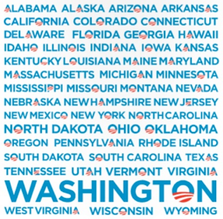
The Versatility: Designer Sol Sender, who created the Obama logo also made a wide variety of logo uses, including placing the logo in each of the state names and customising the designer to appeal to different target markets. This tweaking and customisation meant that the initial target audience could be vastly increased with the logo being customised for more personal messages. The wide range of appeal and specific targeting lead to a greater number of people falling into the Obama camp.


The Experience: Alongside the typeface designers also chose to use other iconic American images to make Obama appear more experienced including the presidential seal. The use of this seal subliminally fed the idea to Americans that Obama is presidential material. Seeing him stand and speak at a podium similar to the official one makes it easier to translate the idea of him really standing and speaking as president.


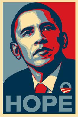
The Bold Poster: This 'Hope' poster is probably the most memorable element from Obama's campaign. Shepard Fairey was inspired by strong political posters from history such as Russian, communist propaganda imagery. The bold colours and simplicity of the design made the images stand out and stay in people's minds. The 'Hope' poster uses a similar style for a similar effect, of course with the addition of blue to give the whole design a far more American feel. The real strength with this image however, is simply because there was nothing else like it, positive, strong and stand out.