Wednesday, 22 January 2014

OUGD405: SB3- Page Layout

5 Double Page Spread

Using the information gathered in our research project and presentation we were now to organise and lay  it out across 5 double page spreads.  The intention had been to use our '100' theme to assist in dividing the information, present facts on one page, stats on another etc. However, due to the way I conducted my research I already had five nice little topics to work with.

Tracks
Animals
Runners
Walking
and Others

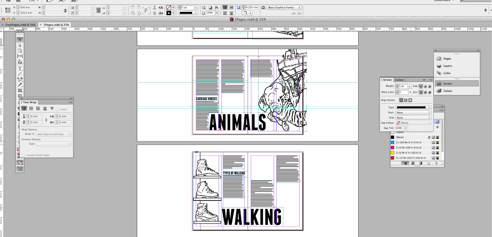
The only problem I could see was layout concept. I wanted my design to be informed rather than pure visual but applying a concept that fit all five would be difficult so I pulled it back and decided to base the layout of each page based of how each vehicle/method of transport moves. For tracks I considered a two column style to mirror the tracks, the same with the runners I made sure to have parallel running paragraphs. For walking and Animals I tried to re create the feel of footsteps and the sway that comes with walking and finally for 'Other' I looked at the Sedan's handles and represented this with parallel paragraphs also. 

However, before I could start sketching ideas I went through my photographs and selected the 'eye grabbing' image I would be using on each page. It may seem like a bit of a cheat, but when it comes to layout I've always relied on large text and large images to help structure the rest of the design (as I mentioned briefly in SB3 context post) also it allows me to get a feel for how the eye will travel across the page, using large imagery and headers guarantees a smooth 'flow'. 

So I ended up choosing these three images from my photos and sourced the other two from the internet to produce my key illustrations.


Sketches

So I began, with images in mind and illustrations being produced, to sketch ideas for my layout. I started with rough sketches, moved onto cleaner versions and then finally produced final sketches of all the pages along with bullet pointed bits of information I could see eventually going into the page.


Sketches Round 1


Sketches Round 2


 Sketches with assumed info.


Illustrations
Producing these was methodical and rather enjoyable, Illustrator, photographs and a Wacom tablet. It's easy to create nice looking doodles when your outlining a photo. 


Using In Design/Design Choices

Having used In Design before I was already pretty confident with most of the programmes features and honestly- although I'm sure many people say this. There were very few dramas when it came to the layout, all I did was follow the plan. 

(when it came to adding in the text there were a few sizing options, but honestly I love In Design because it's a frickin' piece of cake.)


The header font I chose, Franchise, is one I found just before Christmas whilst making a 'quote' poster. A few creative blogs argued that the font is a wonderful high-impact san serif, suitable for non-fiction works and campaign posters. I personally however chose it because it felt like a well designed Impact. The power and presence of the chunky typeface, however, the smooth and dignified corners Impact wishes he owned. It gives the page an eye grabbing feature without the sharpness of the glyphs corners poking you in the eye. It's also a bit taller than impact, and we know taller is always better. 


Interim Crit


I had been (if only slightly) concerned with the similarity of each page, and worried they didn't differ enough from each other (especially with Runner, Other and Tracks all relying on the same parallel paragraphs concept) also I was slightly concerned that the tone of the illustrations didn't lend much to the tone of the title font- although they both have thick lines I worried that the illustrations came off childish. I was also a little miffed about 'Other' page design, it just didn't click with the eye like the rest of my pages, and being honest with myself, despite the balance of text to image being right, they still felt a little dull. So I posed questions to the fellows of the Graphic design Level Four society. 


And they responded with gusto.


I was really, really pleased with the feedback I got, it was the first time that I didn't seem to get a 60/40 split in opinion or lots of people contradicting each other's ideas. I moved forward with set goals in mind- Play about with colour, Find another word for 'other'- a lot of people felt this was the reason the 'Other' page lacked something. 


Final Designs


How'd it go?

Well, I'm pretty confident with the programme In Design, so I found production enjoyable and easy, and I was very pleased with my designs (I know it sounds bad, but especially when I began comparing it to others, perhaps that's big headed but for me I think it's a relief that I consider my work on the same level everyone else's now). This crit was the first one where people made me happier about my work and not angry/disappointing- so that's a bonus.


Tuesday, 21 January 2014

OUGD405: SB1- Design Process:Frame

Framing Features
From my research and analysis I had identified 4 types of backing design that I actually liked. Each had it's own target market and all development potential. I found it difficult to choose one style of design out of the three so I decided to come up with product criteria and initial sketches for all.


Text/Plain

Type of frame it'd be in:
Plain and simple design mirroring the simplicity of the typographic backing paper. Minimum to no detail, high class product.


Target audience: Home owner, young to middle aged, none specific gender, more middle class background.

Sketched Ideas:


Retro/Vintage

Type of frame it'd be in:
Usually a modern product trying to look like it's older than it is, the backing paper assists in conjuring up a history the frame never had. Mid-high end product, fills in the gap in the market for people wanting vintage genuine items but who can't afford to purchase/source them.


Target Audience: Home owner, young to mid aged. Usually leaning towards women in this market and people of an alternative 'style'. 

Sketched Ideas:


Photo/Arty

Type of frame it'd be in:
Like with the text frame it'd be a high end product and very simple in design. The backing papers may not seem as simple for this category as there's a lot of detail, however by keeping the designs simple with no more than 2 colours per piece it shouldn't over crowd the small space.

  
Target Audience: Home owner, middle class (possible photography enthusiast using the frames to show off work) non specific gender however leaning slightly towards the masculine. 

Sketches:


Patterned

Type of Frame it'd be in:
High class piece  A frame more like a design feature than a practical product usually fully of unnecessary details and craftwork. 


Target Audience: Once again mid age range (late twenties to early fifties) however this frame would appeal to someone with more of an eye for detail. A frame of this type would be most attractive to designer types, people who take pride in carefully decorating and choosing objects for the home. For this target market a very high class looking backing paper needs to communicate the importance of the object. 

Sketches:


Interim Crit

What I needed from the critique this session is a clear direction to go towards, with so many ideas, all of which I consider strong, it's pretty difficult to make a decision. I feel the retro/patterned designs would be best as I can visualise their target markets better. So I posed my class mates three questions:


With the majority agreed with my initial opinion. It was time to move on to the production of the patterned ideas. 


Production and Development

With the patterned idea I really wanted to get across a sense of texture and depth, shadows and tints and so on, so it looked as if the backing paper was cut out paper art. I had wanted to do this by cutting out a simple pattern, scanning it in and repeating it using photoshop, however when it came to trying to do this practically, my scaple skills severely let me down and what i produced looked very childish and uneven (plus the shapes kept ripping/blowing away so I nearly lost my sanity).


Also the colours- although faded/pastel like as I had in mind looked really dull and clashy and it was difficult to visualise how effective they'd be in a full scale pattern- so I decided to skip the traditional and cheat slightly.


I scanned in my original sketches and, using illustrator, I outlined the key patterned features to make some easy to play with shapes. I then transferred these into photoshop and worked my magic.

Step One: Colour- I still wanted the colours to be more autumnal/burnt slightly so as to match well with a gold frame. To counter-act the darkness of these colours I had intended to fade the opacity/find a pastel version however this proved difficult. 


Step Two: Creating the 'Layered' effect using drop shadows.


Step Three: Texture- adding two faded opacity layers using an image of crumpled/textured paper I found on the internet making the image looked aged.


Step Four: Text. When it came to choosing a font I knew it had to be serif typeface, the market I was aiming for and the style of patterns being produced just didn't fit comfortably with san serif at all. So I played with the classical looking options- Book antiqua, Modern No.20 (which looked Sherlock-y despite it's name) etc. I ended up settling for Engravers MT, the fixed cap height created a nice shape out of the text and the thinness of the stems keep it from being over powering. I created the boxes using the same paper texture as before (so as not to contrast from the feel of the design entirely.)


Step Five: Repeat for the other two sizes.


Final Products:

(photos needed of print out/backed versions)


Design Boards/Summary:


So How'd I Do?

To be honest I was pleased with myself- rolling along whilst watching my peers tear their hair out and stress from a lack of ideas and creativity. It's smug and pathetic I know but there's a sense of calm you feel when everyone is loosing their stuff around you and you know exactly what your doing. I feel idea generation wise, I kicked ass, so many people said they had no idea what to do and, despite being daunted by the brief initially, I considered, grouped and categorised my research so thoroughly that it produced a clearer path forwards.  I still feel design wise the colours are too dark (especially on the 4x6 and 6x8 designs) and it does look 'photoshopped' so it may not fly in a high class store. Printing quality aside though, the designs are pleasing to look at- and they looked great mocked up in a frame, so I can't complain. I really enjoyed working in photoshop, the satisfying feeling of having a minimum of ten layers per image- and although I had used the programme before, it was good to recap and get used to it again. 

It was a funny after thought I stumbled upon looking at my frames and considering my target audience. Middle aged, more likely female, interested in interior design, considerate in home presentation and design and choosy when it comes to the specific objects displayed in their homes- turns out the target audience was my mom. I think that's probably why I found it as easy going as I did.