Showing posts with label studio brief one. Show all posts

Wednesday, 1 October 2014

OUGD504: Studio Brief 1- Layout Examples

After narrowing my initial ideas down to two main ideas (the scrumpled paper poster and the varying opaqueness booklet) I decided to look a bit further into folded poster and booklet designs, in order to get inspiration for my own layouts.

I feel that for the organised booklet I'm drawn towards the cleaner modern styles of layout design then ripped back into the chaotic postmodern styles when it comes to the poster. The only thing to do is finalise my content and produce some test layout sketches for both ideas. 


OUGD504: Studio Brief 1- Initial Ideas

In total I have four different ideas.


1- The first is a split in two, gate fold leaflet that depicts the expectation of a design process against the reality of what actually happens. I always begin a project with an intention to be professional, well organised and thorough (the expectation), and usually end up leaving everything to the last minute, panicking and rushing the design I produce to the point where I hate the product, the concept and myself (the reality). I would use two different designs for each side as well as different tones of voice, it would end up begin quite a humorous and honest leaflet.

2- The second is a more conceptual approach to the design process. Using possibly a pocket fold and adding additional pages to it I would write out the design process on pages slowly growing more opaque the further through the booklet you get. The beginning page see through acetate, the second tracing paper, the third tissue paper until it finally ends with thick opaque card. This would represent the filling out of an idea and the final product/design becoming 'clearer' and more defined as the design process is followed. 

3- The third is a poster style leaflet that doesn't fold into a neat fold, instead it would become a scrunched up piece of paper that is smoothed out to reveal the content. This conceptually represents my feelings on my own work and design process (the 'ah fuck, just throw it in the bin' approach) and the mess I usually get myself into by leaving a lot of things to the last minute. I feel like this is not only an accurate display of my process, but also a rather unique approach to a folded leaflet, the only worry I have is that the final display would look rather messy- though isn't that, like, the whole point?

4- The final idea I have is a concertina fold flow chart. Each page of the concertina booklet will depict one section of the process but when folded out you see the flow of the process in it's entirety (the 'you only see the big picture when you step back' concept). It could potentially be quite humorous if dotted about with small doodles (as a lot of my work books are) and drawn out in a rather sketchy way. 


Mini Crit

After talking though some of my ideas with a few peers, I have so far narrowed down my ideas to number 2 and 3. They agreed these are the most unique and conceptual ideas that I have produced. It was explained to me that number two makes use of different materials and would be a very clean design with a very clear concept whilst number three is unique and personal and an interesting take on the folded idea.

OUGD504: Studio Brief 1- Folded Leaflet Examples

I decided to have a look around to see what kinds of folded leaflets exist out there and how unique you can be with a folded piece of paper and a design. I came across a series of variously printed concertina/harmonica leaflets, it appears this type of fold is a universal favourite of the graphic designer as it can contain a lot of information whilst still looking 'edgy'. 


I loved this design, it looks all edgy, angular and segmented. It's an excellent way of laying out a piece through fold, the folded edges create sections for text, colour and image to happily sit within. 


I just enjoy the interactive nature of this design, something always feels more real when you can play about and touch it. 


This little awkward design appeals to me as a non perfect chaos lover. The folds aren't perfect but it suits this particular style of design. There's also a wonderful playful element with this folded leaflet as it scrunches down into a fox, I just love that. 


OUGD504: Studio Brief 1- Studio Session 2

During this session we explored different folding techniques. I found my inspiration by looking through a book called 'How to Fold' which listed instructions for creating lots of different folded items including envelopes, locking books, booklets and leaflets. I picked out some that appealed to me and attempted to create them for myself.


The first one was called a folder, it seemed incredibly simple however not measuring the lengths proved my downfall and it ended up looking incredibly ugly. Also the amount of information that could be presented in this type of booklet was minimal, although it looked as though designing a page for this fold would be easier than some.


The second design was also called a folder and was still a little tricky to get completely correct, however it turned out a lot better than the first folder due to scrupulous measuring. There was an issue with this design however, the paper I used was too bulky and so the folds keep springing open, so it would seem a change of materials is required to make this design work.


The third folded creation I made was called a self-locking pocket folder. It too required perfect measuring but was fairly simple to put together (with a little trimming of the edges here and there). As a design it can hold random bits of paper in it's pocket section, but it also seems there could be additional paper stapled to the inside cover to create a little booklet.


The fourth booklet I created wasn't one of the 'How to Fold' designs, in fact it's a simple piece of origami called a Bamboo Envelope and I learnt to create it from the origami website: Origami Instructions. This is a pretty little design that looks very ornamental. It has a good space for text and also a little pocket on the back. However this little booklet would be very difficult to design a layout for.


OUGD504: Studio Brief 1- Studio Session 1

Today we were briefed on our first project. The final outcome of this project is to produce a leaflet that describes our design process.

To begin we did a session on understanding what exactly the design process is. In small groups we brain stormed what we though the design process was and found it to be a combination of many different factors including ideas, research, feedback and development.


After writing all we could about it, we were told to condense the design process into a flow chart, however I chose to condense mine in the form of a list as I found my process to be rather linear as opposed to a series of flowing options. I also saw my design process as two separate stories, the expectation from staff, from professionals and what I also hope to/think I will do, and the reality of letting myself down, letting things slip and ignoring common sense, so i thought it was important to document both of these.

Example of flow charts


After we had done this the group was then told to emulate the flow charts in the form of folding paper: making the 2D chart into a 3D object. I felt it important to communicate the split I feel between my dreams and reality in relation to the design process and so I created objects that were very much separate, either with two mirroring sides or two completely different objects. I feel the two models that communicated my design process the clearest were the neatly folded origami flower and the screwed up paper ball: what I hope to achieve and what I end up with.


Friday, 7 February 2014

OUGD406: SB1- Secret 7"

Tuning In
Before this brief had been formally set, we were given a slight heads up about it last term, and then encouraged to head to the secret 7 website and get our heads around the competition and the songs. After first inspecting the list I knew there were only two options in front of me as there were only two songs that I actually liked- Grounds for Divorce by Elbow (which I knew a fair bit about already) and Strange Creatures by Jake Bugg. So when the brief was finally set I decided to forget the others completely and focus on making my choice between the two as well as generating initial image ideas.

So to get a good dump of inspiration I went to the internet; first I listened to the songs, then watched the video for grounds for divorce (strange creatures didn't have one) and finally printed out copies of the lyrics. 

Video (where applicable) and Songs:
Grounds For Divorce
Strange Creatures

Lyrics:
Grounds For Divorce:
Mondays is for drinking to the seldom seen kid

I've been working on a cocktail called "Grounds For Divorce", whoa
Polishing a compass that I hold in my sleep, whoa
Doubt comes in on sticks, but then he kicks like a horse, whoa
There's a Chinese cigarette case and the rest you can keep
And the rest you can keep

There's a hole in my neighbourhood
Down which of late I cannot help but fall
There's a hole in my neighbourhood
Down which of late I cannot help but fall

Mondays is for drinking to the seldom seen kid
(Ooh, ooh)

There's this whispering of jokers doing "Flesh by the Pound"
To a chorus of supposes from the little town whores
There'll be twisted karaoke at the Aniseed Lounge
And I'd bring you further roses but it does you no good
And it does me no good
And it does you no good

There's a hole in my neighborhood
Down which of late I cannot help but fall
There's a hole in my neighborhood
Down which of late I cannot help but fall
There's a hole in my neighborhood
Down which of late I cannot help but fall

Someday we'll be drinking with the seldom seen kid
(Ooh, ooh)


Strange Creatures:

Oh, it?s a cold world
But it?s haunting me
Oh, a little ghost of a girl
She came to me
She?s been haunting me

Strange creatures
Oh, yeah, you and I both
Strange creatures
Deep down you and I both

This man knows it all
Don?t have a clue about me
I?m in a nightmare
Not a thing can set me free
If only we could see
That we?re strange creatures
Oh, yeah, you and and I both
Strange creatures
Deep down you and I both

Oooh

Strange creatures
Oh, yeah, you and I both
Strange creatures
Deep down you and I both
Strange creatures
Deep down you and I both


After highlighting key words and phrases, scribbling down some initial thoughts and taking note of any colour schemes that made themselves present (especially in the Elbow video, dark reds, greens etc) I took this info and began to make lists, listing out all my initial ideas for both songs and any possible themes/image ideas I could run with. 


It soon became apparent that I had a lot more different types of ideas for Elbow, but not for Bugg- I found it hard to get away from the quite literal story of the song, and with Elbow I found the lyrics contained a lot more image creating devices and due to the way they write lyrics, very metaphorically, the interpretation of the song was still quite open but with some safety boundaries. 

So now it was time to scrap Bugg and focus on the Grounds for Divorce, for which 30 thumbnail designs were required. (I did freak a bit at the thought of this- I won't lie, no one can come up with 30 ideas- and certainly not 30 good ones) I was thankful for my list and continually referred back to it for more ideas. 


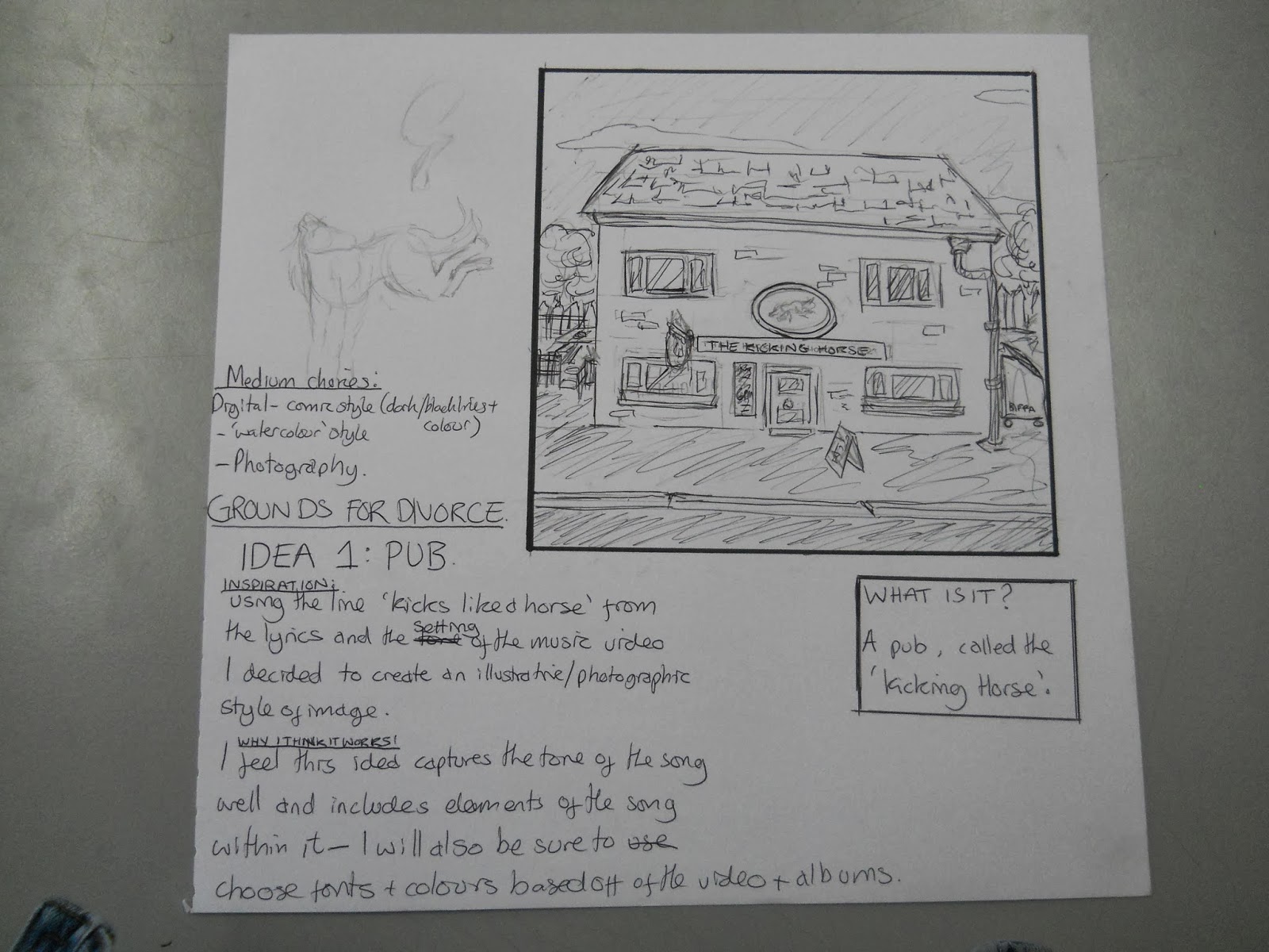
Now came the difficult bit, narrowing these ideas down. First line of attack- ask the artistic boyfriend, I always ask his opinion on all my work and ideas, it's always useful to have someone consistently around whose opinion you trust. However, due to his lack of Graphic Design training I always feel it necessary to get a secondary opinion from my classmates. So a small group of us (about 5) held a mini-crit to help each other make our decisions. We each took it in turn to explain our ideas, our interpretations of the songs and why we had done what we had done. It proved very useful, and helped me select my final five with a lot less pressure and a lot more confidence in them. 


I then drew these sketches up into a 'neater' format, listed the meaning and any initial medium choices I had and then presented them ready for interim crit.


Interim Crit

The key information I was looking for from my class mates was a definitive decision on which was the strongest design out of my five 'cleaner' sketches. Although at the same time I wanted to be certain that to an audience member, my designs would manage in some way to link to the song. 


Although the feedback I had was useful I didn't feel it was conclusive enough to make a decision. There was no clearly defined 'favourite' and personally I couldn't figure out which one was weakest and so I spoke to Simon and asked his opinion in order to make the choice easier. Despite there still being no clear 'strong' design I was able to, with his help, narrow down the five to two which proved a lot more practical to produce in the time scale provided. 

Design Development

Producing digital versions of both designs was simple enough task, but just a time consuming labour of love one. The hole design required outlining the original image with the blob brush tool, this was very time consuming but the only way I could achieve the scribbled look that I wanted, the pen tool just didn't produce the same effect. 


The second patterned design was a lot easier to produce, the pen tool was effective for this design as it gave the clean and vectorised look that i was after. I outlined the images already produced and added colour to them. The only concern came with colour choice and that was a simple one to over come. A white or black background? Black every time, it looks moodier.


Choosing a colour scheme for the hole design wasn't as simple as that, after producing the basic outline I copied the image time and time again trying out different backgrounds and different colour schemes. I made my final choice based off of peer opinion I would ask each student which one they preferred, the one that won overall was the orange design on the scribbled background so this is the design I ended up going with. 


Final Designs

For the first design I chose to produce an illustrative piece depicting the line 'there's a hole in my neighbourhood' as well as representing the relationship in turmoil that the song speaks of.


Submitting the design to Secret 7"


For the second design I chose to go with a patterned look with images depicting specific lines from the song (moral compass, chinese cigarette case, ? and the drink) as the pattern progresses each of the items progress too, the moral compass turns from north to south depicting a relationship going sour, the drink ends up spilt. 


Submitting design to Secret 7"


So how did it go?

I kind of enjoyed this project, however I do feel I relied on my illustrative instinct and produced designs that could be classed more as illustration than graphic design. It was nice to do a bit of drawing again but on reflection I feel that I may have chosen some obvious design ideas. The hole design is definitely my favourite one and as far as illustration goes it was really  nice to draw something I was that satisfied with in a style I have been trying to get right for a long time. 

I had been very pleased with both designs and I also thought this would be a brief I would be amazing at, however, when comparing the final products to the other designs produced for this brief I feel it just paled away and shrunk into the background. I had started this brief very confident but now I'm not so sure… I'm not sure what I'm strong at anymore. Other people's concepts and ideas just blew mine out of the water and this has left me feeling very shaky in my self confidence. 

It'll take time before I understand where my strong point is. 

I didn't end up being selected for the final exhibition which was a little saddening and I do feel this is because of my rather obvious design ideas.