Tuesday, 24 March 2015

OUGD503: MOO- Evaluation


I enjoyed this brief, even if it was only for a day. Of course with day briefs comes the main criticism of the work- it would've been much better/to a better quality if I had, had more time. Once submitted I found a few problems which I missed at the time due to being rushed off my feet, though it was a good exercise in realising how much I'm capable of when pushed to a day long deadline. Despite this project being so short I think the concept and the idea is solid and having created a chain reaction illustration previously certainly helped the whole process along. A few other changes I would've made to the design include selecting a better format, the size I ended up printing the images at was far too small and awkwardly slightly too big for A3 but way too small for A2, I think I would've changed all the lengths to A2 if I did this again.

All in all I believe my final designs are an appropriate solution to the brief. They are fun, interesting, the eye is drawn into the image and people have to take a few seconds imaging how the set up works. It's bold and bright in keeping with their look and brand guidelines and each image is distinctly different but still very much a part of a set.

OUGD503: MOO- Final Designs


OUGD503: MOO- development and design desicions

The initial sketches I created I used as guidelines as to how the chain reaction would flow and for selected different items within it. I went on to produce neater cleaned up versions of the designs that to be digitised later. 

The main use of the sketches was to make sure the balance in the image was solid and the flow through the reaction worked well, after I was certain it would work then I would digitise it. At the end of each chain reaction I wanted a 'finished/successful' representation for the business working well as well as the certainty clients should place in the MOO brand. For the bakery the icing is on the cake, for the mechanic the toy car crosses the finish line, the administrator successfully prints the document and the beautician's mirror spins to give the doll a reveal of her makeover.


Many of the design decisions had already been made. The font choice as well as the colour palate had already been outlines in the MOO brand guidelines booklet, it was simply a case of implementing them into my design.


I used thick lines for the outline and rounded corners to compliment the strokes of the font. This also made the design appear more cartoony and gave it sense of fun, though I was careful not to over simplify it and make it too childish by adding little bits of detail in thinner strokes here and there.


I ended up choosing four colours from the brand palate that greatly contrasted each other to give each poster it's own character. I also made sure to use the colours that the brand uses most often, their main/primary colour choices as opposed to their secondary choices, this would link 


For the layout I didn't attempt to sketch it, instead I moved things around digitally trying to strike a balance between text and illustration. The strong band of colour complimented the colour used in each design however when I had the bottom half of the image in all colour it was far too much. Adding the colour as a band rather than a block gave the whole design enough white space to breathe and framed the image suitably.


OUGD503: MOO- Rational and Initial Ideas

Project Rational 

MOO is a business that helps other businesses. The are an online and print based company that helps small businesses create well designed stationary and promotional material.

Recently that have updated their image tagline to: Design Works Wonders. Their challenge is for creatives to produce a visual representation of this tagline and to really demonstrate to their customers that design can work wonders.

The solution can be any medium as long as it's playful, interesting, visually striking and that fits into the moo personality. They are looking for the idea to promotes awareness that Design Works Wonders in business, look striking and visually engaging, get their customers excited about MOO, makes people smile and encourage people to visit moo.com.


Initial Ideas

Seeing how open and free this brief was I wanted to set it as challenge and complete it as a day brief. My initial idea came from something I've created before for my own personal branding- a chain reaction.


The chain reaction in this style of illustration is not only fun and interesting, but also represents the ease with which a business can flow from creation to promotion when they use MOO. 


I decided to take the tagline and extend it, in order to cover the vast range of businesses that MOO assists I wanted to create a range of posters and use 'design works wonders for...' making it personal, relevant and demonstrating just how many types of businesses can benefit from MOO's services.

The four business sectors I chose to use were administrators, bakers, mechanics and beauticians and for each chain reaction I would use tools and instruments used by each job. E.g. for bakers there would be bread, scales, whisks, for beauticians make up, hair brushes, mirrors etc.


OUGD503: Group Responsive- Evaluation


For this brief we greatly considered our product. Using design thinking we were able to solidly understand our problem and create a suitable solution that solved as many of the issues as possible. Although most of our time was spent designing and sketching, developing and arranging different things we spent an awful lot more time researching thoroughly. The idea of the game would only be feasible if we could fully understand the ecosystems we were trying to recreate and we did this within an inch of our lives. Of course the rain forest is so complex I could've done a lot more towards it but due to time limitations I had to give myself a cut off point. Though this may be true for all briefs; we did overrun with time keeping, every little thing took about three times as long to complete than estimated and this was true with all aspects of the brief, it really pushed us for time in the end. It simply wasn't fully considered all the things we had to produce and complete for our final submission, there was a lot more than we initially thought.

That being said the quality of the final game is fantastic though this is more due Beth rather than me, she would spend extensive amounts of time on the smallest details making sure they were perfect, I'm a more quick creator 'that'll do' kind of a person, but I think this made us complement each other well. I feel on my own part I could've and should've spent more time on my own sections but I also think if I had taken my time with it then we wouldn't have managed to complete it before the module submission. One thing that needs to be considered is that there were only two of us, we started with five and came up with an idea that suited the workload of five people and managed to complete it with two (there was some assistance from a third member, bits of research, the typeface, but these were part time things). I think this makes me proud more than anything, I am astounded at what we were able to achieve, we motivate each other well and Beth's persistence and dedication drove me to want to work harder.

If I could improve on this project I think I would've liked to do more; make some gifs, some animations, more ecosystems, more animals. Also I would love to have taken my time on what I did produce, although I'm happy with my illustrations and my designs I think more time would've improved them greatly.

Monday, 23 March 2015

OUGD503: Group Responsive D and AD Submission

The D and AD brief required us to submit up to eight design boards explaining our concept and solution. These were the submitted boards.


There was also an option to add in supporting material, we chose to add a couple of extra boards to explain a little more in depth where wee got the idea from, how our solution answered the problems set by the brief and how we chose the look of our design.


OUGD503: Group Responsive- Developments

After our research we began to consider the look of the game and how it would play and flow. We sketched out a few ideas for the look of the environments, the shop and the home screen.


Basic sketch of shop look/layout

Basic environment sketch showing levels/layers in the game


sketch showing interaction with page/notifications


Visuals wise I was tasked with designing the animals, home screen, shopping screens and iconography. 

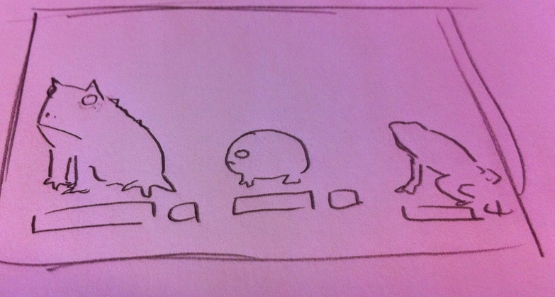
For the animal illustrations I wanted to produce something that would stand out against a backdrop, and although I wanted the images to be simplified versions of the animals (to make it easier for later animation and potential programming if the game were ever to be developed) they still needed to have enough detail so players could recognise individual species.


I make them stand out strong by using bold, thick lines for the main body and thinner lines for the detail (so as not to swamp the image) I focused on illustrating key features and patterns so the species would differ from similar types of animal. I also chose to have each animal from a side view as this better suited the format and play of the game (with players scrolling sideways through 2D landscapes).


The icons had to be simple yet fun. Soft edges and rounded corners to make them less imposing. For the main page icons these were very simple, home buttons, move buttons, basic iconography. I made sure these all had rounded edges fitting in with the style of the rest of the game.


For certain icons such as the ones used in the shopping sections of the game I used circles as my base, not only to make buttons easy to tap but also to link back to a rounded eco system and the shape of the earth. 

The look of the shop was also based on a circular 'wheel' look, from icons to the way players will scroll through the species.