Wednesday, 10 December 2014

OUGD504: Study Task- Print Finishes

This session we were set the task of finding out about print finishes. I was lucky to be given a book to flick through call the production manual, it had an entire chapter on finishing which included folding binding as well as the all important finishes applied to print.


Perforation
Perforation comes from the Latin word “foramen” and means hole or opening. This is a process that creates a cut-out area that can be detached from the page. Potential uses include mail out packages, or contact information that can be torn out and kept.


Duplexing
When two stocks are bonded to form a single sheet this is called duplexing, it's a technique used mainly on business cards or invites. 


Thermography
This print finishing process produces raised lettering using powder fused to the page in an oven. It gives the overall look a bubbly and mottled surface that is very touchable and eye catching. This can be used in any statement piece such as cards, high end promotion materials such as leaflets, and decorative posters.


Foils
Foiling an image adds a 'shiny' layer to the page and is produced by pressing a heated die to the paper. Also named foil stamp or foil emboss it is a widely versatile finished process and can be used on leaflets, book covers and promotional materials such as leaflets or business cards. They can also be used as watermarks for samples.


Embossing and Debossing
Both embossing and debossing involve a mounted plate being pressed into the stock to produce the finish. The difference between the two is that embossing creates a raised impression on the paper where as debossing creates an indented look. Both have many applications including watermarking, book covers, adding a textured dynamic to business cards or letter heads, invitations etc. If doubled with a foiling technique it adds a really interesting look to printed material.


Die Cutting
Die cutting is a process where shapes are 'cut out' from the stock using blanks or templates; blades formed into the desired cutting shape; and a press. When manufacturing mass amounts of one cut out product die cutting is the easiest method to use, however producing a new design takes time and effort and if it is for a small number of jobs it becomes more effort than it is worth.


Laser Cutting
Similar to die cutting; they both remove shapes from stock; but more flexible with what you cut. Laser cutting is all set up digitally and then produced with a laser cutting machine. For smaller numbers of cutting products this is the tool to use, however is mass production is your thing then die cutting is the better option. It takes less time to set up, once a digital 'cutting' file is produced but takes longer toy cut; vice versa for die cutting.


Varnishes
There are many types of varnishing finishes for many different effects. They are: gloss for a shiny look, making photos and images look sharper and the colours brighter, matt for the opposite of gloss, neutral for an almost invisible look useful for quick turnarounds as it dries very quickly, pearlescent for a luxurious effect, satin and silk for that midway look between matt and gloss, textured spot UV to apply texture to paper such as leather, crocodile skin etc, and UV varnish a form of varnish that will dry when exposed to UV rays, a page with this varnish on it will be shiny and a little sticky. 


Laminates 
Like with varnishes, there are many different types with many different effects. Matt, diffuses light and reduces glare, satin for somewhere between matt and gloss, gloss, a shiny highly reflective laminate, sand, for creating a subtle sand grain on a design and leather, to give a leather texture to the page. 


A shape with foiling and UV spot varnishing.


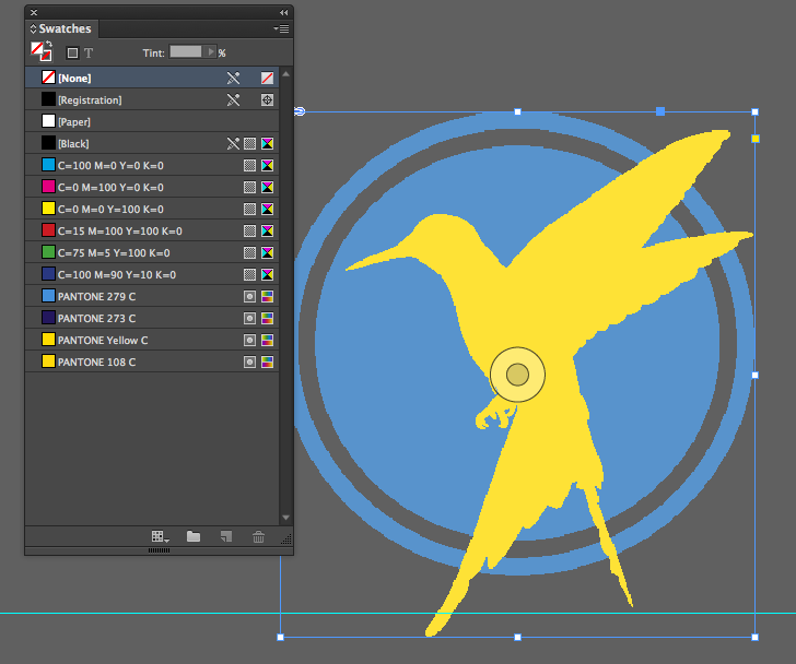
 A two colour image with foiling.


A three colour image with spot varnish. 


OUGD504: SB4- Research

Printed Advertisments


Found on 25 creative designs- From up North


From Creative Bloq's- 100 Brilliant print adverts.


I've been keeping an eye out for conservation related adverts seeing how my site is a conservation related site. However, I am yet to see an advert that doesn't attempt to scare and shock audiences; it's still a powerful message but one that I feel has been drastically overused. I also feel the smaller scale of my project (UK based) and the simplicity of the actions required to make a difference will make it easier to produce a positive friendly campaign as opposed to a fear mongering one. 


I had to include this design because it's a great example of a digital campaign translating itself into a printed one. The iconic style used in dumb ways to die works just as well in printed physical version. I think because of how ingrained the animation has become to audiences you can't help but hear the song as you read. 


For a bed and breakfast, brilliant isn't it?


This one just makes me smile. It's also very clever taking real life and turning it into a single colour. Quirky ideas with strong ties to the product or brand seem to be what makes my favourite printed ads the strongest. 


Augmented/Interactive Design

The capabilities of augmented design range widely. Using technology it seems the possibilities are endless when it comes to what can now be done with printed media. 


Adding an interactive element to it's catalogue Ikea engages it's audiences with the products and allows them to visualise what furniture could look like in their homes. It gives virtual tours and 3D examples and immerses the customer in the ikea world. 


Sometimes it's easy to assume that a smart phone is the only way of adding augmented elements to an advert, however Pepsi manage to turn a bus stop into something special without a smartphone being needed. This advert gets people exciting and makes them interact with the camera and video. And most importantly it makes people look on the other side of the bus stop and view the large poster for Pepsi Max. The combination of enjoyment coupled with product placement makes audiences connect those positive feelings with the soft drink as well as photograph, film and share their experiences ultimately sharing the campaign with the world. 


Thursday, 4 December 2014

Preparation for Print Workshop

When preparing a document from Photoshop always convert file into CMYK or greyscale and save as a .psd or  a .tiff document.

Consider resolution- 300 dpi/ppi as average and prepare images at actual size.

Opening a duotone document in indesign- there spot colours are automatically added to the swatch pallet. For using a limited number of inks and retaining the same colour these added swatches will mean the colours remain consistent in printing. And the same applies with illustrator and vector files.


Before printing checking the links pallet will allow you to check what ppi each image has. 300 is the average and these images only have 72, completely inappropriate for print. However shrinking the image can improve the ppi. 


Separations preview allows you to see what will be printed in CMYK as well as spot colours that will be used.


  Clicking on any of the CMYK options allows you to see a grey scale version of the image, perfect for screen printed positives.


Printing angles are important. CMYK makes up images by using different coloured dots all layered at different angles so as not to cross over each other. This can be manually done in illustrator.


Overprinting can only be viewed using the overprint preview. When used it means that colours can be 'layered' over another colour/image creating a transparent look. It will print the text/colour over the existing image/colour.


OUGD503: Joe Pointon Project

Project Rational 

Over the course of the responsive module we've had many different emails forwarded to us with opportunities for briefs and design work. One particular email was from a student of the Leeds College of Music looking for some personal branding; a logo design and business cards. He was looking to brand himself as a music producer, the kinds of music he creates don't fit into a specific genre, making him more of an all rounder. The recipients of this branding will be potential clients, work placements and people in the industry. 


As one of my responsive briefs I was keen to work with another student so when the opportunity came along to work with students from the Leeds College of Music I went for the chance. A lot of the second year music students are currently branding themselves and require the help of graphic design students to produce logos, web designs and brand guidelines.

I was contacted by one of these students.

After explaining that I wouldn't be able to physically produce his website due to my lack of coding skills, I accepted the challenge and arranged a meet up day to outline what his requirements were and what messages he was trying to communicate about himself and his music.

We talked over coffee and I got a gist of who he was. His music isn't a specific style, he acts as more of a Jack of all trades when it comes to music production and the target audience for his website and his logo would be professionals in the music industry so I felt it was important to create something simple and clean- a text based logo that could appeal to a wide range of audiences instead of specific ones.

I began work on the logo design and just started mocking up ideas in illustrator. I looked through some free fonts to see if there was anything san serif and clean that would be suitable for the design.


The mock ups were fairly simplistic as I was just playing around with positioning, opacity and lines. However I didn't really feel like I was onto anything solid so I collected a selection of my ideas and emailed them back to Joe for his opinion so I could gauge the direction I'd need to go into next.


The feedback I received was incredibly unhelpful.


So I'm stumped for now but will hopefully be getting some more constructive feedback from my peers.

Wednesday, 3 December 2014

OUGD504: SB4- Study Task

Creating a Project Rational

For studio brief 4 we have to produce printed advertisements for our website- some to include an interactive/augmented/digital element to them. In order to do this first a project rational should be written to clearly outline the problem and necessary requirements.

For the rational many considerations must be taken into account including purpose, audience, tone of voice, formats, distribution and placement etc.

So here's mine: Rough outlines followed by formally written rational. (Coming soon)


Purpose: What is it doing?
To inform and raise awareness about bumble bees and bee conservation. The key idea however is to inspire action and promote individual conservation efforts and ideas.

Audience: Who is it for?
Young families and nature lovers, also new audiences who aren't already nature lovers and conservation supporters. Rough ages- 18-35.

Message: What is it saying?
Bees need your help! The key message is that bees as a species are in trouble and simple, small individual efforts can make a difference. 

Tone of Voice: How is it being said?
A two pronged approach is required for the tone of voice. Firstly a formal and informative tone must be used to convey serious facts and problems and secondly a friendly and positive tone must be used to show people that although things are bad there are measure that can be taken to help. 

Format: How is it being presented?
I've had a few thoughts about this. There are the obvious printed formats such as posters and leaflets, however I want to add a digital and interactive twist to these formats. Leaflets and business cards will contain seeds so they can be planted, some leaflets will be folded into 'eco boxes' so they can be buried or filled with soil to grow more wildflowers. Also large posters, certain seed filed leaflets and billboards will have a digital element; when a phone is held up to them flowers are revealed so people can see what the area would look like with wildflowers. Also bees on the posters will fly out and buzz around.

Materials: What's it made of?
For the seed filled printed adverts a rough recycled or handmade paper will be used so that seeds can be embedded within them, for the rest the materials will be a nicer, potentially matt stock. If they could contain some texture to reflect the handmade paper then it would tie them nicely together however whether this would be tactical for printing and display is yet to be tested.

Budget: How much will it cost?
Honestly, I don't know about this one. I'll update it when I've spent all I need to spend on the project. However if this was in the real world then I know it would cost a lot to produce handmade paper on mass and distribute the printed media across the country and billboards won't be cheap so… a lot?

Placement/Distribution: Where will it be?
Like with the tone of voice I envision a two pronged method of distribution. While it makes sense to place posters and billboards and leaflets in areas of nature (parks, walking routes etc) to target the nature  enthusiasts who may already be educated on the subject I also want to encourage new people who may be unaware of the issue and target areas of the country where wild flowers are barely seen. This is why I would also want to advertise in city centres, the interactive 'if flowers were here' would work best in an environment where there are no flowers already.

Must dos and must nots
DO- encourage people to take individual action in bee conservation, supply the tools needed as well as the information needed for at home conservation, encourage people to go to the website (a page must be added/QR code leading to page to show people how to plant the flowers)

DONT- Push all focus with interaction onto flowers and forget the bees, be over the top with tone of voice, come across as patronising, make it difficult for people to understand/want to interact.

Time Frame: When is it going down?
The most appropriate time frames to follow will be dictated by planting seasons (March-May and August-October) so that when people get their hands on eco boxes or seed filled cards and leaflets they can plant them straight away instead of having to wait and then losing enthusiasm for the project or forgetting completely. 


Uses of Augmented Design

What is the Potential of Interactivity with Print?
Whether digital or physical interactivity the possibilities are endless when it comes to augmented design. There are the simple designs such as the afro hair poster or complex digital installations like the bus stop camera used by pepsi max. As long as the advert is engaging and makes people want to interact with it then it doesn't matter how big or small the concept or complicatedness of the design is.


Can Augmented Design Draw People to your Website?
Yes and no, I mean, there's a huge consideration to be made on the overall effectiveness of advertising as a whole and how much it actually contributes to drawing people in and making sales. But the none essay answer to this is yes, it may not draw people directly to your website but it will make people think about the website, it will make the advert stand out in memory and stand out against the none interactive or engaging competition. If we were to choose between an augmented printed advert and a regular printed one then I guarantee audiences will always be more drawn towards the augmented one.


Is it all a bit Gimmicky? Or, are there Opportunities?
No, by any means I wouldn't call it gimmicky. Things that can be considered flash in the pan ideas can go on to make huge impacts on the advertising market. Facebook and Youtube are both strong examples of how websites created for fun have become almost essential tools for advertisers, I think this will be the case with augmented design also. Advertisers always need to find a new way of drawing people in and making a memorable impact and as stated in the previous answer when an member of the public is show an interactive or augmented advert against a regular one, the augmented one will always be the most memorable and will stand out the greatest. 


What Kind of Interactivity Will be Effective for my Campaign? 
Because the aim of my website is to raise awareness and motivate people towards the cause of bumble bee conservation I think the strongest route to go down will be the conservation style posters. So there's a shock value I need to address, but I would like to couple that with a positive twist, an interactive poster displaying what life would be like with bees and without bees is probably my best bet. Everything looks dark and depressing until you interact with it, physically do something to the image and suddenly because of your intervention the world can be positive and bright again. I also think producing something physical will engage audiences also, seed paper is something that could be printed on but also provide the tools for people to begin home conservation efforts straight away and begin making a difference.