My concept for this alphabet was taking a key aspect of Luke's life (Charlton and football), finding the font that suited it (Futura condensed bold) and using his personality to change and adapt it suitably. I had my list of characteristics, now it was just a case of visually representing them. I chose to only adapt the letterforms E, K, L and U throughout my sketching and development stages- I did this to make sure Luke's name would always look good in his own typeface if it didn't then it couldn't really be a suitable typeface for him.

To get the ball rolling I produced a list of different visual ideas, each one represented some part of his personality:

To get the ball rolling I produced a list of different visual ideas, each one represented some part of his personality:

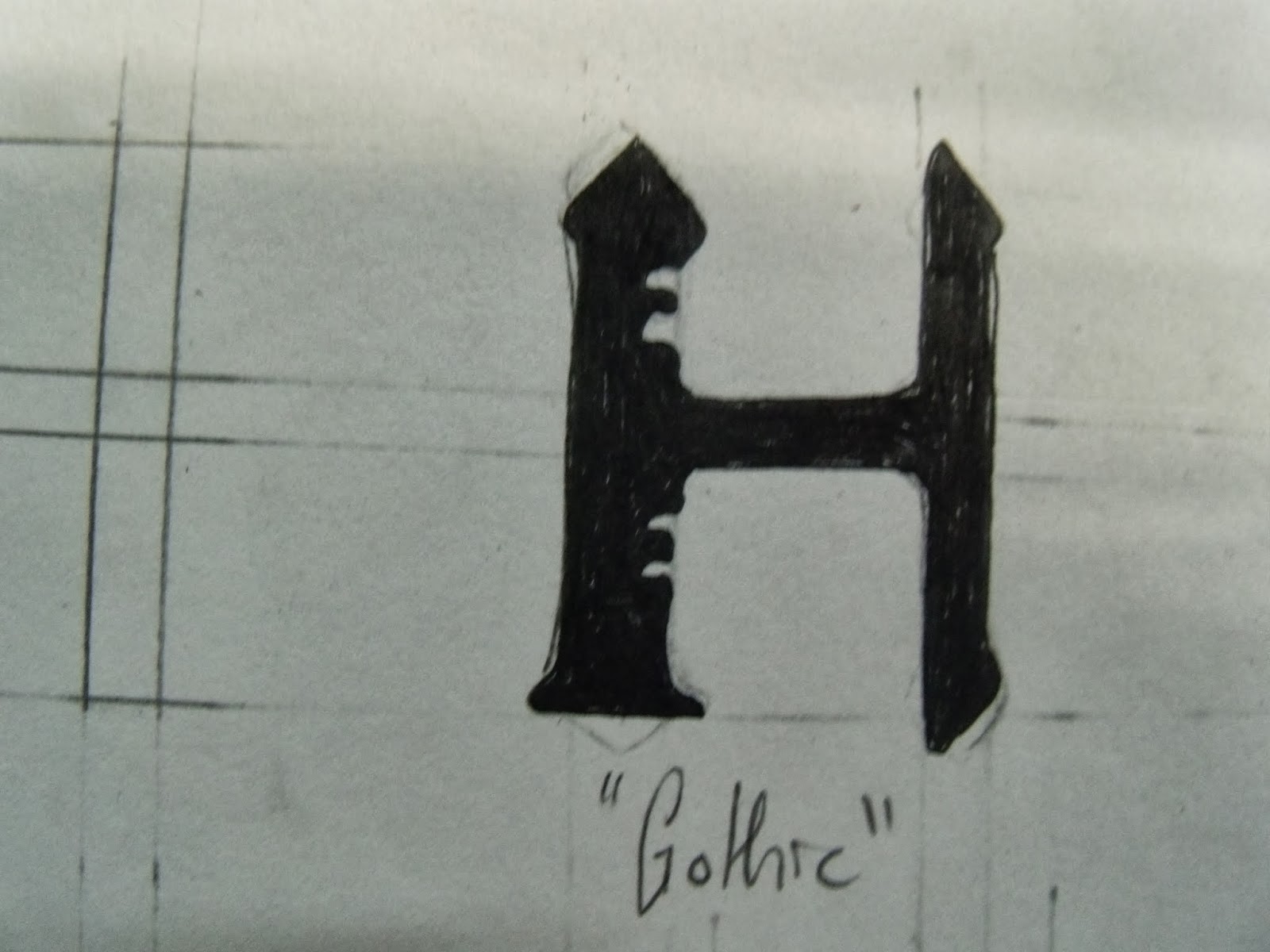
a 'sketchy' look to show unfinished, extended descenders for his laziness, squashed 'relaxed' versions of Futura condensed bold for his lazy and chilled out nature and bolder version of the type for his 'bold' personality. When it came to initial sketches it was a case of combining these visual concepts to produce a wide range of design ideas.
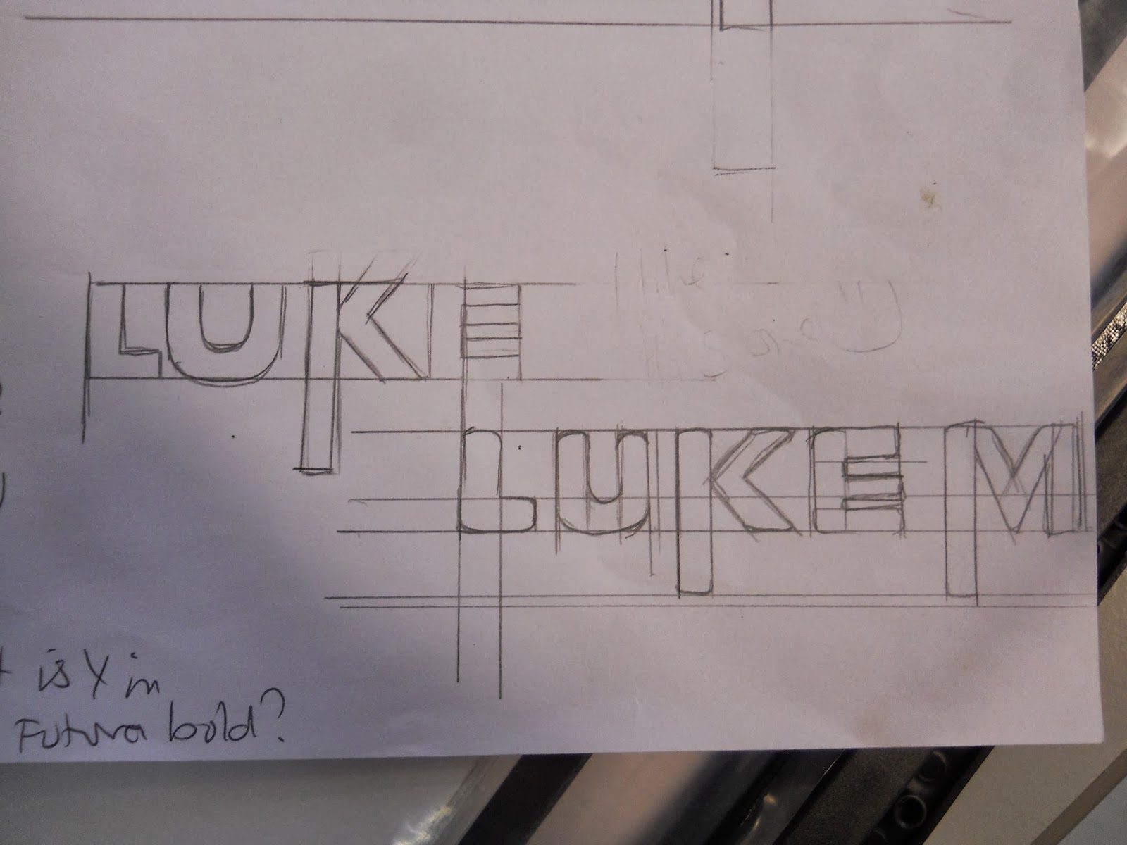


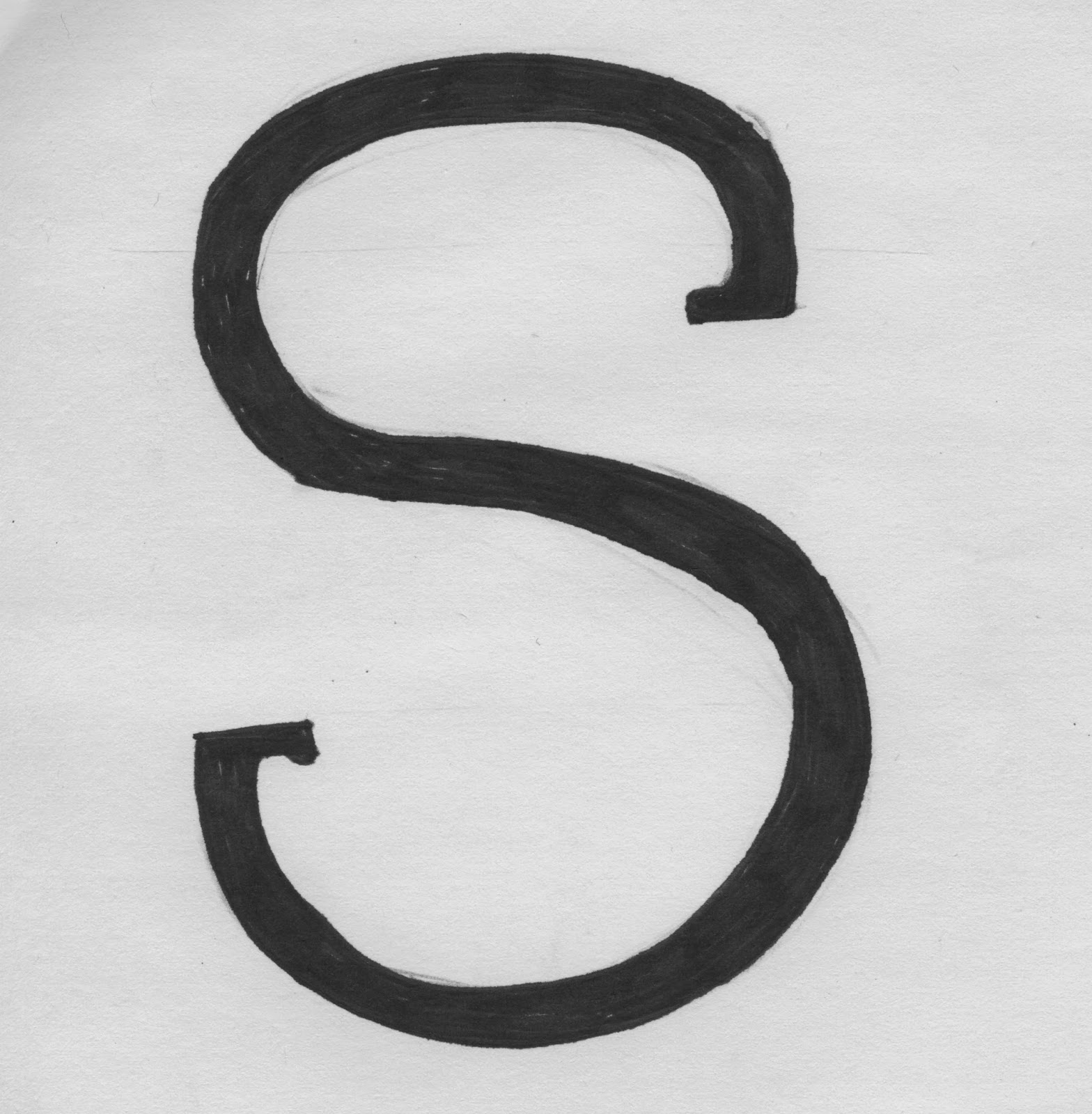
As I began sketching it occurred to me that the letters weren't showing the strength and boldness I had wanted. Luke as a person is a very noticeable individual- the way he stands out from a room or a crowd is the way I needed this type to stand out from the paper. Whilst playing around with how to 'relax' the letters I drew a set with a chunkier bottom that had a greater presence on the page that the others- so I ran with this idea and drew a few letters with the new chunky bottom addition. My other issue was that I found the typeface quite intimidating- after giving the letters presence with it's boldness, I now needed a way to soften it's impact so as to represent Luke's friendly and approachable nature. I found that rounding off the corners gave the letters a softer and more informal feel.
Going through my sketches there were two similar designs that stood out to me as the strongest- the chunky bottomed, relaxed and the sketch version of it. Out of all the designs they were the two that best showed his personality, they included the most characteristics- they didn't just show one side of Luke, they showed lots of different sides of him from his laziness to his friendliness his physical presence and his history. I wrote out Luke in both styles to properly asses how strong they were as designs and to visualise them as the final name badge. I felt both designs were very close to being finished, but it didn't feel like I should have been that close to being finished.


When it came to the interim crit I looking for confirmation and opinion on which one my favourite designs was strongest as well as suggestions to how I could change them to include more sides of Luke's personality and to 'finish' them off. I presented my two strongest ideas along with my research and ideas in order to give them some context. I also felt it was important to include neater versions of some of my earlier ideas- just incase I'd missed a golden design nugget that would prove stronger than my current idea.


The crit was useful in some ways and confusing in others. I got the confirmation I was looking for with a couple of people approving of the chunky bottomed design and commenting on it's likeness to Luke, offering suggestions for simple tweaks and subtle changes. The most common suggestion that came up was to find a way to further represent inconsistency and the irregular parts of his character. However a lot of the critique was contradictive; some people liked it some didn't, some felt that the extended descenders worked well, some felt they didn't. Some feedback was entirely useless- people telling me to 'look into football, because he likes football' without seeming to notice that my whole choice of font was based around his love for one specific club. Although for all of it's annoyances and contradictions I came out a lot more confident and certain of my design.
I decided to produce the letterforms at home and then trace them onto the final poster to save time, however after sketching out all 26 letters and 6 glyphs I discovered they were too big to all fit into the standard size, so I started again. I was still toying with ways to include the inconsistency concept people had mentioned from my crit; it was awkward, I wasn't able to make the changes in the line weights to show inconsistency without loosing the presence on the page. Whilst redrawing out my template letter forms an idea struck me I could represent inconsistency through the size of the glyphs. Reducing the size, having a small exclamation mark next to a large letter didn't cause a loss of impact and added another dimension of 'Lukishness' to the typeface.
Being inconsistent, bold and full of impact I felt that presenting the final typeface in the same way as everyone else wouldn't suit it's character. I needed a form of presentation that complimented the strong presence each letter possessed. Working in the normal 4x7 format to make everything fit I had to scale down the letters quite considerably, although they still had strength to them, it was no where near the block 'most-of-the-page-is-letter' impact I was after. With some minor adjustments to the glyphs, on a 4x8 grid everything fit neatly, the letters got to stay large and the 'slap you in the face' eye-grabbing-ness was restored.


I wish I had had chance to print my typeface instead of hand rendering it for the final poster. The quality and consistency of black would've been much greater if it had been digitally produced it as well as just looking that but more professional. Looking back on this project I feel I could've done more research - (said in old Chinese voice) Greater knowledge opens up more doors on the road to development. To sum up, as a whole I am thoroughly pleased with my typeface, I'm certain that at some point in the future I'll realise how weak and obvious it is as a piece of design, but right now I would consider it my current favourite piece of work. I feel like I really considered Luke's personality (representing many characteristics instead of just one) as well as his loves and his past, what makes him, him. One person in the final feedback said they loved it as a design, during the interim crit they had felt it was the only typeface where they could tell who it was for, and others agreed. I don't take this as an excuse to not think about or worry about my ideas, or to allow my ego to grow unnecessarily but as proof that I was successful in following the brief and what more could I ask for?


The crit was useful in some ways and confusing in others. I got the confirmation I was looking for with a couple of people approving of the chunky bottomed design and commenting on it's likeness to Luke, offering suggestions for simple tweaks and subtle changes. The most common suggestion that came up was to find a way to further represent inconsistency and the irregular parts of his character. However a lot of the critique was contradictive; some people liked it some didn't, some felt that the extended descenders worked well, some felt they didn't. Some feedback was entirely useless- people telling me to 'look into football, because he likes football' without seeming to notice that my whole choice of font was based around his love for one specific club. Although for all of it's annoyances and contradictions I came out a lot more confident and certain of my design.
I decided to produce the letterforms at home and then trace them onto the final poster to save time, however after sketching out all 26 letters and 6 glyphs I discovered they were too big to all fit into the standard size, so I started again. I was still toying with ways to include the inconsistency concept people had mentioned from my crit; it was awkward, I wasn't able to make the changes in the line weights to show inconsistency without loosing the presence on the page. Whilst redrawing out my template letter forms an idea struck me I could represent inconsistency through the size of the glyphs. Reducing the size, having a small exclamation mark next to a large letter didn't cause a loss of impact and added another dimension of 'Lukishness' to the typeface.
Being inconsistent, bold and full of impact I felt that presenting the final typeface in the same way as everyone else wouldn't suit it's character. I needed a form of presentation that complimented the strong presence each letter possessed. Working in the normal 4x7 format to make everything fit I had to scale down the letters quite considerably, although they still had strength to them, it was no where near the block 'most-of-the-page-is-letter' impact I was after. With some minor adjustments to the glyphs, on a 4x8 grid everything fit neatly, the letters got to stay large and the 'slap you in the face' eye-grabbing-ness was restored.


 |
| Name Badge |
 |
| Final Luke-A-Bet |
I wish I had had chance to print my typeface instead of hand rendering it for the final poster. The quality and consistency of black would've been much greater if it had been digitally produced it as well as just looking that but more professional. Looking back on this project I feel I could've done more research - (said in old Chinese voice) Greater knowledge opens up more doors on the road to development. To sum up, as a whole I am thoroughly pleased with my typeface, I'm certain that at some point in the future I'll realise how weak and obvious it is as a piece of design, but right now I would consider it my current favourite piece of work. I feel like I really considered Luke's personality (representing many characteristics instead of just one) as well as his loves and his past, what makes him, him. One person in the final feedback said they loved it as a design, during the interim crit they had felt it was the only typeface where they could tell who it was for, and others agreed. I don't take this as an excuse to not think about or worry about my ideas, or to allow my ego to grow unnecessarily but as proof that I was successful in following the brief and what more could I ask for?