Thursday 18 February 2016

OUGD603: Christmas Joy! Final Printed Paper and Christmas Stall


It was a lot of hassle, and two more weeks of back breaking, screen printing disasters, but finally I completed the robin set along with the mistletoe designs (which took longer because of their three colours). I even managed to produce some cards, although the only recycled card I was able to get my hands on didn't particularly match the paper and wasn't of the best quality. Due to the set backs and budgeting I was unable to order card online and so had to rely on the stores and their minimal options which really left me in the lurch. Though the paper turned out great which I was happy with and I had enough for myself, and the crafts stall, which I ran along with Taylor, Eva and Lucy.


In order to advertise our stall I very quickly threw together a poster. Using photoshop I distressed some vectorised snowflakes to made them look hand printing in order to reflect the hand-crafted nature of our products.


Beth even donated some time to produce a chalk board for our stall with the intention of bringing more people into look at what we produced. She had originally intended to also make something to sell, but due to time constraints ended up having to back out of the project.


The stall was fun to run and over the course of three days each of us managed to sell a few items here and there. I don't think any of us sold anywhere near enough as we hoped we would, and although we got a lot of people browsing, not too many made a final purchase. I believe this was down to a lack of advertising; which due to time constraints had to be minimal and last minute. Also if we had timed our stall for perhaps an interview or open week we could have potentially brought in more customers.


Tuesday 16 February 2016

OUGD603: Secret 7" Development and Submission 2- Chvrches


When I first listened to Clearest Blue I sketched an incredibly rudimentary idea involving a man and woman, she floats away and he holds onto her strings. Although after producing the Dream 3 submission, which was very figure/person based I decided to scrap this idea and pursue something more focused on graphic design with less reliance on an illustration of a person.


After listening to the song a few times I picked up on a lyric 'shifting ground' which sparked off the idea of a commute and a busy city environment. However the style of the song felt so futuristic to me so I pulled the two ideas together and decided to create a futuristic/science fiction style city scape.


Following on from my rougher more free style of illustration I decided to use a brush tool in illustrator to outline my work. I feel using the pen tool would loose the hand sketched quality of the drawing, plus the way I sketch does not relate well to straight lines. I did attempt to use the brush tool in photoshop, however it was very difficult to get the line work right, I had to go over lines again and again, and when I did the lines remained very thin and difficult to work with. 


After outlining the piece in illustrator I transferred it into photoshop when I added some 'filled in sections'. These areas kept the image from fading into the background and also kept the look and feel of a hand drawn image. The slight offsetting of the white sections from the line work transformed the image in a more three dimensional looking piece whilst retaining the simplicity of flat vector work. The background colour choice was obvious, it had to be blue. I wanted to use a very deep and dark blue and have the line work contrast with bright white. This gave the image a feeling of night time and the city a sense of illumination. I was somewhat pleased with the final image and so when to prepare it for submission.


However I encountered a problem. I had been working, unknowingly, at a very low resolution and so when I changed it to 300 dpi the work became very, very blurred, very noticeably blurred. Because I had merged my two layers featuring the white spaces and the line work there was little I could do to salvage the image that didn't result in starting over. I attempted a few different things but ended up shrinking the image down until  the blurriness was unnoticeable.


By doing this I ended up creating a much stronger layout than I had originally intended, one that made good use of the empty space. This new layout I felt suited the song better, the city and futuristic ideas were still there but now I had added the 'clearest' element to the image. Respecting the empty space also made the design feel more graphic design inspired rather than purely illustrative, this submission better contrasts the Dream 3 design. I shifted the moon up to balance the image out and, now working at the correct resolution, prepared the image and submitted it to secret 7.

Monday 8 February 2016

OUGD603: Secret 7" Development and Submission One- Max Richter


My attempt to produce an image for Dream 3 is based around a dream like state. I attempted to replicate the beauty and uneasiness of a dream all in one image. 

When I first started listening to Dream 3 I noted down some of the images and initial thoughts that popped into my head. I also made a very brief sketch of a recurring idea to remember later. Looking back on the small doodle I realised with some polishing it could become a strong submission and idea so I took an image of it and used it as the basis for my design.


For the outlining and colouring I used photoshop, a programme I don't often use but is perfect for a more painted, freer style of line art and illustration. Usually when I attempt illustrations I opt for a more strict style with very defined lines, however with this design I wanted to try something different. The ability to treat the line art almost like a sketch made the whole process a lot more enjoyable and more akin to how I sketch in real life.


There were some elements of the design I struggled with, specifically the hands. I used reference pictures to draw something that actually looked like a hand, loosely tracing around it in the same style applied to the rest of the drawing.


For the colouring style I was inspired by Cezanne's Large Bathers. The abstract looseness used in the brush work mirrored what I was attempting to achieve with the line art. With this painting I particularly like the abstract forms and the use of white bare canvas, areas where Cezanne specifically chose not to add paint giving the figures a ghostly unfinished feel. The whole piece feels like the construction of a dream, the gist of a subject is there but the brain fails to fill in the details. I wanted to translate this feeling into my design in a more contemporary way.


I attempted to mess around with backgrounds asking for suggestions of what would work well with the image. I tried a few ideas out with only a couple of the attempts shown here. Though after a certain amount of time was spent on playing around I realised that the image looked better on a stark plain background. The isolation of the subject from it's surroundings not only draws further attention to the figure but also adds to the dream-like surrealist feel, the figure is alone, falling at quite the wrong angle in a very deep unstoppable dream. 


Richter’s work is described as postminimalism, adding in detail and layering his music rather than stripping back to the bare bones. I wanted to nod to this construction and so placed high amounts of detail, layers and intricate brush work against a stark minimal background. Not only does the eerie contrast represent a dream like state but also Richter’s music against minimalistic compositions.

Although there are lots of details and intricacies I kept the brush work light and free, not only as a representation of Cezanne but also to maintain the free flowing and momentum of a dream. Visible brush work represents a physical construct within our own heads, free and open but built by ourselves.


Wednesday 3 February 2016

OUGD603: Secret 7" Research


This is a brief that doesn't particularly require much initial research and a lot of decisions can be made for purely aesthetic reasons. That being said there is still some basic research that can be done, listening to the songs for one, mind mapping or jotting down initial thoughts.

I went through each of the tracks and listed initial feelings when listening to it, I also made comments on whether it was a good song (one I could come up with lots of visuals for) or an alright song (one I couldn't come up with any good visuals for and probably didn't like the song too much)


CHVRCHES: CLEAREST BLUE

ETTA JAMES: AT LAST

JACK GARRATT: WORRY

MAX RICHTER: DREAM 3

JOHN LENNON: IMAGINE

THE JAM: ART SCHOOL

TAME IMPALA: THE LESS I KNOW THE BETTER


I also did a quick youtube search to find out how many views each song has to determine it's popularity and thus, the likelihood that a larger amount of people will design covers for those songs. The most popular was Imagine by John Lennon and the least was Max Richter's Dream 3. 


From my initial thoughts alongside the viewing numbers I will go on to create ideas for two of the songs. Chvrches and Max Richter. From here I then looked into the intended purpose of both tracks in order to gain a better understanding of what I was trying to represent.


Dream 3


"On one level, Max Richter’s latest album is straight-up ambient postminimalism, all hushed and precious moodiness, but there’s concept behind the mellow loops and drones and wordless floaty vocals. A decent night’s sleep lasts for eight hours"


Dream 3 and the album SLEEP are designed and composed to send the listener to sleep. He constructs melodies and rhythms that are repetitive yet comforting and that allow you to switch off and drift off. The album is intended to be listened to as we sleep and acts as a 'personal lullaby for a frenetic world'


Clearest Blue

To Chvrches clearest blue was the track where they began to define their sound and manage to balance positive and negative feelings within a big, bold track. It depicts the journey of them as a band and their rise to fame- represented by a 'drop' in the track. Band members described it: "Well, it's big and happy and sad and a banger. It's a sort of a cry-dance."

Lyrics within the song reflect the madness and the overwhelming sense of work and fame and music that happened to the band as they went from small time to the big charts. Exhausting and great, positive and negative, all summed up.

They placed a lot of emphesis on how the song grows and how it grew almost unstoppably followed by a satisfying crescendo or 'drop': "It started out super, super low key and it just wanted to come alive. It became clear that the whole thing was building to that crescendo, the way the meter of the melody works, it's really frantic and quite anxious. That release is my favorite moment on the record. I think it's just Chvrches in a bottle, that 8 bars and that explosion. That's what we do." 


OUGD603: Secret 7" Brief

Produce one or more album artworks and designs for any of the songs listed on the secret 7 website.

Consider style of artwork, create artwork that represents the song in a visual manner. Representation of songs can range from tone of voice, literal translation, artistic inspirations to abstract.


The form of representation will be based upon the style of the song and will be appropriate to the track.
How can you represent the song?

Consider song style, genre and tone of voice.

What is the song about?

Tuesday 2 February 2016

OUGD603: Penguin Design Award- Ideas


Idea One: Are you a feminist?
In the book Caitlin Moran has a section where she poses a series of questions to determine whether the reader is a feminist. The questions are: Do you have a Vagina? and Do you want to be in control of it? 'If you answer yes to both, congratulations you are a feminist!'. I wanted to reproduce this as a photographic or illustrative representation of these questions laid out on a piece of paper. The questions would be on the front cover and the the congratulations on the back. This idea not only links directly to the book but also sandwich's the content. A reader may take up this book questioning their opinions on feminism and so are posed the question 'Are you a feminist?' by the time they complete the book, absorbing Moran's ideas and close the final page they are faced with the congratulatory note on the back 'Congratulations! You are a feminist!'. This idea represents the power of Moran's humorous opinions to change or reinforce your own and so by finishing the book you can congratulate yourself on your new found super feminism based powers.


Idea Two and Three: The Abstract Lady
One of my first, but understandably, more obvious ideas. Abstract shapes that represent parts of the female form, the vagina, breasts or butt. The concept is simple, female stuff, female body. Also it has the shock tactic that can create an impact on the audience. However I do feel this idea is not only obvious, not only will be the likely choice of many others within this competition but also something that was done a lot last year. Oranges are not the Only Fruit was the choice of book in the fiction category last year, and as a book that explores sexuality within a strictly Christian upbringing there were a lot of religious and vagina based designs put forward. I've seen far too many vagina designs over the past couple of years so it's time to break out and find something new.


Idea Four: Vagina Names
The list of names for a vagina offered to Moran by the good people of twitter was immense, and immensely funny, and sometimes rather disturbing. It was a section of the book that I have quoted to most people for a good old giggle. I want to take those names and write them across the front and back cover. The personal touch will come from hand writing these names and hopefully it should be intriguing enough for a person to get closer and read them. Also if someone hasn't read the book this list of miscellaneous words is oddly confusing and, hopefully, intriguing. Once they get to the right section however, it will become obvious and funny, a little inside joke. This idea also links directly to a section of the book and displays it. Taking a bold, controversial image like a vagina and presenting it in a more subtle and humorous way. 


Idea Five: Womanly Things
In a simplified vectorised style the cover will be covered in various items that one needs to be a woman. Some of them will be taken directly from the text, such as maxi pads, dangerous high heels, the £12 dress etc, and some added in of my own personal opinion of items that either make a woman or sarcastically 'make a woman'. This idea is a little plain but I think more appealing to a larger market with items that everyone can identify and engage with. Hopefully with bright enough colours it could really make an impact. However the question with this idea is do I want something with great audience pulling power, or something I feel is more a true representation of the book?


Idea Six: The 'Pube Garden'
This is quite a cheeky idea that only I, or others who know the concept may get. The cover would feature a bright stand out colour with the 'garden' drawn in a loose black ink illustration style. The wild savageness of the garden may seem pretty but it will based off of the look of pubic hair with the addition of little flowers. The idea is inspired by one of the nicknames mentioned for a vagina, the lady garden. It also relates to the chapter where Moran talks about her own hair muff and the satisfaction she gets from growing it long and looking like a woman, as opposed to a pre pubescent girl. I do like the concept, it makes me giggle and it's not too serious, however many people may not get it. Is it worth having a joke that only a few get, or perhaps is it better doing something that is more obvious and funny to a wider range of people.


Idea Seven: The Vagina Gallery One and Two
The vagina gallery is a more obvious interpretation of the vagina names idea. It would be a photograph of a gallery featuring illustrations of women's hips, each with a sticker covering the vagina area. Each sticker would be a literal interpretation of a vagina nickname, a tuppence would be a 2p coin, a muffin would be a muffin, each line art would have one sticker. This idea has some tongue and cheek about it but in a more obvious way. It also has the female form shock factor to catch attention but achieved in a new and different way. So far this idea is my personal favourite, although it will take considerably more work than the others it may be worth it.

OUGD603: Penguin Design Award- Research


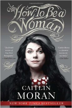
To begin my research I got a copy of how to be a woman and read it cover to cover. It was a surprisingly fast read, simply because I couldn't put it down. I laughed, a lot, it was a very funny book. Also very honest, brutally so, no sugar coating anything- this is what it's like to have a vagina, yep... there it is. This blunt honesty was refreshing and sometimes made me very emotional. There was a particular chapter where Moran discusses being in an emotionally empty relationship with an asshole of a boy, the desperation to have love, to form it where it doesn't exist, to baby asshole men with a belief that they just need fixing very much connected with me. I have had similar experiences and it was bizarre to have someone word it so perfectly when I have found myself unable to do so.

Sections of the book also make me light up with glee, vagina names, wild muff afros, the power of bras and pants. The aching annoyance of clothing, fashion, not having anything to wear and how an outfit changes the person you need to be for various occasions. The ridiculous nature of stupidly expensive handbags and heels. With many things I felt like I shared so similar opinions but remained unable to express them in really funny and sensical words, and she did it for me, and made me giggle at the same time. Reading this book also makes me now curse the patriarchy every time I stub my toe or drop my keys, because well, it's a fun thing to do.

The short and simple aim of this book was to discuss still existing issues of sexism but do it in a funny way. To be able to handle a topic that affects 50% of the population but laugh about it at the same time. And from reading the book and analysing it I was able to produce some visual ideas as well as gauge the tone of voice required for the cover. The cover needs to not take itself too seriously, so it will be enjoyable to have some fun with the design.


Other Titles and Covers

I went into a bookstore to have a look at the competition and gauge what kind of designs work for feminist/gender based publications. I took pictures of lots of different designs and found that the books tended to fit into three categories.


The stripped back simplistic ones

These covers tend to be rather, as the title suggest, simple and stripped back. Minimal design appears to be making maximum impact. A lot of these titles are the more serious works of feminist writing, The Second Sex and The Vindication of the Rights of Women are both older works that address the initial basis of sexism, the oppression, the lack of rights, the treatment of women as second class citizens. All of these covers with their minimalist looks seem to strip away everything and shout 'LOOK! There's the issue! There's the problem! Look at it!!'. Most of these designs are typography based, when a strong point is being discussed then it seems cutting to the chase and stating it through the cover is a key tool. Although powerful in design these works lack a softness, or a personality in their covers. When addressing difficult issues it seems inappropriate to try and be all personal and friendly and so they don't need to be warm, they need to be strong and stand out, minimal simple design appears to do that.

On a side note The Vindication of the Rights of Women looks like a Saul Bass design... which just rocks.


The female body ones

It's an inevitability. When you talk about women and women's issues there is bound to be a cover with a vagina on the front. I knew this and it was in fact one of my first ideas, something I will sketch down but probably not produce. There are certain covers that go for the obvious, a photograph or literal representation, and then there are versions that do it more subtly. I personally love the cover to The Vagina. It's so simple, so clever but yet so obviously a vagina. The problem is with these covers is that they've been done, and done and done again. It's almost the go to symbol and visual when you consider these works and these displayed are just a few of the many like them. What they aim to connote is either a sense of empowerment or a sense of sexuality. It's something that's supposed to shock you and make you look twice, a controversial image for the controversial topics within female sexuality. These books are powerful but also obvious, it's difficult to push an idea that's been done countless times. Of course it can be done, it would just take a lot of thinking outside the box.


The little bit different ones

There were a few designs that really stood out because there wasn't much else like them. These designs retain the powerful element of minimalist book design whilst injecting a real sense of personality and attitude in the covers. These books feel like they were written by angry women after three glasses of wine and I like that. Except The Vagenda oddly, other than Moran's book, it was the only cover to just have the authors stood there, it seems like a humorous book in a similar vein to How to be a Woman but that being said I've always felt like 'picture of the author' covers are a bit of a dull copout. All the other images in this category I love, The Female Eunuch and Girls will be Girls, just scream angry, angry protesting woman who is going to 'sort this shit out', they have a real sense of attitude, but with a pinch of fun. I feel for my cover design I need to find something similar but balanced differently, a sense of fun with a pinch of attitude- however,  that is easier said than done. Either way out of nearly all the images I took these were the ones that stood out first and that really impacted on me. It certainly means to me that for my design to be successful I will have to get creative and push away from the obvious, which is wonderful because I love a creative challenge.