Wednesday 21 October 2015

OUGD603: Charity Promotion- Research

Coming up with the idea for a charity exhibition was a pretty instantaneous brain wave however, it's proving a lot more difficult to come up with a brand and presence for the submission, promotion and look of the whole thing. So I've decided to look into pre existing charity promotion campaigns for some inspiration.


Stand up to Cancer


Stand up to cancer, a partnership between channel 4 and cancer research and one of the most recent additions in a long line of TV based charity promotion events/extravaganzas. This campaign burst onto the scenes around four years ago and gains more and more momentum each year.

There are many reasons for it's success from mass celebrity involvement and endorsement to some of the best video and TV based advertisements going including the 2014 SU2C advert 'It's Payback Time'.


The campaign has also been a rousing success because of the proactive stance it has taken, where as most charities play on the sob stories to twang the heart strings SU2C (and also race for life in recent years) have taken a more positive angle on the subject of cancer. When talking about the 2014 advert heads of 4Creative, John Allison and Chris Bovill said: “We wanted to create something that would empower people to stand up and throw cash in cancer's face. We did this by literally giving cancer a face. An unpleasant, pathetic, terrified and destroyable face. Then what better way to show the epic destruction of cancer than by utilising all the tropes the modern disaster has to offer. In your face cancer.” 


In terms of communication and branding the strong empowering message is translated in all areas of the design. From bold uppercase letters standing strong, to inspiring powerful imagery depicting scientists and fundraisers as super heroes everything about the brand is meant to communicate action, strength and positivity.

This kind of tone is more likely to get people involved, instead of presenting problems they are communicating potential solutions making people feel like what they do and the money they donate can make a difference.


The Big Knit


The Big Knit, a partnership of Age UK and Innocent, is a yearly charity event that's been running since 2003. The event asks people to knit tiny hats to be placed on the top of tiny innocent smoothie bottles. These bottles are then sold and 25p from each bottle goes to Age UK to help elderly people keep warm over winter.


The whole event works because it is nothing short of adorable, it just is. Tiny collectable hats, each one unique and hand made all to go towards a good cause. It works for me, every year I buy up bottle after bottle of smoothie just to collect the tiny hats because I love them. As one of the big knit's main contributors said, “The Big Knit is an idea that makes you smile. How can you not smile at little hats on bottles?”


The tone of voice is friendly and positive with a touch of humour and it successfully plays on it's cuteness. It has been received well and continues to work and attract audiences due to it's collectable and positive nature. People want tiny hats and people like to think they are helping. Instead of giving 25p to a collection tub the donator gets something from their good deed, they get a tiny adorable little hat. The branding plays on this, as well as innocents existing brand, by using their chunky, lower case friendly font, coupled with simple illustrations of wool and hats, all made to produce a smile and look like they're not taking themselves to seriously. The innocent brand translates well into a creative promotions campaign, by coming across as simple they can easily gain trust and momentum. 


As far as promotion goes they use TV adverts (their current campaign has been the same campaign they've used for the past few years) and by using their own products. It's clever and it saves on producing more posters and promotional material.
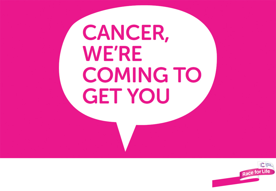


Race for Life

Race for life is a female based running event with many held all across the UK. They certainly make the female aspect obvious with everyone drenched in pink but take a very powerful and positive stance, sometimes bordering on the comedic, with famous offensive tag lines including 'In your face cancer, you berk'.


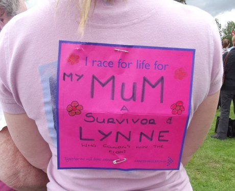
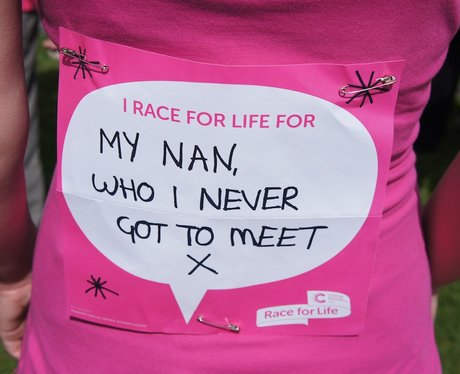
Other than the stand out pink one of the most notable aspects of RFL is the personalised messages. Each runner can customise, create and write a 'banner' to be worn on their backs proclaiming who they run for. This personal angle coupled with the empowering feeling makes an audience feel that every step ran have a physical affect on cancer. It is essentially a more physical, more female voice that SU2C employs, a very motivating campaign and event that makes people really feel like they are making a difference.


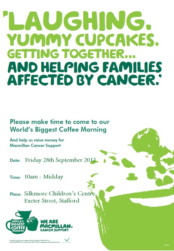
Mc Millan Coffee Morning


Monday 19 October 2015

OUGD603: Christmas Joy! Development


After sketching out ideas I began to consider the style of illustration I wanted to use. I had previously used a single line 'messy' style of illustration for a poster design inspired by Picasso's single line drawings. I really liked producing this style, it was a lot more freeing than my usually constrained 'perfect' outlines and fit better with the way I sketched on paper. Oddly the final results looked more professional than clean, crisp line art so I decided to experiment and use it again.


Comparing it to my traditional line art the messy style looked far more comfortable and professional so I applied it to the other elements of my design.


Whilst digitising the sketches I worked on top of a brown paper texture to make sure whatever I produced would look good on the final stock choice. After producing the individual elements I considered how they would be laid out on the paper. I decided that a repeat pattern design would look the best, the detail of the design comes from the illustration style and so keeping the pattern and final look as simple as possible will produce the most aesthetically pleasing final product. 


It was here when I decided to produce two different papers using the mistletoe as my soul evergreen plant. As a set the two different designs manage to look good on their own but also work together and if they are to be sold on a christmas stall I would like to sell cards, paper, envelopes and tags all in one set with two matching yet contrasting designs that would work together under a tree. 

This would also mean I can add a packaging element to the project, extending it further into real world contexts beyond wrapped presents and cards.

So following on from the set idea I began to apply the designs to christmas cards. I played around with lots of different looks to find out which ones worked best, producing both image and type and image based designs. The type face of choice was century gothic. I chose this very clean, organised and simple font to juxtapose the messy, free and detailed look of the illustrations and create a balance for the whole image.


After gaining some feedback the consensus was that the third idea worked best. The design found the right balance between text, image and space having just enough detail to be interesting and eye catching without going over the top and becoming too complicated.


OUGD603: Christmas Joy! Research and Ideas

After deciding on a screen printed finish and my types of stock I began to do some research in Christmas symbolism for ideas. I wanted to produce a design that was closely tied to Christmas but that wasn't linked to christianity or any specific religion.


The main categories I looked into were colours, animals, objects and weather related to Christmas, I started with the colours.

Green: Holly, Ivy and Mistletoe- evergreen branches

Red: holly berries, Christ's blood, bishop robes, robins

Gold: Sunshine, light

White: Purity, angels, peace, snow, candles

Blue: Mary, royal (expensive dye in middle ages)


From this category list I was most interested in exploring the origins of evergreens, candles and robins and their association with Christmas. Green, white and red are the quintessential christmas colours and so finding none christian symbols relating to these would fulfil the none religious requirements I wanted for my designs.


To find out about evergreens I went to the site why christmas.


"Holly, Ivy and other greenery such as Mistletoe were originally used in pre-Christian times to help celebrate the Winter Solstice Festival and ward off evil spirits and to celebrate new growth."

"Mistletoe is a plant that grows on willow and apple trees (and in garden centres!). The tradition of hanging it in the house goes back to the times of the ancient Druids. It is supposed to possess mystical powers which bring good luck to the household and wards off evil spirits. It was also used as a sign of love and friendship in Norse mythology and that's where the custom of kissing under Mistletoe comes from."


I also used why christmas to discover the origin of candles


"There are many different reasons why candles are associated with Christmas, although no one knows when they first became connected! They were used during ancient winter solstice celebrations a way of remembering that spring would soon come.

One of the earliest records of candles being used at Christmas is from the middle ages, where a large candle was used to represent the star of Bethlehem. Jesus is sometimes called 'the Light of the World' by Christians. This might have started the custom of the Advent Crown and Advent Candles.


Candles are also used during Hanukkah, the Jewish Festival of light which is also celebrated during winter. During the eight nights of Hanukkah, a candle is lit in a special menorah (candelabra) called a 'hanukkiyah'.

Candles are also used in the modern winter festival Kwanzaa, where a special candle holder called a kinara, that holds seven candles is used.

Perhaps the most famous use of candles at Christmas are Carols by Candlelight Services. These are services when the church is only lit by candles. Candles were also originally used to decorate Christmas Trees, until safer electric lights were invented!

In some parts of Ireland, it was traditional to have a Yule candle instead of a Yule Log. In Southern India, Christians often put small oil burning clay lamps on the flat roofs of their homes to celebrate Christmas. Christians in China use paper lanterns to decorate their Christmas trees. Candles are also used as part of the St. Lucia's or St. Lucy's day celebrations in Sweden."


For Robins I used the site uttertrivia.

"In Victorian times the postmen wore a red tunic as part of their uniform. They were nicknamed Robin Redbreasts after the birds. Each postman was a servant of the Crown whose regal colour also contained red. Postal workers often worked over the Christmas Holiday and even delivered presents and cards on Christmas Day. This association earned the Robin with his red breast a place on an early Christmas card and started a popular Christmas image."


Although I liked the idea of candles being multi faith and multi cultural I was hoping to avoid any strong relation to religion and make Christmas designs in my own interests and for the rising number of atheists (like myself) who may not want religious based designs. So from this I decided to develop and produce ideas for robins and evergreens, specifically mistletoe. 

OUGD603: Charity Promotion

I've heard back from a few different emails and sources, first concerning the charity I will be working in partnership with. Both Whitehall dog rescue and dogs trust have got back in touch, and I am unsure which ones to commit to, or I could even work with both. Dogs trust are a well established charity and have a good brand presence as well as connections to advertise and promote my event through. Whitehall on the other hand are smaller, they don't have as much of a reach in terms of promotion but I know that every penny given will be used wisely and that they have less donators. This is something I'm going to have to consider, I would like to work with both but I need to discuss and find out whether this would be a good idea. I did intend to work with a smaller charity first so I am more drawn to whitehall, but we'll see.


I heard back from youtube as well about suitable inks, the advice is good and gives me a certainty that water based inks are the way to go. I just need to understand the curing process fully, I think I'll talk to someone in printed textiles about this closer to the time. 


Thursday 8 October 2015

OUGD603: Charity Promotion- Research

I had a quick feedback and discussion session today. I got to ask some questions and figure out what the next steps to take in this daunting project were. From this session I have fine tuned some areas of my idea. Instead of dog beds, dog blankets seem to be a better and easier option, it was suggested that I probably wont want to/have time to produce a series of dog beds whereas if I were just to print straight onto the blankets they could then be automatically repurposed for the dogs to be sold or to be donated. Also it was suggested that I use the kudos of a bigger charity to help with exposure and promotion and that it may be worth contacting a store like Pets at Home to see if they would be interested in sponsoring the event by donating blankets to print on. Also the start off point recommended to me was to find a space, somewhere relevant to the exhibition so either a dog friendly place or somewhere where surrounding people are more likely to have dogs.

So my start off list goes a little like this:
Find spaces
Email dogs trust and pets at home
Find suitable fabric for printing that also works as a blankets
Find out how exactly to print onto that kind of fabric

I emailed Dogs Trust first:


Followed by a quick search on the Pets at Home website for blankets:


Fabric
Though there didn't seem to be any blankets that appeared suitable for printing so I did some searches for blankets that could work for printing, as well as how to print them.


I found a channel that talked about printing onto fleece fabrics, they only mentioned printing for hoodies and sweatshirts however, the type of fabric appears easy to print on as well as being soft enough and suitable for a blanket. Seeing as they're the experts in screen printing fabrics I sent them a quick question regarding inks and their suitability for dogs, just some things I think will be important to know down the line.


I've found some places on eBay that sell the appropriate fabric however I will also try the university shop in the fashion department, as hopefully it will be cheaper and I can ask directly whether the fabric is suitable for printing and also get a feel for it's softness, strength and suitability as a blanket. I also want to have a look at the leeds market, I know they sell a variety of fabric there too and I will be able to get a good deal as well as getting to touch/see/feel the fabric first hand to judge it's suitability.


Spaces
For the exhibition space I wanted somewhere, as suggested in my feedback, that has dog lovers and owners near by. Despite this I also really wanted somewhere near the city centre of Leeds to gain the most traffic and potential viewers/donators and that would also be accessible for any students who contribute a design for the show. It was then I remembered about an area I used to live in through my first year of college; Clarence dock.


From memory the dock often has empty spaces despite being in a beautiful environment and also had a lot of dog walkers passing through the boulevard every single day. I also recall that there were often exhibitions held in some of the spaces, the Thought Bubble comic festival was held there and Leeds Beckett (then Leeds Metropolitan) have also held exhibitions there and worked within the area so it's clear they are up for creative collaborations and events. Also with the armouries near by streams of human traffic pass through the area daily maximising the amount of people that will pass by, and hopefully pass through the gallery. So I sent a quick email to the info@clarencedock and I hope to hear back from it soon.


OUGD603: Christmas Joy- Research

Before I jump into designs and ideas I want to research into the practicalities of production and find what form of stock and printing would be suitable affordable as well as easy to replicate and hopefully as environmentally sound as possible.

Stock
I want to produce wrap, cards, tags and boxes so I need a form of stock that will look good as all three, match and also be environmentally sound. So I chose to look into brown recycled card and paper, they are usually cheap, have a socially good benefit and also come in many different forms.

I've started by looking on online stores for paper.
It appears that recycled brown roll will work the best for my purpose although in a lot of places it seems to come in 450mm width rolls at quite a reasonable price too. A2 size finishes at 420mm width but I don't think this should be an issue, it's good to have some overspill and I should be able to trim it down. This type of paper is also environmentally sound and also looks really nice when printed on (it's the stock choice I've used for my two previous years).


For the ease of printing (digital or screen) it would make sense to take the roll and cut it into A2 sheets, these can then be rolled up again or folded if being packaged.


The card to be used for the cards I found a very similar looking card to the paper, 50 sheets for £13 which isn't a bad haul. With the cards being a4 sheets it will make it easier to print either digitally or screen based, and then fold them into appropriate sizes after.


I also found (courtesy of Amazon) these tags. I think these are wonderful because they are recycled but come in a variety of colours so it may be worth not printing onto the tag and simply finding the colour that matches to create a set, I'll most likely do the same thing with the envelopes. 


Ink
I have heard of soy based inks before but on close inspection and a quick google search it appears these are only suitable for textile and fabric printing so it seems that if I were to screen print I would have to use the standard inks.