Monday 23 May 2016

OUGD603: Module Evaluation

Extended practice has been daunting and rewarding. It's certainly been a challenge to organise, manage and produce solutions for 10 different briefs but I've enjoyed the opportunity to tailor my practice to what I like doing. There were some briefs such a GF Smith, Penguin and Secret 7 which felt more intuitive and I could work through freely expressing a more creative or illustrative or loose response. And I jumped on the opporunity to just create things that I liked the final result to, in some ways, mostly from a creative point of view these were my favourite briefs. Although I equally enjoyed the structured client based briefs such as Smart Grid Consultancy (SGC), You be You or Armadilla. Although at the beginning of the year I was looking forwards to these briefs the least I found them pleasant to work on and I feel my responses are professional and suitable. In fact I enjoyed this kind of brief so much I'm determined to continue extending it way beyond the deadline- hopefully in a more professional context. 

My time management was a very mixed bag and varied from brief to brief. In projects such as the charity brief I pushed my deadline so far back that I wasn't able to complete anywhere near as much practical work as I had hoped to, with certain elements of my submission failing to arrive in time. The charity brief frustrated me the most because I started out with such determination and I achieved a lot in the first term; research, statements of intent, development work, and unfortunately they didn't amount to very much- not for submission at least. I do have a strong brief to continue outside of university and develop fully with more relaxed time constraints, still I wish I could've done more. In opposition to this though, briefs such as my presidential campaign, armadilla and SGC I was able to get an awful lot done in such a short space of time. With my campaign I was able to produce research, generate and fully develop ideas, and print final designs in less than a week- something I had doubts I would be able to do. In fact with SGC and Armadilla I was using up my last few days- plus printing my response for the charity brief.

If I were to do this entire year again I would organise myself a lot better. Even if it meant creating a calendar for the whole year's work, just so I could visualise exactly how much time I had to spend on each project. I would also pick my briefs a lot more carefully- with some of my choices such as the Christmas paper I did them simply because I wanted to. Though the whole brief took an incredible amount of time- time that could've been spent on more useful projects and more design specific projects. There are a lot of things I wanted to do at the start of this year and I wish I had considered the reality of choosing the projects I did so I wish I had considered what briefs I wanted to do and how similar some of them were. 

Though overall I am pleased with my results and the sheer amount of work I've managed to produce. I find it impressive that I was able to create all that I have done and it's certainly made for a lot of good portfolio items. Not only portfolio fillers this year had supplied briefs I can continue after the deadlines and hopefully use to forge my career. 


Sunday 22 May 2016

OUGD603: Armadilla- Evaluation

It was good to have another opportunity to work on a branding brief, I worked on this brief- as much as I could, in the same manner as I worked on my Smart Grid Consultancy brief. Working conceptually, not doing things for the sake of looking good and justifying my actions. This was a little harder when in a group but I still applied it where I could. I love what we've produced, I think the whole brand looks spot on and certainly beats the existing one, so I look forwards to sending the company the idea and seeing if they would like us to develop it further and help implement it.

As much as I like what has been produced for this brief there were some issues. We left the brief very late and so when we started it was already a rush, I felt with three of us it would be easy to accomplish, I was wrong. There was a definitive lack of balance when it came to work load and I felt some did far more than others, in fact there were several instances of specific members bringing up changes in designs or issues with layouts and logos far beyond the time when it would be appropriate and yet failing to accomplish their own tasks. If it hadn't been for two of us pushing through and taking up the slack nothing would've been produced. It's just another lesson for myself in the long run- don't work with friends. They make great friends and poor colleagues. 

On a positive note what we did manage to achieve technically understaffed and in such a short space of time was admirable. The catalogue took the greatest amount of work from conception to binding and I found myself pitching in to lighten the work load, but I think it's the strongest part of this brief and it takes the stationary I produced to the next level when you see them all together. I think my stationary worked well, and I had fun experimenting with a conceptual grid, something I hadn't tried before, it made something as simple as text placement mean something and I think this made the whole design stronger. 

If I were to repeat this brief again I would give the whole group more time and perhaps make a few adjustments to the members. I believe if we had, had more time and fully committed members this could've been a really fun brief, hopefully if the company asks us to develop it, it will be.

OUGD603: Charity Promotion- Evaluation

Out of all of my briefs this was the most poorly timed. At the beginning of the year when I first started working on this project I put a lot of effort into it, lots and lots of research, planning, sketching, development. However, time got in the way, dissertation, Christmas, DBA, other projects. Because I didn't structure a definitive deadline I kept pushing and pushing my time scale until I was three weeks away from our final deadline with a horrible feeling that I couldn't produce anywhere near the amount of stuff I had wanted to. So for this hand in, I am no where near where I wanted to be. That being said, I now have a brief I want to extend and work on after our deadline and into the summer and possibly further. It is a shame I don't get to submit it for assessment but at least from my research and initial developments I now have a pretty strong brief to continue with.

I am also frustrated that my stamp didn't arrive in time- I had intended to stamp each card with the Ruff Edges logo and perhaps number the prints to add to their exclusivity, but unfortunately there were some issues with producing my design and this set the whole process back further.

As a solution to a brief- creating a way to promote charities, I really think I developed a strong idea. From my research I know that pushing a positive message is more beneficial than a negative one, also there is a market for hand printed cards, this coupled with making the buyer feel as though they are helping at the same time makes for a more desirable product. So even though I wasn't able to produce the physical products as a solution to my brief I still feel I solved the problem and have something good to work with in the future.

OUGD603: Presidential Campaign- Evaluation

Let's start by saying this: I didn't win and quite frankly I was pretty devastated. I think as a whole I did a good job and I really did put a lot of work and effort into this brief so, despite now thinking that I maybe wouldn't have been so great at the job it's still a massive blow to my pride and confidence that I came last out of two people.

That over, how well did I think this brief went? On reflection I can see some areas where I went wrong and needed improving and I can see what I got right. Although I can see how important it was to get my message across to students and discuss my manifesto I can also see how having a very over complicated set of 6 posters (especially with the restrictions in budget) can make for a broken and scattered message. If this had been a campaign on a much larger scale then multiple posters in a similar style would've been appropriate but with our campus, and students potentially only seeing one or two posters on their routes around the college, too much variety makes for a muddled message. Also on the design- I expressed how I wanted my manifesto to be at the forefront and I still think this is a good idea, though not one that is really appropriate for my target market. It was slightly naive of me to expect students to stop and look at the slogan posters long enough, or get close enough to see the smaller 'vote Roz for president' at the bottom of the design. As good or bad as the designs may be, if audiences only catch a glance and the main message in their face isn't 'vote for Roz' they probably aren't going to remember to vote for Roz. I also think I overestimated how much people pay attention to manifestos and policies, of course in an ideal world students would've stopped and read everything, but it's not their job to stop and read, it's my job to make them want to stop and read and I don't think I quite got it.

Like I said before if I had a larger budget, or perhaps if this were a larger scale campaign then maybe my tactics would've worked. If I was already known as a figure then perhaps it would've been smart to push my values and my manifesto, however in a small institution where only people in my class know me it seems I should've been promoting myself, not just my opinions.

That being said I managed to acomplish a great deal in a short space of time, from research to production the whole process took two weeks, a time scale that, when I set it, I didn't believe I could get everything finished and yet I did, even with the usual problems setting me back. I managed to spend an entire week campaigning, talking to students, and arguing my case, even if I didn't win I am still proud of what I managed to achieve and if nothing else it was all a valuable experience.


OUGD603: Smart Grid Consultancy- Evaluation

This isn't the type of brief that I thought I would enjoy. Corporate branding always seemed so dull to me and yet here I am finishing a brief which is very corporate, in a sector I would've never considered interesting and yet I found this brief really fascinating. In terms of branding I think it's one of the first times I have tried to present all the company values through the logo and brand application and this came about from a good solid understanding of the company. When I was approached about rebranding the company I felt incredibly daunted but once I understood what SGC does and where they fit in the energy market translating their company values into design became easier. 

Throughout this brief I also made conceptual decisions- there was very little I did without having a reason behind it. For most of my time at LCA I have been an aesthetic decision maker, doing something because it looks good. This isn't necessarily a bad thing, and sometimes can be the right response to a design challenge, however, in this case, thinking conceptually really helped my sell my ideas back to the client. He had very little issue with what I was producing once I explained what it all meant and why I had done it, in fact he seemed more interested in my ideas because they were all justified. I think this is a lesson I will use when dealing with clients from now on, especially when someone has built their own company from the ground up, it puts them more at ease making them believe you've really thought about and considered what you are trying to say rather than slapping a lot of design features together just because they look good. 

I would've liked to have done more- perhaps translate the brand onto more things, pens, vehicles, email footers etc. Though due to time constraints I stuck to the basic stationary, which is a shame I really feel this brand can be more with a bit more continue the brief in a more professional context.

I think the main thing I can take away from this brief is that I shouldn't turn down work I perceive as boring because it might be a great opportunity to grow and that I should work conceptually as much as possible, selling the client a story about their brand rather than just a bunch of pretty designs. 

OUGD603: Smart Grid Consultancy- Final Designs


OUGD603: GF Smith- Evaluation

This brief was an enjoyable one. I love to use print as much as possible so to have an entire brief structured around it, for a print festival, it was pleasant. Although I have designed to size restraints before I have never produced something with colour restraints so it was an interesting way to generate ideas when the colour could not change. Although there wasn't a lot of research involved in history or understanding it took longer than I had assumed to analyse the layouts of entomology cabinets and I certainly received a fair bit of education in entomology specifically when it came to yellow and black insects (most of whose scientific names I can still recite).

In terms of creative challenges, I can honestly say there weren't many. I believe this is the first brief I've encountered where my first idea sees it to production. Though there were some issues here and there with print sizes and preparing the screens, it's just natural to assume this comes with physically printing an idea- it never goes exactly how you want it to, which is why it's a medium I enjoy so much.

The biggest thing I got from this brief was the reintroduction to my love of print and an insight into what I want to do when I leave university. From the Christmas wrapping paper brief I was ready to leave screen printing alone for a long time, however working on these prints made me realise how much I missed it. I couldn't leave this brief alone- even extending it to print onto tote bags in order to produce more sellable content. Printing and selling designs is something I definitely want to pursue after I graduate and perhaps something I have thought about setting up a business in, but only now, and really only after this brief do I feel like I could confidently achieve it. 

If I were to repeat this brief again I don't think I would've done much different. I think I would change a few things, take more time when printing, make sure the black ink isn't blotchy, order more stock to get more prints and wipe my hands clean to avoid ruining designs with blotchy fingers but with all that said and done, this went as well as one could hope a brief goes.

OUGD603: GF Smith- Final Designs


OUGD603: Armadilla- Finals


OUGD603: Charity Promotion- Finals


OUGD603: Charity Promotion- Printing


The printing day was straight forwards. Certainly for my type design it was incredibly easy- however my illustrative pug print was difficult. Out of ten cards, two came out correctly. There were slight issues with alignment and with the design being a four colour print certain layers were way off, even the two successful design were slightly off. However, I think imperfections- to an extent- make screen printing so desirable, to see the hand crafted work in them makes them more valuable than perfect digitally printed designed.


OUGD603: Charity Promotion- Print Development

Once I had the logo ready I began creating the prints. The first thing to decide would be the style of my image, I looked into different illustrators whose work I admire- illustrators whose work has been translated into a sellable commodity just as I am to do with the cards.


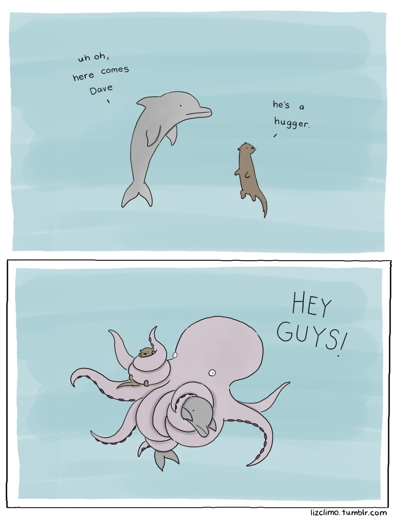
Liz Climo
 

Liz's work has been successfully sold in books, calendars, prints and cards. Her cute and funny style is incredibly popular with a wide audience- mostly young and young adult females. There is a sense of humour in her work that makes her designs more appealing than just depicting animals in an adorable way. I love her simplistic style- it's easy to translate into screen printed cards with her use of bold block colours.


Angela Che


Angela Che is a more detail orientated illustrator though she has had success in selling prints in the form of cards (depicted left) which appear to be screen printed and have a vast appeal. Even though her usual style of illustration can be argued to targeting a female audience her stripped back cards have a more open audience. Though, what is gained in simplicity and audience appeal is lost in personality within the work. The designs feel flat, not just physically but in character. There is very little to latch on in terms of something to connect with in these design which I feel Climo achieves in a far more successful way.


Rebecca Sugar


Sugar's work usually focuses on creating character prints- characters from stories she's had a hand in designing including Steven Universe and Adventure Time. That aside her style is a vastly appealing one, very bright and positive. Bizarrely she's has just as much appeal with men as she does with women, perhaps this is down to the popularity of her shows and the uniqueness of the characters she depicts, however I believe that it's in part down to her style. Although a lot of her imagery can be described as adorable, it can also be described as cool- thus widening her appeal.


From researching into successful illustrative styles I now had an idea of the style I wanted to implement- something with a touch of humour and a simplistic, positive style. After I had discovered this I began to consider what will be the subject of my prints. With Ruff Edges being the title of the collection I knew the designs had to be dog based and I wanted to create two contrasting prints. I decided that to improve maximum appeal I would produce one illustrative print and one illustrative typographic print. 


The illustrative print draws greatly from Climo's work, creating a simply drawn character and adding a touch of humour to the design with the inclusion of 'fabulous'. 


The typographic design I drew to mirror letterpress based typography pieces, however I drew the letters in a similar style to my three illustrators, making certain it was obvious this type was produced by hand. This meant including imperfections and wonky lines to add that essential personality to a very two dimensional image that I felt was lacking in Che's card prints.


Wednesday 18 May 2016

OUGD603: Armadilla- The Catalogue


When we discussed producing a product catalogue we wanted a high quality magazine bind and aimed to get our final designs professionally printed and so I contacted a local printers who also provide the style of binding that we aimed to achieve.


Unfortunately, they never responded and so we had to resort to printing and binding the book ourselves. We didn't want a simple stitch bind, and aimed to get the professional spine we sought after. In my opinion a stitch bind or staple bind would look ok, but to properly represent the high quality product and to aim towards a higher end range of clients then a more complicated binding would be needed.


The way we would achieve the spine is to split the catalogue into two booklets, bind these together and then print a cover separately and wrap it around the bound pages.


This was a bit more ambitious than simply printing and stitching and so we spent a good amount of time calculating what pages needed to go where, how to separate the books and how to set up the files for printing.


We also needed to figure out the new width of the cover- including spine, to wrap around the final catalogue. So we spent time mocking up a 'test' booklet measuring the width of the spine and adding extra space to the cover so it properly covered the pages.


OUGD603: Armadilla- Stationary


The layout needed to be simple. For each element I would be free and light with the sketches and then apply a more strict set of guidelines for the digitisation. I wanted to make certain that geometric shapes were apparent in each design element and not only use colour and type to link the brand together but geometric clusters of text too. That being said I was sure to stick to my guidelines but allowed for room to breath to keep the designs light and positive tone. The joy of an Armadilla pod is, yes it uses strong shapes but the manage to make them feel natural, as if the pods chose that shape. I wanted to reflect this within my layouts to give the stationary a similar look, whilst at the same time keeping the feel professional By balancing space and content, whilst being restrictive with freedom I think I achieved this.