Fish Wings and Shark Fins
There were a few questions to settle in my mind before I could start sketching and they were:
Who is my audience?
What am I trying to tell them?
Am I trying to inform them, scare them or shock them?
My audience, your average Chinese citizen, my tone, informing. But what did I want to tell them? It was simple enough to play on the 'bad' factor of finning, the pain the animal goes through, the horrible slow death, the effects on shark species, and I didn't want to do this; I wanted to focus on the soup and the facts and I wanted to do it in a way that didn't rely on blood and gore.
I was most fascinated by the issue of mistranslation- the word Shark Fin (Yu Chi) translating literally into the word 'Fish Wing'- the reason the Chinese public showed such little concern to sharks was they didn't even know they were eating sharks and remained unaware of the horror the creatures are put through. This linked nicely to my original article and a quote that I highlighted by Peter Knights, head of WildAid:
"Consumption is based off of ignorance rather than malice"
Even if I had no other ideas- I knew I wanted this quote for my final designs. Not only did it sum up my point of view on the whole situation but it also was a catchy, memorable, high-impact sentence, perfect for a text poster.
Sketches
Image only:
 I'd consider the purely image poster the most difficult through which to communicate a message. Being obvious and clear in opinion and message is surprisingly hard without text to explain yourself. Focusing on the mistranslation idea from my research I needed to create a clear visual ideas to represent fish wing and shark fin. Shark fin was easy- it's a culturally recognised shape thanks to Jaws, however symbolising fish wing proved more awkward. I created a 'character' or sorts that was as literal a translation as I could think of- a fish with wings.
Whilst sketching I came up with- what I thought was- a genius design idea. The easiest way to show my concept and relate it back to the fin soup from my original article was to physically show the soup. I had the idea of a 2-sided poster (originally I had wanted the poster in the shape of a bowl, however format limitations didn't allow for this). I felt that the 2-sided design not only referenced Chinese banners that hang outside of shops but it also communicated the idea of ignorance within the Chinese public as they were unaware of the soup's ingredients. It also plays on the concept of revealing secret knowledge and understanding both sides of a story.


Text only:
 Consumption is based off of ignorance, rather than malice- I knew this is what I wanted. Regrettably I didn't spend as much time as I would've liked on my text posters. I assumed that because I had the content down that the organisation and order wasn't going to be difficult to sort out- so I spent a lot of my sketch time for the text poster deciding on colours (I had wanted light blue for no other reason than it looked nice) and the possibility of pattern. I had wanted to cut the words out of, or write over photographs- however this idea pushed too much into the image and text category so I decided to be plainer with the design.
Text and Image:
 I had no initial ideas for this poster, I mainly took inspiration from the sketches I had produced for the previous posters. I knew the three had to work together as a set and so felt that by combining the key elements from the text and image sketches I would create a strong design. I knew I wanted to use some Chinese characters for the text and image poster as I felt it was a different way of including text.
Final Sketchs
I selected my strongest ideas and drew them out again clearer and more detailed than before. Heading into the digital and production stage, this is what I was hoping to produce.
 |
| Image- 2-sided soup bowl. |
 |
| Text- Consumption from ignorance not malice. |
 |
| Text and Image- 'divided' |
1st Designs and the Interim Crit
After sketching, scanning and outlining my basic ideas I started putting together my designs. Where I had originally wanted white, black and light blue for a colour scheme I instead opted for orange- based off of the colour of the shark fin soup. I also decided that my text and image posters could potentially work 2-sided as well and so produced them in a similar format to my pure image design (Annoyingly enough it only dawned on my to make my text poster 2-sided after the crit, it would've made them work better as a set.). Using illustrator gave my images a clean vector look which I've never achieved in digital drawing before- it was probably the excitement of discovering that clouded my design decisions. I honestly believed my designs were really clear and professional looking and I couldn't be more chuffed with them.
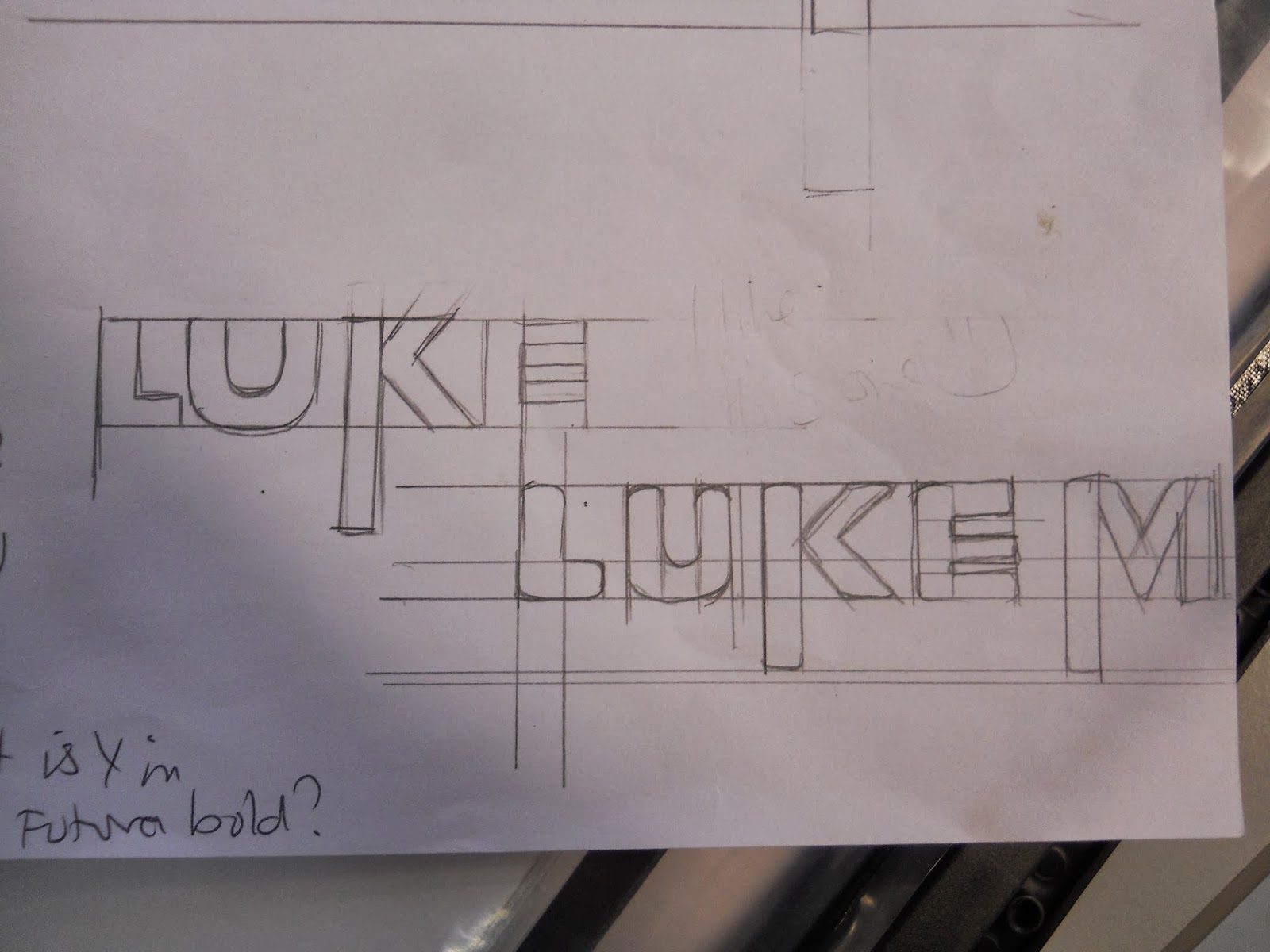
The text poster I produced was the design I spent the least amount of time on- I hardly considered my font choice, picking avenir because I thought it was pretty, I didn't consider it's appropriate use. I ended up sketching it and pulling it out of shape, it looked distorted- oddly though I didn't even notice this until our interim crit.
 |
| Image mock-up Side 2 |
 |
| Image mock-up Side 1 |
 |
| Text and Image mock-up Side 2 |
 |
| Text and Image mock-up Side 1 |
 |
| Text mock-up |
I went into the interim crit with a positive attitude, I believed I was well on my way with the designs, almost near completion, I felt they were strong and clear and all the informal feedback I'd received so far seemed to confirm these beliefs. However I left the interim crit feeling genuinely shitty. Majority of the anonymous feedback I'd received was negative, people said they couldn't see my opinion, that the concept was highly unclear, the posters had little impact, the drawing of the fish 'with a hole in his head' was childish and silly and over and over again people remarked on the poor choice of font and colour.
There's an issue with feedback- when it's anonymous people become overly and unnecessarily harsh, when it's face to face, people become pointlessly nice to the point where it's damaging. I was told again and again in my informal feedback sessions that my concept was clear, the design was good and the whole thing worked well yet I didn't get one comment even close to this on the interim critiques. I think what threw me the most wasn't the opinions themselves but the massive contradiction in opinions. It made it very difficult to decide whether the designs were worth saving or not. In the end I scrapped them completely and decided to start again
So with a few days to go and most of my sketch work now useless I had to come up with another idea. I looked back at my poster research and landed on the FINished with Fin poster designs. It seemed a little bit like cheating- stealing the hand over mouth concept, but at this point I was very stuck for original and clear ideas. I felt as well that I could change and manipulate the placement of text to reflect my earlier concepts (understanding the whole picture, two sides of a story etc). And here's the new idea I came up with.
Final Posters
My main image concept was taken from the FINished with Fin campaign- a girl with her hand over her mouth showing the refusal to eat the soup (I made her very classically Chinese looking to fit with my target audience). I placed the text in specific places to back up my main points, the word 'consumption' covers her mouth and the word 'malice' covers the fin.
Using what I had learnt during the interim crit I replaced avenir with a more powerful typeface making sure it fit nicely on the page so as not to stretch and distort it. I also changed my colour scheme- I had originally wanted to avoid red, white and black as they're so over used in high impact design. However they're over used because they work, red will always grab attention and signify danger, passion or threat, white and black compliment red well and don't detract it's power. It was a cliché but obvious choice.
I really wanted to represent the idea of layering with these three posters as it reflects the layers of the main story/article, China didn't see a decline in finning and consumption of shark fin soup from conservation projects alone. It was a combination of many different factors, awareness and education, campaigning and conservation and politics and current political events. The drop in shark fin soup was just as much down to China's war on extravagance as it was educating the public and I wanted to represent this in some way.
 |
| Image Only |
 |
| Text Only |
 |
| Image and Text |
 |
| The whole set |
How they should be viewed
Throughout this process I refer again and again to my target audience- the Chinese public, however my text is in English. Well not having such a wide choice of Chinese fonts was one issue and not being able to check spelling, grammar was another, the main problem was when I presented it to my class, they wouldn't be able to read it, not understanding the text would alienate them and make the images loose their impact automatically. So I've been working in English since the get go with the intention of changing the language when I put the posters into context. So here they are in Chinese instead of English. (I wish there was a Chinese equivalent of Abadi Condensed Bold.)
 |
| Example 1 |
 |
| Example 2 |
 |
| Example 3 |
Were they good?
I'm frustrated that I can't do this project again immediately, I feel that I've learnt enough about impact posters and studied enough different examples that I would now be able to produce something really good. I'm a little frustrated with my results, I always compare my work to others and it never seems to stand up to the average standard, however, ignoring everyone else, I'm quite proud of my achievements. I'm mostly impressed with my skills in Illustrator, the short amount of time I had to produce my work (especially my final designs) meant I had to get to grips with the programme quickly, and I did. I feel more comfortable creating images in Illustrator than I ever have before and it's satisfying to open up the programme and actually understand it.
Design wise I know I could've done better, I need a lot more work on my typography skills. It frustrates me that a practice that seems to simple and minimal can be so goddamned difficult to master, moving a word even an inch changes the mood entirely and I'm still not confident that I can even recognise good and bad typography- I know what I like but it's not always considered 'good' by the people who know best. (That being said my pure text poster is the one I consider strongest)
I liked my image but it's not high impact enough, in final crit it was mentioned that she looks all cute and like she's saying 'oops' and I completely get that, the body language and position is far too relaxed for such a serious issue- I blame this on a lack of drawing skills, however I should've adjusted my design based on how well I can and can't draw rather than overstep myself. The text and image design is far too busy, there's a lot to look at, the message gets lost in all it's detail and fine lines- it's a shame because in my head it looked so clear and strong but I guess it got lost in translation.
With all my problems and issues with typography I really didn't consider my text one to turn out ok, but honestly I like it. The blocks of black with white letters on them really makes that message stand out from the page, it also feels a lot less cluttered, the message becomes easier to absorb. Though I still feel it's over crowded, coming from quite an illustrative background I always add more and more to an image if I feel it isn't complete and that just doesn't translate into graphic design. Good graphic design is clear and minimal, you take things away if you feel it isn't complete and you should know when to stop- I still need to learn this, and soon. I feel like I'm 100 years behind my fellow students sometimes and I know I won't produce a piece of work I;m genuinely satisfied with until I master simplicity.


