Thursday 30 April 2015

OUGD505: Studio Brief 2- Development

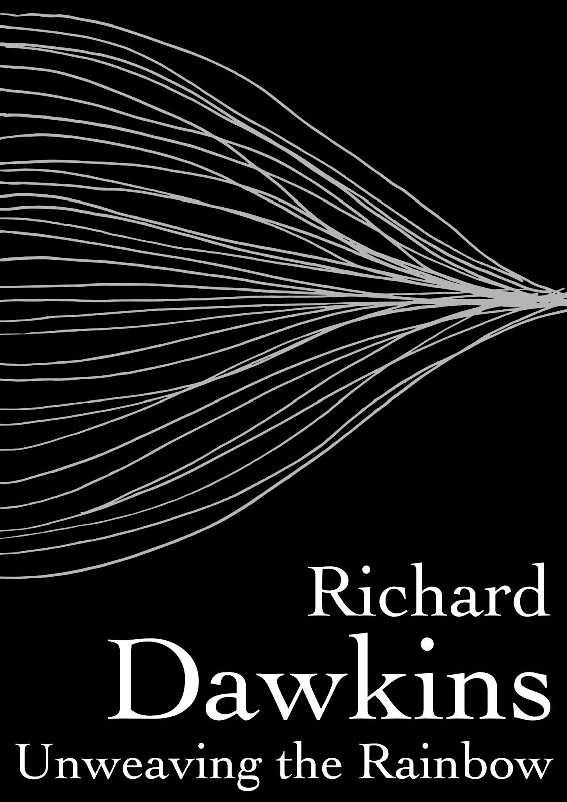
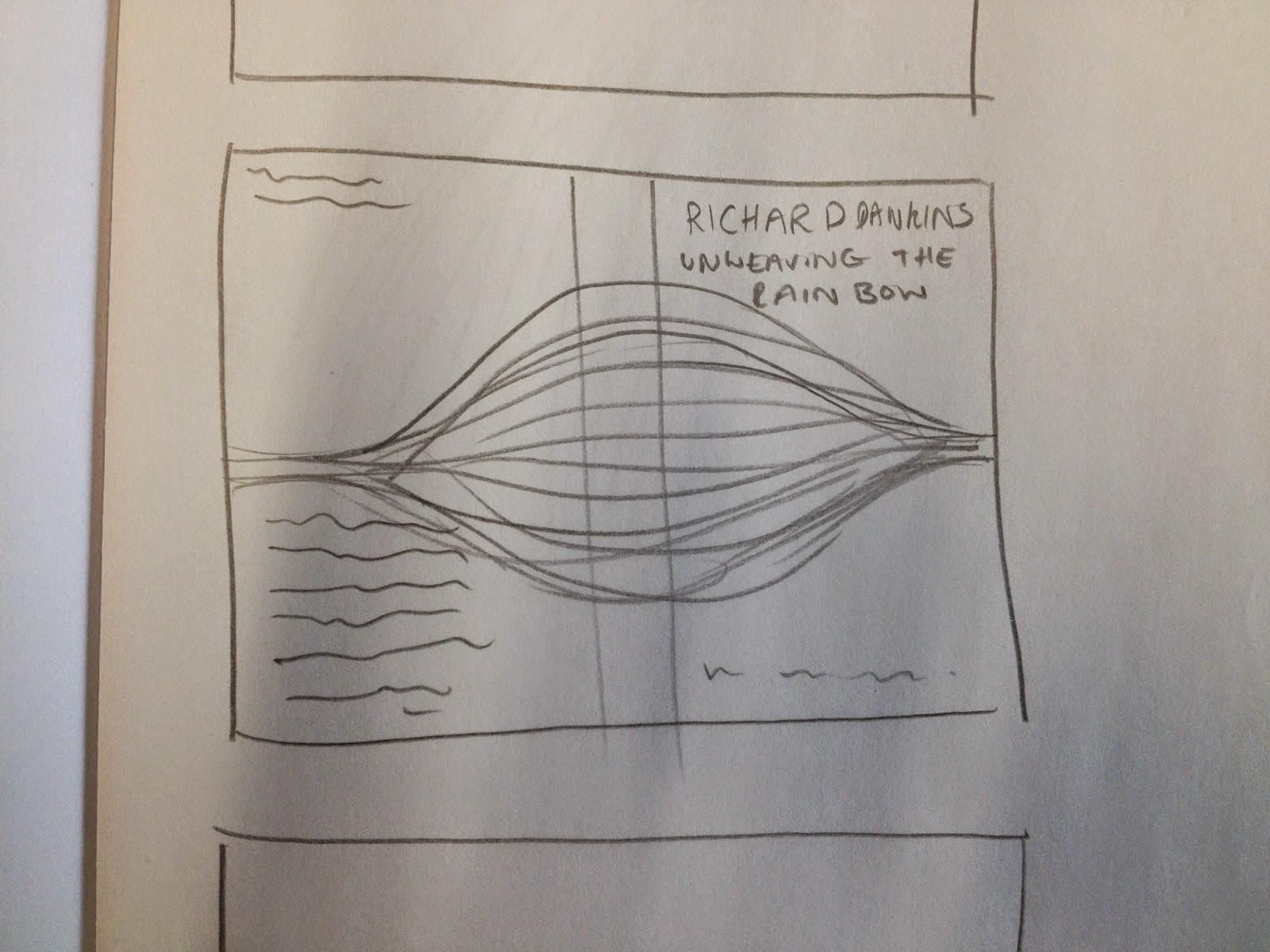
I order to add a human touch to the design I decided to hand draw the unweaving sound waves and then digitise them. The plan for the design would also required very clean text choices so I wanted the 'illustration' to balance that out.


For the font I chose bookman old style, I knew that a serif font would be the most appropriate choice. I needed something that was sophisticated and elegant but not too excluding in it's tone, it still needed to be friendly and accessible. 


Despite initially developing the design on white stock I decided to put the final arrangement on black stock with white in for the letter and silver foiling for the lines. I felt this represented the ideas of light waves, reflection and refraction and tied the book back to it's main theme- the unweaving of the rainbow and the understanding of the colours light is separated into.


The final developed designs look minimal but with enough detail to not be boring. For the wrap around cover I wanted the 'illustration' to flow seamlessly from front to back carrying the readers attention from one side to the other and drawing their eyes to the summary displayed on the books back cover.


OUGD505: Study Task 4

How can graphic design be used to ensure that more than 41% of 18-22 year olds actually participate in the election process?

For this task we'll be working in randomly selected groups of three. 
My group: Me, Vanessa and James Holt.
Deadline: May 7th

The final outcome will be a slideshow compiling all our work, ideas and development. The font slideshow will be presented to the other groups on the 7th.

5 minutes presentation. Presenting as if to a government organisation, explain certain decisions and a rationale for the solution. 

OUGD505: Study Task 3

For this week long study task we were asked to produce a flyer and a concertina booklet for the exhibition 'Disobedient Projects North' at the People's History Museum in Manchester.

Both needed to be A5 with the flyer containing the basic information and the booklet containing more detailed text about the exhibit. The flyer was confined to black and white where as the booklet could be in colour if we chose.

We were given the content and images to be used for the design and set off to produce the final products.

I decided to start with the flyer as it had to most design constraints and then produce the booklet based on the final leaflet design.


The final look for the flyer I wanted to be quite simple and also a little dated looking. I felt that over crowding the design would take away from the information it was trying to provide.


From this design I went on to produce my booklet, although now I see that I've laid it out the wrong was round. I used the same text style from my flyer to keep a consistent look but added some colour to the mix. I didn't want to bombard the piece with colour, I wanted to make sure the design was secondary to the information so just stuck to orange (orange to me always felt like a rebellious colour).

Booklet:

Instead of spreading the information across both sides I wanted to have one side dedicated to a quote that I felt really summed up the feel of disobedient objects. This would also make the booklet into a collectable poster to take a piece of the exhibition home with you.


I wanted to capture the sense of rebellion and anarchy throughout the designs t so I decided to use bold stand out and unconfined type. To continue this free and rebellious feel I didn't use a grid for either piece and instead went by eye to get the content to sit properly on the page.

OUGD505: Studio Brief 2- Initial Ideas


From reading the book and understanding its content I came up with a few different ideas. The first was based on a section of the book that discusses sound waves. Dawkins discusses the way that the brain decodes sound and how it can reconstruct it again in the form of imagination and imagery. 
'At one level it is all done by a pattern of air pressure waves, a pattern whose richness is first unwoven into sine waves in the ear and then rewoven together in the brain to reconstruct images and emotions.'


My second idea also came from the same chapter about the unweaving of sound waves, Dawkins shares a poem by Keats on the Nightingale's song. To represent something beautiful in a scientific way I decided to record or find footage of a Nightingales song and play it through recording equipment to get a visual representation of the song, hopefully through pitch rather than volume.


The third idea was based on two parts of the book. The first was the decoding of DNA mixed with the second, the prelude of the book. 'The set of possible people allowed by our DNA so massively exceeds the set of actual people. In the teeth of these stupefying odds it is you and I, in our ordinariness, that are here.' A strand of DNA would be made up from lots of little dots to represent the number of potential people who aren't here.


After some crits and feedback I decided to go with my first idea, it was felt that this was the strongest and most conceptual. It would also fit best with the constraints to colour that was required of the final design- my initial want was to make the cover very colourful to represent rainbow, but the two colour plus stock restrictions made me have to think outside of the box.


OUGD505: Study Task 5- Book Analysis

For studio brief 2 we have to produce a book cover for an academic or theoretical text. My book of choice is Unweaving the Rainbow by Richard Dawkins.


Book analysis
Book Blurb- 'Keats accused Newton of destroying the poetry of the rainbow by explaining the origin of its colours, thus dispelling its mystery. In this illuminating and provocative book, Richard Dawkins argues that Keats could not have been more mistaken and shows how an understanding of science in fact inspires the human imagination and enhances our wonder of the world'

There are many romantics, poets included, who believe that science destroys the beauty of an object. Dawkins heavily disagrees and believes that knowledge does not taken any wonder or delight away from anything, and in fact only adds to the objects initial beauty.

In the book he describes how the unweaving of the rainbow and the understanding of the light spectrum has lead to so many discoveries. From the understanding of stars, to the unweaving of sound waves Dawkins picks apart various scientific theories to reveal their beauty, wonder and delight, linking science to poetry and using various segments of poems to support his ideas.

Science is beautiful and Dawkins writes in such an artistic and engaging way, he never diminishes the science or dumbs down the facts but explains them in such a way that you can't help but be fascinated.

'we are granted the opportunity to understand why our eyes are open, and why they see what they do, before they close forever.'


Existing Cover Research/Analysis

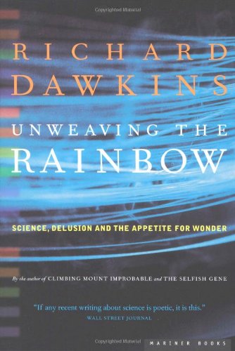
Light is a key theme for the book and for it's design with both designs on the right contain the spectrum. Strangely though other than referencing the spectrum none of them have direct images of rainbows, instead they, as previously mentioned reference light and the spectrum as a whole.They all have a sense of authority, using very formalised serif type and a no nonsense layout, however I don't think either of the designs on the left create a sense of wonder or beauty, however the top left design does it to some extent and the bottom left achieves it through photography. The bottom left design is so far the most suitable for the book's title and content, using the natural wonder the Aura Borealis which captures wonder, beauty, light and the universe it captures the combination of science and poetry which is what the book is so keen to bring together.

In order to produce a design that is most suitable for the book I could too rely on the joining together of science and poetry, however I feel that because this has already been done successfully my design should try and represent the book through another concept/route. 

OUGD505: Studio Brief 1- Initial Development

After producing, simplifying and dividing up my research it was time to start visualising how each page of the book would look. I didn't want to produce a book that was too long, it needed to be short, entertaining and concise so children won't get bored when reading. 


As well as considering the layout I also decided which pop ups would be most suitable for each page, different pop ups and interactions would be paired with the information most suitable. I was cautious not to repeat the same interactive element over and over to keep the book interesting and each page unique. The layout sketches gave me a clear idea of how the book would look and feel and also a list of the required illustrations to start working on.


Tuesday 28 April 2015

Methodology

What is methodology?
a system of methods used in a particular area of study or activity.
"a methodology for investigating the concept of focal points"


What is design methodology?
Design methodology refers to the development of a system or method for a unique situation. Today, the term is most often applied to technological fields in reference to web design, software or information systems design. 
Whilst your design process outlines the procedure that you adhere to when doing design projects, methodology aims to interrogate there procedures in terms if their effectiveness and suitability. 


Why is methodology important in developing effective graphic design practice?
Second guessing, good design has a reason/purpose. Understanding the context and audience that it will exist within.

500 words on graphic design methodology. 

The basis of all good design is thorough research and this is no exception for my methodology. There are main areas of study that I begin with when researching for a project, the first is the potential audience. Understanding the target audience makes for stronger design, who are they? What age are they? What do they do? What do they enjoy? What will communicate the idea to them the strongest? Alongside this I always narrow down what exactly I am trying to communicate, am I intending to inform or persuade? Educate or entertain? From this tip of the iceberg many ideas can begin to formulate but it is with further research and understanding that one will become more fruitful than the others. The key here is to now understand the market place it will exist within, the context it will be surrounded by, a bus poster will be a very different creature from a doctors brochure, a logo that will identify a company will need many different things than an album cover. It is down to me as the designer to research and fully know all of these potential changes and to produce work that works alongside them. This can include the materials it will be printed on, the cost of each piece of design, what will it physically need in the real world and what design would suit the requirements. We can also look into tone of voice, and this will be born out of context, audience and communication, a brochure in a doctors office that is describing the symptoms of breast cancer wouldn't work with the same colours, shapes and tones as a children's magazine and vice versa, there will only be so many decisions that can be considered appropriate for the final product and it is again my job to figure out what is and isn't suitable. Another form of research is to look into what's been done before, it's not acceptable to imitate another piece of design (unless imitation is an appropriate requirement of the solution) but it's fine to be inspired by other work, to see what can be done and to understand how your work could relate to theirs.

From here we can begin to make design decisions, font choices, colour, layout, size, shape, stock, look, feel, tone, all based on our research and understanding. This is where any ideas will flower or die, some will prove to be the most suitable for the situations and others won't cut the mustard. There is no way that the product will be fully ready at this point and there's still a lot of refinement, mock ups and development to be had but from here I will at least have a strong foundation for an idea to grow out of. Good design isn't done for the sake of it, good design solves problems and research and methodology answers all the suitable questions from these problems in order to create the most suitable result.

Lots of Love Roz.

Friday 24 April 2015

OUGD505: Studio Brief 1- Why is the Sky Blue?

The first book will tackle the question why is the sky blue? So it's important to fully understand why and then simplify the science for children aged 7-11.

So how do we see?


It's all about light, when light hits an object it reflect or bounces off the object and enters our eyes, this is how we see. When the light hits our eyes it travels trough our pupils and lens and hits an area at the back of our eye called the retina.

The retina is made up of photoreceptors called rods and cones. The rods are sensitive to light and dark, shape and movement. The cones are not as sensitive to light, instead they are sensitive to colour. There are three different cones in our eye those most sensitive to blue light, those most sensitive to red light and those most sensitive to green light.

When light hits an object, like a red apple it absorbs all the other colours and reflects back red into our eyes. The red cones are stimulated and this causes us to see red. Yellow light will be reflected back from a yellow banana into our eyes and cause us to see yellow.


So why is the sky blue?


Light from the sun is not white as it appears and in fact contains a vast spectrum of light with all the colours of the rainbow within it, we can see this when we split light with a prism. Light travels in waves and some of this waves are shorter or longer than each other, blue light has the shortest, 'choppiest' waves and travels the quickest. Red light the longest, lazy waves and travels the slowest, this is why red is on the outside of a rainbow and blue on the inside. Light will always travel in straight lines until something either reflects it, like when we see, bends it, like with our prism or scatters it.


So why does it get scattered?


Our atmosphere/the air we breathe is made up of millions of little particles containing oxygen and nitrogen, when light hits these molecules it scatters separating all the colours. Because blue is the shortest choppiest wave length it is more likely to hit all the little particles in the air. The particles absorb the blue light and reflects it back out again scattering it across the sky, the light then reaches our eyes and makes the sky look blue.


But why then is a sunset red?


As the sun gets lower in the sky light has to pass through more atmosphere to get to you, this means the quickly scattered blue light gets scattered even more trying to get through all those particles allowing the red and yellow light to pass through the atmosphere and enter your eye.


Rewritten for Children

How do we see?


When light hits an object it bounces off the object and enters our eyes, this is how we see. When the light hits our eyes it travels trough our pupils and hits an area at the back of our eye called the retina.

The retina is made up of photoreceptors called rods and cones. The rods are sensitive to light and dark, shape and movement. The cones are sensitive to colour. There are three different cones in our eye those that see blue, those that see red light and those that see green.

When light hits an object, like a red apple it reflects red back into our eyes. The red cones react and this causes us to see red. Yellow light will be reflected back from a yellow banana into our eyes and cause us to see yellow.


Why is the sky blue?

Light from the sun looks white but it actually contains all the colours of the rainbow. Light travels in waves and some of this waves are shorter or longer than each other, blue light has the shortest waves and travels the quickest. Red light the longest waves and travels the slowest, this is why red is on the outside of a rainbow and blue on the inside. 

The air we breathe is made up of millions of little particles like oxygen and nitrogen. When light hits these particles or molecule it scatters separating all the colours. Because blue is the shortest and quickest wave length it is more likely to hit all the little particles in the air. The particles absorb the blue light and reflects it back out again scattering it all across the sky. This scattered light then reaches our eyes and makes the sky look blue.


But why is a sunset red?


As the sun gets lower in the sky light has to pass through more air or atmosphere to get to you. This means the quick blue light gets scattered even more trying to get through all those particles allowing the red and yellow light to pass through the atmosphere and enter your eye. This is why the sky at sunset looks red.

Thursday 23 April 2015

OUGD505: Study Task 3

Create a flyer and small booklet for the exhibition 'Disobedient Objects North' to understand the importance of clean and clear layout for communication within design.

The a5 flyer will be simplistic, the concertina booklet will be more text heavy. The content will already be provided though we can create and use new images if we choose.

I decided to begin by creating the simpler flyer and then extending it into the booklet design, I felt the flyer had the most restrictions being black and white and so it would be best to start there. 

After downloading the disobedient objects images I flicked through to see which I felt were the strongest and would be best suited for a flyer design and then sketched a rough layout design for said image.


I then experimented and mocked up some of my better ideas digitally. The font choice for them all was Blackout and Blackout 2AM, I wanted something heavy and strong replicating type used for placards and demonstrating the  strength that comes with protest. I contrasted it with futura, something simple and straight talking with very little personality. The point of blackout was the sum up the exhibition, futura was used purely to convey information. 


OUGD505: Studio Brief 1: Research

For my research I decided to look at various examples of scientific kids books, first I started with some basic education books to get an idea of what kind of science is being taught to my target audience age.


Although they were informative they weren't exactly engaging and exciting to look at, they mostly functioned as an 'answer the questions' tool. Though they were practical I don't think they would really get children excited about science, it may in fact make it seem like hard work and I think it could be done better.

The next section I went to look at was the more engaging, interactive science based books. These were a lot brighter, more illustrative and certainly a lot more fun and engaging. The pop up book really excited me and I think it brought the science to life, this is what I want to replicate with my own book. Despite there being many general all round science books there was nothing that went into specific scientific questions so there is still a gap in the market for my idea of answering one question per book, though the feasibility of this may change after further research and selecting my final questions.