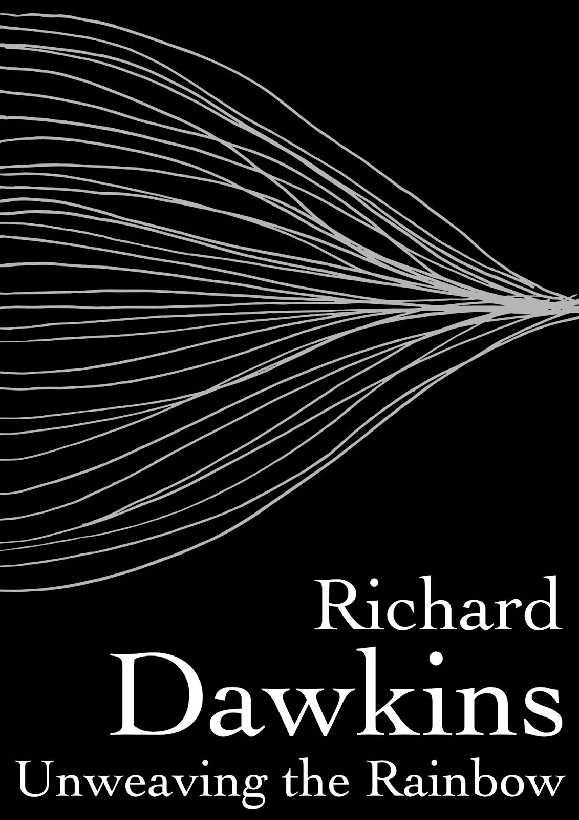
I order to add a human touch to the design I decided to hand draw the unweaving sound waves and then digitise them. The plan for the design would also required very clean text choices so I wanted the 'illustration' to balance that out.


For the font I chose bookman old style, I knew that a serif font would be the most appropriate choice. I needed something that was sophisticated and elegant but not too excluding in it's tone, it still needed to be friendly and accessible.

Despite initially developing the design on white stock I decided to put the final arrangement on black stock with white in for the letter and silver foiling for the lines. I felt this represented the ideas of light waves, reflection and refraction and tied the book back to it's main theme- the unweaving of the rainbow and the understanding of the colours light is separated into.

The final developed designs look minimal but with enough detail to not be boring. For the wrap around cover I wanted the 'illustration' to flow seamlessly from front to back carrying the readers attention from one side to the other and drawing their eyes to the summary displayed on the books back cover.

No comments:
Post a Comment