Friday 22 May 2015

OUGD505: Module Evaluation

Over the course of this module I pushed myself, I wanted to achieve something complicated and refresh and expand upon skills I'd learnt. With studio brief one I attempted a project which I don't think I'd have dared to do in the previous year, making books is something I do enjoy doing but increasing the complexity of the binding process was a challenge that I took on joyfully. I enjoyed the research process required throughout the module, not only into science denial, which was very interesting to explore in depth, but also with supporting research to create my final product. Researching and experimenting were essential in making a successful piece and this was one of the few modules I didn't trudge through it begrudgingly, I genuinely liked making little experiments, comparing my product to existing products on the market, understanding my book's content and watching and reading videos and articles on science denial, homeopathy and anti vaccination. I would be lying if I said it was easy though, despite all my research and experimentation I still produced two dud versions of the book and three useless covers, picking myself up after something goes wrong has always been an issue of mine, I'm more of a 'it has to go perfect first time' kind of a person and so dealing with mistakes was new to me. This project however, it didn't bother me anywhere near as much, instead it was just a matter of saying 'ok, what went wrong this time, what do I need to better next time?' and then applying it, each time the book got better and better. Unfortunately the final book still has some errors and due to lack on time and print slots I had to call it enough, though I know now if I was going to produce it again, it would be better still.


Throughout studio brief two I pushed my ideas conceptually and my practical skills in production, I enjoyed pulling away from illustrative responses and relying more on type, layout and conceptual based visuals to solve the brief. It was enjoyable screen printing again for this brief, although time consuming, it's a skill that I don't want to loose and instead wanted to expand upon, I did this by learning how to foil an image. I had worried with my final design for this brief that could potentially be so simple it became boring, however using foiling really added a subtle detail to the piece and I think kept it intriguing yet minimal. I think I'm beginning to break into a new style of design that isn't necessarily reliant on my ability to illustrate, it's strange but rather freeing to work with ideas and areas I wouldn't have considered previously. I think I used my drawing ability as a crutch, although I'm good at it I've begun to realise it's not an appropriate response to most of my problems and instead I come out with stronger solutions when I apply strong ideas and concept to a brief rather than trying to get some form of drawing in there. Of course I say that and yet my book for studio brief one is highly illustrative with less focus on layout and type, it was more an exercise in construction than it was a strong graphic piece of work, I don't think that matters too much though, it would be impossible to create a children's pop up book and not include illustrations somewhere. I think perhaps I was determined to do one final big illustrative project before I put drawing on the back burner to focus on other things, it was a good send off at least.


Overall I like my work, and oddly I prefer my response to studio brief two because it's none illustrative. I still like the book, it's construction and final clean vector look does appeal to me, but it's just a sign that I'm growing as a designer, I'm gaining a style and I'm breaking away from a skill that I used to rely on far too much that it prevented me from really growing. It's exciting and I'm genuinely looking forwards to producing more graphic based work over the summer and across the third and final year.

Thursday 21 May 2015

OUGD505: Studio Brief 2- Evaluation

Book cover design, although niche, is something I've really begun to enjoy doing. From the freakonomics book cover design last module to Unweaving the Rainbow for this one, it's enjoyable to produce design based on writing. There's a particular skill with book covers, not only is the intention to be attractive and drawn in audiences, but appeal to right kind of audience as well as visually represent/summarise the book. I believe for this brief I have achieved that and in a way if I hadn't been limited by the two colour print required for the brief I don't think I'd have done it quite as effectively. My initial ideas required rainbows of colours, gradients against a white background, these would've ended up look rather garish as a final piece and the limitations of this brief required me to think a little more conceptually.

Throughout this brief I was determined to screen print again, it's a technique I haven't tried in a while and not something I want to become rusty at. However I felt, as I explained previously in my design boards, that I wanted to learn a new skill alongside refreshing an old one. Foiling was the skill of choice, and I really enjoyed learning it, it's really easy once you know how but it's the knowing how that's the hard part and I did make some mistakes. Out of ten prints only one came out properly, the glue was too thick on some and the screen got bunged up, the white wouldn't print properly, but it was something I've learnt from and hope to apply to any future projects I choose to undertake.

If I had, had more time to dedicate to this brief I would've really loved to add a foiled finish onto the wrap around jacket, it just doesn't have the same impact as the poster for this reason. I think the cover looses something by not being reflective and it certainly doesn't display the concept as well as the poster does. Also I'm incredibly annoyed at myself for folding the cover slightly too short so it doesn't fit the book perfectly. I think I would've also liked to experiment with different fonts a bit more, although Bookman Old Style works well on the poster as the only font once you begin to introduce a lot more text in the full cover it all begins to blend into each other and takes the impact away from the title. I did experiment with some san serif choices for the body copy/quote/blurb but struggled to find anything that suited it well before I had to call it finished and move onto other projects.

OUGD505: Studio Brief 1- Evaluation

The reason I chose to produce a book in response to the issue of science denial was to find a way to make science exciting, interesting and not scary to the next generation of children who may otherwise go onto not trust science, facts and provable evidence and instead place their faith and belief into various false methods from psychics, homeopaths, astrologists and vaccine deniers. Although I only produced one book I can see a series being created in a similar style for many other questions including the ones I had spoken of in my proposal being an effective method of getting children  initially interested in science. However, I can see a few flaws in my books as well, would parents convinced in their belief of anti vaccination truly let their child read a book that could cause them to poke holes in that belief? Perhaps not. Are they truly engaging and interesting and suitable for a child? Perhaps not. When testing my book and letting others play around with the pop ups I found that I had to instruct them on what pop up does what and how to use each page, I think if I were to produce this book again I would include more instructions on each page such as 'turn this' 'lift here' etc. That aside I think it certainly is on it's way to being a successful product and if I were to start it again it could be, maybe with a different front cover though, I don't like the front cover.

I had a few problems when constructing the book. Although I had produced mock ups of the final design testing out how I would bind it and how each page would work, I still struggled to make it work properly when scaled up to full size. Binding the pages was awkward and wrapping the whole thing in a cover proved impossible, the book submitted in this folder is the third full sized book  produced having messed up the others in various ways previously. Although it didn't go perfectly and although there were issues I can say that I still did it well, this was a binding method alien to me and most other book binding technicians I spoke to so it was a leap into the unknown that for the most part paid off. Overall I do like the final book and I think I took on an ambitious project I may have been too afraid to do before, I finally have the confidence to do something bigger with my work and this is something I'd like to continue to do over the summer and start of next year.


Wednesday 20 May 2015

OUGD505: Studio Brief 1: Final Design


The final outcome came out very well, there were a few snags and issues with the final book but overall most of the pop ups worked and the binding held together well. When it came to creating the book I had to improvise the binding methods, they needed to hold the pages together but allow for space behind each page that would make the pop up work, this created some imperfections in the final product and made some pages awkward to turn. There is also an issue with the second pop up on pages 7 and 8, it doesn't actually pop up properly, however that aside the rest of it works well. 


OUGD505: Study Task 4- Vote!

The final presentation for our solution to study task four.


OUGD505: Study Task 4- Development


In order to appeal to a younger audience we wanted to take a slightly cheeky tone and use some hand rendered type to create a none authoritative look, we did this by using a cross to represent an expletive as well as a cross in a voting box. Using examples of Vanessa's handwriting I created a digitised type to complete the none formal look and feel of our posters.


The whole campaign would be a pack handed out and delivered to student accommodation and universities. As well as containing a booklet on how to vote, information on the parties and a form to register to vote there would also be badges and key rings.

I designed these as well as the posters for the final campaign. 


OUGD505: Study Task 1- Appropriate and Subversion

After looking into examples of fanzines and the rushed cut and paste aesthetic of zines such as sniffin' glue we were given the task of producing images in the same style. I focused on parody adverts as opposed to a zine and produce two 'mock-verts'.


OUGD505: Study Task 2- Presenting Research

After gathering all of our information this study task required us to organise it and present it through 5 design boards.


Monday 11 May 2015

OUGD505: Studio Brief 2- Final Designs

For the exhibition I wanted to produce a screen printed version of my book cover poster. Screen printing was something I hadn't done this year and I was determined to use it somewhere. I also felt that this was a perfect opportunity to increase my knowledge and learn another skill so on top of remembering how to screen print I also wanted to master the art of foiling. 


Out of 10 prints that I started only one came out 'perfectly' which is suitable. The foiling really adds an extra element to the final poster and makes the seemingly simple design pop with a subtle bit of detailing. I really like that the foiling hasn't perfectly transferred to the paper, I think if it had come out perfectly it wouldn't look anywhere near as good.

I had wanted to foil over the wrap around cover too, however time was against me and I chose instead to make the lines grey. The back cover was incredibly difficult to layout, there was considerable more text than I had first imagined and the unwoven pattern across both covers limited the space available, however I think, although crowded there's just enough empty space to not be insanely cluttered.


OUGD505: Studio Brief 1- Experimentation

Prior to printing I wanted to make sure I chose a suitable stock and that the final pages could be bound together whilst still allowing the pop ups to work.

After looking through some stock choices I chose a 200 gsm satin stock that could stand up to some wear and tear, pop ups and greasy sticky fingers. I then mocked up some of my more complicated pages to make sure that they would work with the stock when bound and produced a cover with thinner stock to fully understand how the whole finished book would hold up together.

The result is the cutest mock up you've ever seen. It helped me figure out some final bugs I wouldn't have initially seen coming as well as work out any worries I had previously had with producing the final book.


OUGD505: Studio Brief 1- Development

I began to digitise the various illustrations required for the book as well as the front cover. I had initially wanted to use a style with very bold outlines, however, it proved more suitable and a better look overall to keep them simple and vectorised. Although I am aware I'm designing a book for children, I also want to produce something that is beautifully designed too so treading a line between the two is my overall aim. As long as it's still appropriate for the target audience (which I think it is thanks to the bright colours and lack of complication in the images) then it works.


The title font I chose for the publication is called 'DJB This is Me' and the body font is Avenir Medium.


I chose this is me as it's a friendly, casual and approachable font. It also looks childish in its production. I wanted the titles and questions to appear as if a child/the audience wrote them to further connect the reader to the information. I also wanted the tone of voice to not be dominating or authoritative, this font makes sure that when reading the titles the voice seems friendly and safe.

I chose avenir medium as my main text font as it's easy to read but still friendly and casual. It was very important to select a font that was legible and readable but with a suitable tone, avenir does all of these things well. It's easy to read and understand and has a rounded, safe and friendly character.


Using my sketches as well as the developed illustrations I began to set out the pages. I made sure to size up each added pop up and illustration for each page and leave markers that would make the final production of the book easier. Although certain pages required black backgrounds due to their illustrations I wanted to add sky based colours to the others, I feared over using black would make the pages very dull to a child and although there are illustrations and interactions I still wanted to brighten up whichever pages I could.


OUGD505: Studio Brief 1- Pop up Experiments

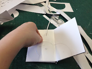
To avoid any snags later down the line I made a rough mockup of my book out off paper based off of the page sketches. As well as understanding how each pages element/pop up worked it also helped visualise the final designs and how I would have to produce the attachable elements so they would work in the finished book.


Friday 1 May 2015

OUGD505: Study Task 4- Ideas

Idea Generation

After combining all of our research we began using design thinking, listing down issues and potential solutions for our voting problem. 


The main issues we found was a distinct lack of trust and a feeling of not being heard felt by the younger generation of voters. There was a sense of apathy and uncaring with politics felt by 18-22 year olds as well as not being informed enough about politic policies, party views and issues. We also discovered that most 18-22 year olds are easily distracted and demand to the point, simplified information without too much waffle.

Idea

The idea we came up with revolves around the tagline 'Because it matters'
We want to create a campaign that engages in a no nonsense not patronising way to inform 18-22 year olds that taking part in a vote does truly matter. We would focus on the policies that will directly affect audiences of that age and explain that if they have an issue with the way it's done the only way to change it is to do something, because it matters.

We'll be creating a pack that can be handed out at uni's and sent to student accommodation filled with basic information on each party, highlighting political policies and issues the generation faces and a guide on how to vote. We would also include a voter registration form, a poster, badges, key rings and even bottle openers.

There would also be a digital arm for the campaign including twitter and facebook pages as well as youtube videos discussing issues relevant to younger people and the policies that matter to them.

The whole idea behind the campaign is to try and make it personal for young voters, to connect them to politics by discussing the policies they care about and that directly affect them. It would explain that although they may not like the process, or the politicians involved if they want change or have an issue with whats happening  the only way they can actually do something about it is to become involved with the political process and vote. They should take part in it because it matters.

OUGD505: Study Task 4 Research


Why do young people not want to vote?

Guardian Article
The first conclusion from these results is that it is no surprise that the current political system is unappealing to so many young people. Take immigration, a subject that obsesses politicians and the mainstream media. Many of those I spoke to conceded it was a big issue – or, at least, so they had been repeatedly told. No one nominated it as the issue that most concerned them personally. “The media are portraying immigration to be a monumental issue,” said 22-year-old Jenny Sturrock from east London, “but I think that is just because of parties like Ukip who see it as an easy target.”

At the same time, subjects that disproportionately affect the young get bumped down the political agenda. The main parties are finally waking up to the housing crisis – perhaps because middle-aged homeowners have stopped cheering how much their big asset has appreciated and started wondering why their children are still living at home. But the solutions offered are limited, because, like the Tories’ Help to Buy initiative, they are often aimed at stoking demand without tackling the fundamental problem of lack of supply. This problem is most acute in the south-east of England, and the average age of a first-time buyer who does not have parental help is nearly 40. As 19-year-old Joseph Dwan from Sutton in south London puts it: “I feel like London is the epicentre of what is currently wrong with the UK. As a young person, my options for employment are mostly entry-level jobs. I simply cannot work in central London, however, where many of these jobs exist. If it costs me upwards of £15 to travel to and from work a day, that’s close to half a day’s work post-tax.”

“There needs to be a cap put in place to stop greedy landlords rinsing us.” Lauren Sharkey, 20, lives with her parents in Kent because she cannot afford to rent a flat of her own. She says: “Ultimately, I want to live in London, but looking at the price of renting there is depressing. The housing crisis seems to be getting worse, not better.”


What are their issues with the democratic process?
Ageist Policies
The highest age of voter is 65+ this means that politicians have to appeal to them more than the younger population (18-24) who vote the least. When policies are made and cuts are announced it's safer for a political party to tread on the younger generation; by cutting education, minimum wage, increasing uni fees and house prices, who aren't likely to vote anyway, rather than the older generation by cutting money to pensions, nursing homes, NHS elderly dedicated departments. 


Russel Brand
The anti-voting anarchist Russell Brand may be responsible to a younger generation who don't feel the need to vote. He appeals in a way politicians don't and stands out as a voice very different from the samey political talk. He also understands how to interact with a younger audience and what mediums to use to engage them, far from the political TV debates Brand uses youtube, twitter and social networks to spread his ideals, something 18-22 year olds can engage with more.

However a recent interview with Milliband may be something that can engage the disinterested generation who were determined not to vote.


“There was some cynicism underlying the whole thing – they saw it as a very blatant attempt to reach the youth vote and felt that Miliband was a little bit clumsy in his performance with the weird cockney accents.

“But they said that ultimately this didn’t really matter – they were pleased that one of the main parties was trying a bit harder to engage with younger people and felt that, on the whole, Miliband came across well, managing to get across some good ideas and policies.

“They said that it felt like an important and positive election moment when there haven’t been many and brought it up spontaneously when I asked about ‘key election moments that have changed your mind or confirmed your view’.”

Among those who took part in the Dewsbury focus group, Uwais, 25, said: “I thought it was good – he [Brand] was asking the right questions, the questions I would want to ask. He surprised me, Miliband. He came across well, he handled it well, he had some good ideas.”

Yedidia, 18, said: “I saw it on Facebook and read comments about it. I think it was targeted more at our generation. Everyone on Facebook was saying Miliband did well.”

Husna, 23, said: “I really like Russell Brand. David Cameron said something about Russell Brand being a joke and so Miliband was a joke, but I think he said that because he was intimidated. Russell Brand is very, very confident and for Ed Miliband to go and be interviewed by him knowing what views he has I think it was quite challenging. 


“Ed Miliband has done well. You can’t ignore people like Brand who say ‘don’t vote’ because I’m at uni and I’ve never once had a conversation with other students about voting, and the youth vote matters. Cameron’s being a bit naïve to think that Brand doesn’t matter because he does.”


Why do they distrust Politicians?

BBC Article

Almost two thirds of young people have little or no trust in politicians, new research suggests. Three quarters of those surveyed also said political parties didn't keep promises once they were elected.

"After the expenses scandal, why weren't there harsher consequences for the people involved?

Researchers surveyed more than 1,000 18-year-olds and found most (63%) were interested in politics.

However, the same number also said they were turned off specifically by the behaviour of politicians and political parties.

Almost two thirds of those surveyed (64%) said political parties weren't interested in things that mattered to young people.

One of the researchers, Professor Matt Henn, said the evidence pointed to young people feeling "disheartened and frustrated" by politicians.The study, from Nottingham Trent University, is aimed at understanding why fewer than half of 18 to 24-year-olds voted in the 2010 general election.

His colleague Nick Foard added that politicians must now do more to show young people that they have "a sincere and transparent concern to listen to their voices".