One last brief of the module, and one last chance to milk the research project.
Looking back at our research we now had to identify and produce a solution to a problem we had discovered, however due to the how very different each of our bodies of research were this briefing was a lot looser than the others. We were told to think about the problems, come up with a few ideas of products we could produce based on our research and finally write a brief for ourselves outlining what it was we were going to do.
So my head began to turn and I felt a little stumped for ideas, but then I was presented with a wonderful opportunity- I could finally break away from the literal translation of my project and when one of my peers mentioned producing an AT-AT pilots manual (AT-AT's are the camel looking walker bots from Star Wars- on the fight on Hoth? You know the ones...) I knew that sci-fi vehicles were the subject for me and to be honest I was a little peeved at myself for not seeing that link earlier.
So Sci-fi vehicles and more specifically how to pilot them... in order to keep the content research down to a minimum I decided to settle on a vehicle I pretty much knew everything about anyway. The TARDIS. Being a die hard Whovian (fan of Doctor Who) myself this gave me an advantage of knowing my target market.
True fans of shows will pay a lot of money for products from the show, be they hand made for a more personal touch by another fan, or official 'studio' stuff (however a lot of these official products feel like an overpriced, half-arsed middle finger to the fans who made them rich). So when it comes to creating a product mostly designed for entertainment- the fandom market is a good one to aim for. (The whole point of liking fandoms is pure entertainment/escapism)
so... Brief
What will I be producing? A Booklet- entitled How to Pilot a TARDIS
Who will it be for? Whovians and fans of doctor who/cult science fiction.
Why? Because sic-fi fans love collectable, original, fan merchandise, even me. We pay out of the nose for something with a slice or originality in it.
What is it's tone? The booklet is primarily produced to educate, however due to the subject not being real it can be argued it's more for pure entertainment. (It can also be argued the entertainment comes out of being informed)
What is my hopeful outcome? That upon completing the booklet all readers will be able to pilot imaginary vehicles. That the audience perhaps learns some new information about the universe the Doctor exists in, and that overall they get a laugh out of it.
So my target audience was very clear and very precise. Whovians. And what a wonderful bunch to design for they are.
Sketches
Ironically, I produced my sketches in this: (my handmade, hand bound sketchbook.)

Seriously though, if you liked Doctor Who, you'd be pissing yourself by now.


So I began to sketch out some ideas- though honestly I kept these ideas rather loose. It was only once I had finished my key illustrations for each page that I could begin to mentally arrange image and text. I knew what kinds of pages I wanted (two with diagrams, a couple pure text) and I knew what kinds of information I had to get across in those pages so sketching wasn't as necessarily important.
Illustrations
After the previous brief I decided I needed to add more illustrator illustrations into my work. They had been easy, quick and fun to produce before so it made sense that I used the same methods in order to produce quick- good looking, content.
To show the marvellous people at home how to pilot their imaginary vehicle I knew I needed diagrams of the consoles and controls (which proved a problem in itself, the console changes every goddamn series giving me a lot of options, so I settled with a classic Doctor Number 5 design)
Above View

Side View

SIDE NOTE
(It was at this point as well that i decided to use one colour throughout the booklet- thinking logically, if the high council of Gallifrey were to produce them, it would be beneficial to keep down on printing costs- plus to iconic TARDIS blue can be enough to identify the Doctor Who brand)
Content/Font Choice
The content was incredibly easy to produce, I just sat down one evening and had a giggle to myself, finding as many references to cram in as possible. I did have to rely on tardis.wikia.com for some of my more specific information, however 90% of the content was pulled from memory.
My font choices are pleasing ones. For the header, I spent a lot of time browsing the internet to see if a fan had already produced a .ttf downloadable font version of any of the Doctor Who typefaces- unfortunately the only one available was the latest (and my least favourite) font, belonging to Matt Smith's series, still it was a doctor who font, and actually once placed in the context of a booklet, it didn't look quite as ugly as I had assumed. (If I had, had the time I would've made sure the font matched the date of the console and used the font from Doctor Who when Peter Davidson was still in the role, but time didn't allow for such detail.)

My body font was futura- futura book appears in the opening and closing credits of the current series of Who.
Production
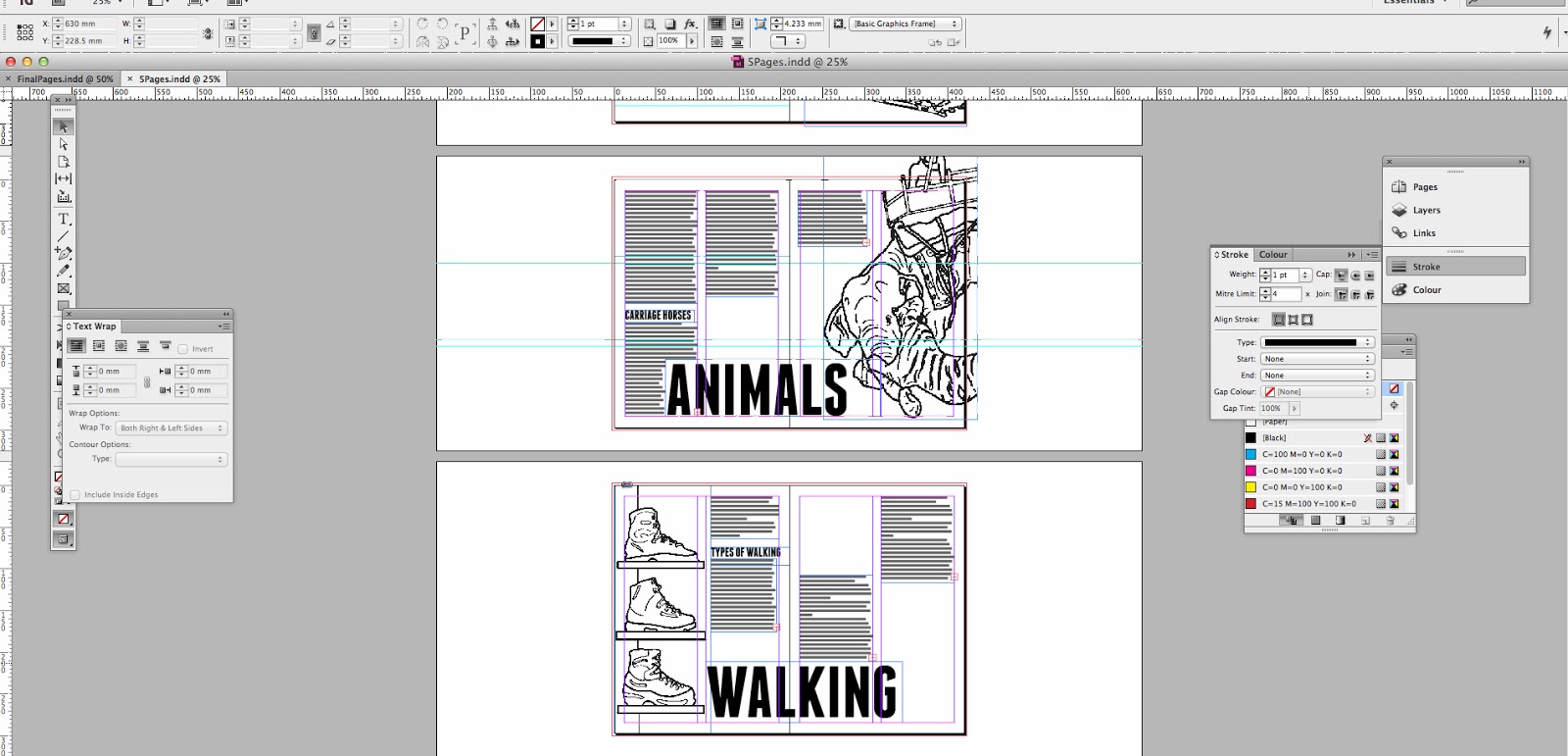
So I began to layout my pages- using my images as framing devices, and, when I couldn't I would use my header text to help organise the rest of the page (that and sub headings, which proved invaluable in breaking up large chunks of body copy.) It didn't take long than a good solid evening worth of work, and honestly in the layout's themselves I failed to apply a design concept just for the sake of speeding up time.
The Crit


So I went into the crit with a simple print out/mock up of my booklet and I recieved some very excellent feedback. The illustrations recieved positive comments and it was a general feeling that the target market was very clearly identified. There were a few issues of over crowding on the 'How to fly' pages, where a lot of text swamped the eye line. But other than that, they felt it was strong.
When asked wherte I could envisage my booklet being displayed/sold I mentioned a few local nerd spots- Forbidden planet and Fab cafe being two keys ones. It was then suggested by my tutor to perhaps extend the set further. Using my already constructed illustrations there was an option to take these key iconic images and use them to produce posters. I honestly loved the idea, we all agreed that it would fit the target market- everyone knows what the Blue Box looks like Whovian or not, but to know a print of Peter Davison's console from back in the 70's-80's well that would be something only true fans would recognise.
So I went and washed down some screens.
Further Development
Booklet
I added a few extra pages and spread the crowded text out over another spread to loosen up some white space. I also found and produced a brief illustration of Gallifreyan writing to take up some blank space on the back pages (they were there purely to get the booklet to the right amount of pages for printing, but actually as a design feature, it looks very pleasing.
When it came to printing though... holy crap it was a Herculean effort. I had to recreate a whole new document in In Design with the pages pre-shuffled into booklet printing order, to convert them to PDF's to set up the printing properly and print out a few dud copies where the double sided printing had gone funny. All this because In Design doesn't seem to do double sided printing for a booklet, not an option I managed to find anyway.


Posters
Screen printing was fun, slightly daunting as it was the first time I had tried it unaided, but fun. I hit hiccups and issues from not washing the screen properly beforehand, to coating it far too thickly causing the emulsion to not completely vanish and finally I kept accidentally printing on the screen bed, having flooded my screen, but forgetting to put another piece of paper under it. Despite these issues, 3 out of 6 prints of each design didn't turn out horribly. I consider that success.


Where they belong...
So I went to FAB Cafe- a very geek/fandom themed bar, where I knew my posters and booklet would feel right at home. I chatted to the manager (who happened to be a fellow Whovian) who kindly ;let me stick the posters up and take a couple of photographs in the fandom rich environment they belong in.
He was also very impressed with the designs and ended up keeping a copy of the booklet and console poster for the bar, I consider that successful.

 |
| Bar Manager- Enjoying the Product |


How'd it go?
Good, very good. I really enjoyed this project, I loved what I produced and I genuinely can't wait to head out tonight to FAB Cafe and get some pictures of the products in their 'home' (see above). I genuinely cared about my subject, this meant I just wanted to keep pouring effort into it. I hand-bound my booklets with needle and thread instead of stapling them together, because I wanted to make that effort, I screen printed the posters instead of going to digital print, because I wanted to.
I think there's something wonderful about non digital techniques and that's that they can go horribly wrong. It takes skill as a creative to control these production methods, and they are time consuming and often go wrong at the last fiddly minute (I did end up ripping two books on the last couple of stitches) so it takes a person of great care and determination to see it through... I think that's me, at least it's who I want to be.
When I leave university, I now know that I have to get into fandom design, specific target markets and designs full of dreams. I really care about this stuff and I care about making it good for the fans- I think this is because I know I am the fans. I hope I can apply this enthusiasm to briefs that I'm not so interested in, in the future, but I'm sure that sounds easier to do than it is.