Thursday 26 March 2015

OUGD505: Practical Proposal/Brief

For the practical element of 505 I have decided to focus on inspiring a new generation to have trust in science and the scientific process. 

The main problem I encountered through my research was that most adults who deny science, refuse to vaccinate their children and believe in 'alternative' medicine are stubbornly set in their ways. No matter what data or facts are presented to the they will ignore it and continue with their own belief, in fact any data opposing their belief is more likely to make them believe it more rather than cast doubt.

This is why I think it's important to target children with my project instead of adults, appealing to a generation who have yet to make up their own minds is more beneficial than trying to change someone who is set in their ways. And the way I'm going to achieve this is through the production of a children's book that encourage critical thinking. 

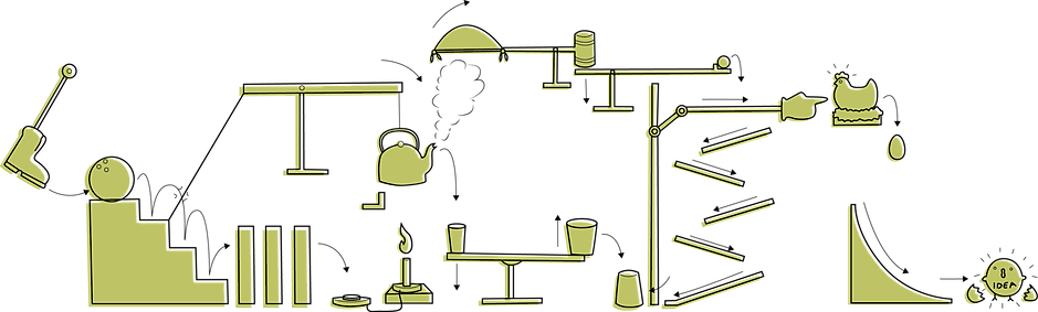
The books will focus on questions from a variety of scientific topics including medicine, physics, biology, chemistry and psychology presenting the information in very easy to understand formats with brightly coloured illustrations and a friendly tone of voice.

These stories will encourage children to believe something not because someone told them to or because it's always been that way, but because there is evidence for it. The plots will begin with a question and go through the answer in a simplified way, questions like why is the sky blue? For physics or why does the camel have a hump? for biology. 

The research I will be conducting for this brief include finding out answers to scientific questions for the plot lines, as well as looking into existing children's books to gauge the appropriate tone of voice and writing style. I will also be researching and experimenting different illustration styles to find the one most appropriate. 

OUGD503: Module Evaluation


Although I may not have thought it at the time, on reflection I thoroughly enjoyed this module. The challenge of managing my own time and the freedom to choose briefs that I found interesting made the workload feel more exciting. However when it came to time management at the beginning of this brief I was far from organised. With the Joe Pointon and Penguin briefs I had started out wanting to complete them before Christmas but became relaxed with a 'I'll do it later' attitude and they were only completed mid March, although they were both finished before the module and brief deadlines this wasn't a particularly professional way of going about my work process. That being said when I finally did sit down and focus on them I produced solutions to both that I am very pleased with, it has taught me that I am not a long haul project kind of a person, I work best with tighter deadlines, working non stop and staying late for three to four weeks followed by periods of calm. This is how I work best, and although it can be argued that I could've done the same amount of work over a longer period of time the lack of pressure makes me lazy where as stress and deadlines make me focused, nothing wrong with this, I'm sure many designers are the same.

Because I was free to choose my own briefs I only picked projects that I had good few concepts for initially, I think this really helped with my idea generation, there was no pressure to come up with a strong idea, I already had a couple for each brief. For the Moo brief, a task that I set myself to complete in a day, I had had a strong concept when reading the requirements a few weeks earlier so when it came to producing my solution the process was a lot easier. Though I can't say that all of my initial ideas and concepts were the ones that ended up being executed, in fact quite the opposite for some briefs. For the Penguin brief I had started out wanting to play on a literal visual for the 'freak' part of Freakonomics however in the end I used the tone and style of the books content as my basis for a solution. For secret 7” I had a defined and definite visual in mind with a specific style, however through execution the style was warped and altered until it became something entirely more suitable.

Researching wasn't an essential part for some of my briefs, particularly secret 7 and feathr, which were very open to interpretation and applied a 'do whatever you want' mentality but for others, especially my larger briefs like WWF and Penguin, research was essential. For WWF I produced a large body of research, to begin with it was looking into social media scavenger hunts for a potential solution followed by a full on analysis and break down of the Amazon rain forest ecosystem to support the games design. For penguin I started with what I used to class as research, which was looking at, taking photos of and analysing various examples of book cover designs for economics based literature. However what really assisted in producing my final solution and concept was reading Freakonomics and studying info graphics and various different ways for displaying information in an interesting and visually beautiful way.


Over this module I have learnt to time manage, I've also began to understand what I need to do to get the best out of my work process and time. I've also better understood conceptual thinking and applied this to many of my briefs honing in my ability to understand what a solution needs to communicate and producing the means to communicate it as clearly as possible with the right tone of voice within the right contexts. There are still improvements to make though, I can always do more for each brief and I need to find a way to add the pressure I feel is so essential to get me working to my full capacity. I also need to apply more research to my next set of briefs, using it as a backbone for the concept and final design, where I have done this already it really shows in the work, I just need to do it more. As a whole I am pleased with my outcomes and although there were many moments where I was lazier than I should've been, frustrated and out of motivation and creative ideas I managed to pull through and produce designs that I am proud of and although I still relied on illustration for many of my briefs (feathr, secret 7, moo) I managed to apply a more graphic approach to it all and find a good symbiosis between my two disciplines. 

Wednesday 25 March 2015

OUGD503: Feathr- Evaluation


I chose the feathr brief because it was simple, it required very little in the way of context or concept and it was something I could have a bit of fun with it. I managed to get the brief done fairly quickly and spent only a couple of days sketching and digitising the idea. Although they asked for an artistic wallpaper I still drifted towards a more design based response, this may have been why I didn't get too many votes, despite this I still think it's a very cute design and I would personally have it up on a wall somewhere. If I could repeat this brief I think I would've liked to do more than one design and perhaps push the boat out a bit, create something more abstract as opposed to literal. That being saidmodernising a traditional decorative style I still feel was a strong concept to base it around, it may have been good to produce a set of modern coat of arms so the range could appeal to a wider range of audiences.

OUGD503: Feathr- Final Designs


OUGD503: Joe Pointon- Evaluation


This project genuinely had me stumped for a while, after having my first round of ideas rejected coming up with a new angle for the design proved difficult. I left a large gap between first tackling the brief and starting it up again, this both hindered and helped my process; it gave me time to think, clear my head and start over but it also meant I became detached from the project, the motivation and inspiration I had started with was fizzled out and it took a lot more effort to get back into it, however once I had come up with a stronger concept everything flowed a lot easier. I think if I had pushed myself earlier on in this project I could've finished it much sooner with room and time for further development and applications- I had initially been tasked to mock up a website example but ran out of time and had to leave it to just the business cards for submission and continue with the scamps afterwards. I certainly could've been a lot more professional from the clients point of view, I took this brief a bit too casually and left things late and pushed things back, all that aside though the final designs and the concept behind them are solid and will be a great platform to build an entire brand around.

OUGD503: Secret 7- Evaluation


Secret 7 is always very free so I can't really say I had many commercial considerations or a target audience to aim for, and I only spent a week or so on it so I wasn't restricted by time limitations; I just did what I wanted and really enjoyed it. Although I started trying to do a full on illustration with extensive detail and intense amounts of shading it turned out the best result was a simple vector. I think I've not got enough experience in detailed illustrations so since this brief I've leant towards more simplified forms of drawing, it works, and in many instances it looks good. Last year I didn't get into the exhibition, I certainly hope I do this year, I made sure to submit all three variants of the design so that perhaps they may have a preference to one of them and let me in. From last year I stopped worrying about 'getting it right' and just did what I wanted, I think my designs are much stronger from this attitude although it does help that I'm a year further on in skills.

OUGD503: Secret 7"- Final Designs


OUGD503: Joe Pointon- Final Designs


OUGD503: Penguin- Evaluation


This was a very drawn out brief and one of my two longest running ones. At many points I didn't think I would like the end product and at certain others I felt like giving up, however, persistence and research were my saviours. Although I had the longest amount of time on this brief I don't think it helped, all it made me do was put it off tell myself there would be plenty of time later to do it, this caused me to loose my motivation and it was only when the competition deadline was looming that I finally got into gear and produced a final design. There were three rounds of idea generation with the project, every time I felt like I was onto something digitising the idea quickly made it fall apart. The reason why many of my ideas didn't hold up is because their concepts were minimal and barely existent I was think purely visually rather than conceptually and it showed in my work. However once I actually sat myself down and read Freakonomics, something I had been putting off for a long time, I came up with a strong idea that directly linked to the book. This was the brief where I began to expand my ideas of research, I started by simply looking at examples of economics based covers, but eventually ended in reading the book and studying infographics as a means of research- it certainly benefitted the final design. 

The improvements I feel could be made with the final design include experimenting a little more with colour and font choices instead of just relying on helvetica (the font already used on the current cover). Though concept wise I think I've done well and I enjoy the final design, it communicates what I wanted it too and sums up the character and tone of the book pretty well.

Tuesday 24 March 2015

OUGD503: Penguin- Final Designs


OUGD503: MOO- Evaluation


I enjoyed this brief, even if it was only for a day. Of course with day briefs comes the main criticism of the work- it would've been much better/to a better quality if I had, had more time. Once submitted I found a few problems which I missed at the time due to being rushed off my feet, though it was a good exercise in realising how much I'm capable of when pushed to a day long deadline. Despite this project being so short I think the concept and the idea is solid and having created a chain reaction illustration previously certainly helped the whole process along. A few other changes I would've made to the design include selecting a better format, the size I ended up printing the images at was far too small and awkwardly slightly too big for A3 but way too small for A2, I think I would've changed all the lengths to A2 if I did this again.

All in all I believe my final designs are an appropriate solution to the brief. They are fun, interesting, the eye is drawn into the image and people have to take a few seconds imaging how the set up works. It's bold and bright in keeping with their look and brand guidelines and each image is distinctly different but still very much a part of a set.

OUGD503: MOO- Final Designs


OUGD503: MOO- development and design desicions

The initial sketches I created I used as guidelines as to how the chain reaction would flow and for selected different items within it. I went on to produce neater cleaned up versions of the designs that to be digitised later. 

The main use of the sketches was to make sure the balance in the image was solid and the flow through the reaction worked well, after I was certain it would work then I would digitise it. At the end of each chain reaction I wanted a 'finished/successful' representation for the business working well as well as the certainty clients should place in the MOO brand. For the bakery the icing is on the cake, for the mechanic the toy car crosses the finish line, the administrator successfully prints the document and the beautician's mirror spins to give the doll a reveal of her makeover.


Many of the design decisions had already been made. The font choice as well as the colour palate had already been outlines in the MOO brand guidelines booklet, it was simply a case of implementing them into my design.


I used thick lines for the outline and rounded corners to compliment the strokes of the font. This also made the design appear more cartoony and gave it sense of fun, though I was careful not to over simplify it and make it too childish by adding little bits of detail in thinner strokes here and there.


I ended up choosing four colours from the brand palate that greatly contrasted each other to give each poster it's own character. I also made sure to use the colours that the brand uses most often, their main/primary colour choices as opposed to their secondary choices, this would link 


For the layout I didn't attempt to sketch it, instead I moved things around digitally trying to strike a balance between text and illustration. The strong band of colour complimented the colour used in each design however when I had the bottom half of the image in all colour it was far too much. Adding the colour as a band rather than a block gave the whole design enough white space to breathe and framed the image suitably.


OUGD503: MOO- Rational and Initial Ideas

Project Rational 

MOO is a business that helps other businesses. The are an online and print based company that helps small businesses create well designed stationary and promotional material.

Recently that have updated their image tagline to: Design Works Wonders. Their challenge is for creatives to produce a visual representation of this tagline and to really demonstrate to their customers that design can work wonders.

The solution can be any medium as long as it's playful, interesting, visually striking and that fits into the moo personality. They are looking for the idea to promotes awareness that Design Works Wonders in business, look striking and visually engaging, get their customers excited about MOO, makes people smile and encourage people to visit moo.com.


Initial Ideas

Seeing how open and free this brief was I wanted to set it as challenge and complete it as a day brief. My initial idea came from something I've created before for my own personal branding- a chain reaction.


The chain reaction in this style of illustration is not only fun and interesting, but also represents the ease with which a business can flow from creation to promotion when they use MOO. 


I decided to take the tagline and extend it, in order to cover the vast range of businesses that MOO assists I wanted to create a range of posters and use 'design works wonders for...' making it personal, relevant and demonstrating just how many types of businesses can benefit from MOO's services.

The four business sectors I chose to use were administrators, bakers, mechanics and beauticians and for each chain reaction I would use tools and instruments used by each job. E.g. for bakers there would be bread, scales, whisks, for beauticians make up, hair brushes, mirrors etc.


OUGD503: Group Responsive- Evaluation


For this brief we greatly considered our product. Using design thinking we were able to solidly understand our problem and create a suitable solution that solved as many of the issues as possible. Although most of our time was spent designing and sketching, developing and arranging different things we spent an awful lot more time researching thoroughly. The idea of the game would only be feasible if we could fully understand the ecosystems we were trying to recreate and we did this within an inch of our lives. Of course the rain forest is so complex I could've done a lot more towards it but due to time limitations I had to give myself a cut off point. Though this may be true for all briefs; we did overrun with time keeping, every little thing took about three times as long to complete than estimated and this was true with all aspects of the brief, it really pushed us for time in the end. It simply wasn't fully considered all the things we had to produce and complete for our final submission, there was a lot more than we initially thought.

That being said the quality of the final game is fantastic though this is more due Beth rather than me, she would spend extensive amounts of time on the smallest details making sure they were perfect, I'm a more quick creator 'that'll do' kind of a person, but I think this made us complement each other well. I feel on my own part I could've and should've spent more time on my own sections but I also think if I had taken my time with it then we wouldn't have managed to complete it before the module submission. One thing that needs to be considered is that there were only two of us, we started with five and came up with an idea that suited the workload of five people and managed to complete it with two (there was some assistance from a third member, bits of research, the typeface, but these were part time things). I think this makes me proud more than anything, I am astounded at what we were able to achieve, we motivate each other well and Beth's persistence and dedication drove me to want to work harder.

If I could improve on this project I think I would've liked to do more; make some gifs, some animations, more ecosystems, more animals. Also I would love to have taken my time on what I did produce, although I'm happy with my illustrations and my designs I think more time would've improved them greatly.

Monday 23 March 2015

OUGD503: Group Responsive D and AD Submission

The D and AD brief required us to submit up to eight design boards explaining our concept and solution. These were the submitted boards.


There was also an option to add in supporting material, we chose to add a couple of extra boards to explain a little more in depth where wee got the idea from, how our solution answered the problems set by the brief and how we chose the look of our design.


OUGD503: Group Responsive- Developments

After our research we began to consider the look of the game and how it would play and flow. We sketched out a few ideas for the look of the environments, the shop and the home screen.


Basic sketch of shop look/layout

Basic environment sketch showing levels/layers in the game


sketch showing interaction with page/notifications


Visuals wise I was tasked with designing the animals, home screen, shopping screens and iconography. 

For the animal illustrations I wanted to produce something that would stand out against a backdrop, and although I wanted the images to be simplified versions of the animals (to make it easier for later animation and potential programming if the game were ever to be developed) they still needed to have enough detail so players could recognise individual species.


I make them stand out strong by using bold, thick lines for the main body and thinner lines for the detail (so as not to swamp the image) I focused on illustrating key features and patterns so the species would differ from similar types of animal. I also chose to have each animal from a side view as this better suited the format and play of the game (with players scrolling sideways through 2D landscapes).


The icons had to be simple yet fun. Soft edges and rounded corners to make them less imposing. For the main page icons these were very simple, home buttons, move buttons, basic iconography. I made sure these all had rounded edges fitting in with the style of the rest of the game.


For certain icons such as the ones used in the shopping sections of the game I used circles as my base, not only to make buttons easy to tap but also to link back to a rounded eco system and the shape of the earth. 

The look of the shop was also based on a circular 'wheel' look, from icons to the way players will scroll through the species.