Tuesday 17 November 2015

OUGD603: Milkshake Mix Packaging- Live Brief

On Wednesday I received a college wide email about producing some packaging for milkshake syrup mixes. Having never tackled packing before I decided this was something I wanted to explore through different briefs this year so I called them up and arranged a meeting to discuss ideas.


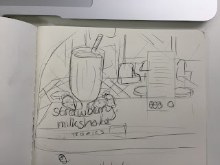
On the phone prior to the meeting he spoke about wanting to create a 50's diner look with his inspiration being heavily influenced by a packet of strawberry milkshake creme oreos. He liked the Americanised look and the use of the type, the image of the milkshake glass and the image of the fruit. So I sketched a few ideas and potential label layouts before we met for discussions.


After meeting and going through my ideas he explained that the packaging was not a label but a heat wrapped plastic label that would cover the entire bottle. He also make clear that he wanted something very similar to the oreo packet including the angle of the glass and the style of the image. I had suggested a vectorised style but he wanted 'realistic and slightly animated' which I'm not sure how to achieve or whether I can achieve it. So I sketched out a few more layouts and designs and although what he says he wants is clear I still think he has a specific look but no actual idea what the final product should look like, which worries me a little. 


Although I asked him for the required information, the blurb and what was needed on the mix bottle I received very little so I'll start with attempting to produce the image of the glass and the fruit in the style he's requested to see if I can actually achieve it before continuing with the rest of the label. 


Thursday 5 November 2015

OUGD603: Charity Promotion- Branding Ideas and Development


To start the long process of creating a look for the exhibition and promotional material I began with a  name and logo design. In my weekly crit box session I spoke about my ideas and pitched the name 'Ruff Edges', the idea was received well. I wanted to play with and celebrate the idea of imperfection linking the brand to the printing processes and the dogs. Ruff or rough edges can relate both to the imperfect look that screen printing fabric produces as well as the rough edges many of the dogs posses. The mis-spelling of ruff adds a touch of humour that makes the whole experience more relatable and strongly connects the identity to dogs.

For the look of the logo I wanted to push the concepts of imperfection, the printing process and dogs to create a strong link between the name and the visuals. To me the best way to present this was by creating a dog silhouette using a paint/print texture to create an imperfect shape.


I messed around with some paint and scanned the result to create a realistic vectorised texture and then translated this texture into the existing silhouettes to create a rough, painted look. I chose to use the font century gothic to contrast the roughness of the icon and create a balance between text and image. I felt it was important to create a brand that was 'cute' but in no way girly, something that can link strongly to dogs but still appeal to a male market.

After trying various layouts and pairing between texture, text and dogs I presented my ideas for feedback. The overall consensus was that the dachshund/sausage dog created the strongest image and was the most recongisable species from a simplified icon.


Although most of my feedback was positive after taking some time away from this project I had begun to dislike my logo. I felt the simplification of a detailed outline made the image look a lot like clip art and that it had lost the clean yet textured look I had wanted. In fact the vectorised paint didn't exactly look like paint or a texture anymore so I went back to tweak slightly and produced a more simplified, cleaner drawing. I did however keep the dachshund shape as my feedback had suggested.


With this new simplified look I had to find a more organic way of adding texture to create the 'roughness' essential to the concept of ruff edges. To achieve this I took my image into photoshop and layered various different textures including; a stamp effect, which looked too fake like with the paint, a couple of canvas effects, which were far too subtle, and finally a paper texture which oddly gives the same look and patchy effect as a screen print. The paper texture was received as the strongest in a few casual feedback sessions and so I went on to use that one. Also in one of these casual sessions it someone pointed out that having lighter text next to bolder text really threw the image out of balance. So to return some stability to the image I made all the characters bold complimenting the boldness of the illustration, the roughness of the texture used within and the cleanliness of the line work, all together they sing the visual song of perfect imperfection.


OUGD603: You be You- Further Development

After some further feedback it was suggested to me to push the flower/plant design and the 'y' even more. I did a few tests and examples but I really wasn't feeling the overall look, everything I tried was too complicated or unprofessional and so I wanted to pull away from this and revert back to one of my preferred previous ideas. 


Taking the offset square design I had worked on previously I added in gradients and drop shadows to give it a more professional feel and played around with placement of text and how the text logo would function.


After experimenting and developing I held a crit with a few people. They liked the drop shadow saying tat it was a good representation of a full three-dimensional person whose problems are real tangible things. However there were some issues, it was questioned why I chose blue, although blue can be considered a calming colour it's cold and still gender specific. They also argued that the use of a sharp box made the icons unwelcoming and almost 'boxing' the individual in and that using and highlight 'be' took away from the you, which should be the main focus of the design.

I made some alterations based on this feedback. I changed the colour from blue to yellow, a colour that's not only gender neutral but also very positive and bright. In the full logo I shifted the focus from be to you bringing the main theme back to the user and the individual. I also rounded the corners in the icon to make it more approachable and changed the 'be' to a y. Not only does this link strongly to the whole brand and the individual but it also 'breaks the box' showing the user that they don't have to be confined to a norm, that they can break out of their containers and truly be themselves. I think the new logo is a very inspiring and refreshing, it matches the tone of the app and offers a positive feeling to its users.