To start the long process of creating a look for the exhibition and promotional material I began with a name and logo design. In my weekly crit box session I spoke about my ideas and pitched the name 'Ruff Edges', the idea was received well. I wanted to play with and celebrate the idea of imperfection linking the brand to the printing processes and the dogs. Ruff or rough edges can relate both to the imperfect look that screen printing fabric produces as well as the rough edges many of the dogs posses. The mis-spelling of ruff adds a touch of humour that makes the whole experience more relatable and strongly connects the identity to dogs.
For the look of the logo I wanted to push the concepts of imperfection, the printing process and dogs to create a strong link between the name and the visuals. To me the best way to present this was by creating a dog silhouette using a paint/print texture to create an imperfect shape.


I messed around with some paint and scanned the result to create a realistic vectorised texture and then translated this texture into the existing silhouettes to create a rough, painted look. I chose to use the font century gothic to contrast the roughness of the icon and create a balance between text and image. I felt it was important to create a brand that was 'cute' but in no way girly, something that can link strongly to dogs but still appeal to a male market.

After trying various layouts and pairing between texture, text and dogs I presented my ideas for feedback. The overall consensus was that the dachshund/sausage dog created the strongest image and was the most recongisable species from a simplified icon.
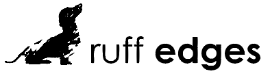

Although most of my feedback was positive after taking some time away from this project I had begun to dislike my logo. I felt the simplification of a detailed outline made the image look a lot like clip art and that it had lost the clean yet textured look I had wanted. In fact the vectorised paint didn't exactly look like paint or a texture anymore so I went back to tweak slightly and produced a more simplified, cleaner drawing. I did however keep the dachshund shape as my feedback had suggested.


With this new simplified look I had to find a more organic way of adding texture to create the 'roughness' essential to the concept of ruff edges. To achieve this I took my image into photoshop and layered various different textures including; a stamp effect, which looked too fake like with the paint, a couple of canvas effects, which were far too subtle, and finally a paper texture which oddly gives the same look and patchy effect as a screen print. The paper texture was received as the strongest in a few casual feedback sessions and so I went on to use that one. Also in one of these casual sessions it someone pointed out that having lighter text next to bolder text really threw the image out of balance. So to return some stability to the image I made all the characters bold complimenting the boldness of the illustration, the roughness of the texture used within and the cleanliness of the line work, all together they sing the visual song of perfect imperfection.


No comments:
Post a Comment