Friday 18 March 2016

OUGD603: GF Smith- Development


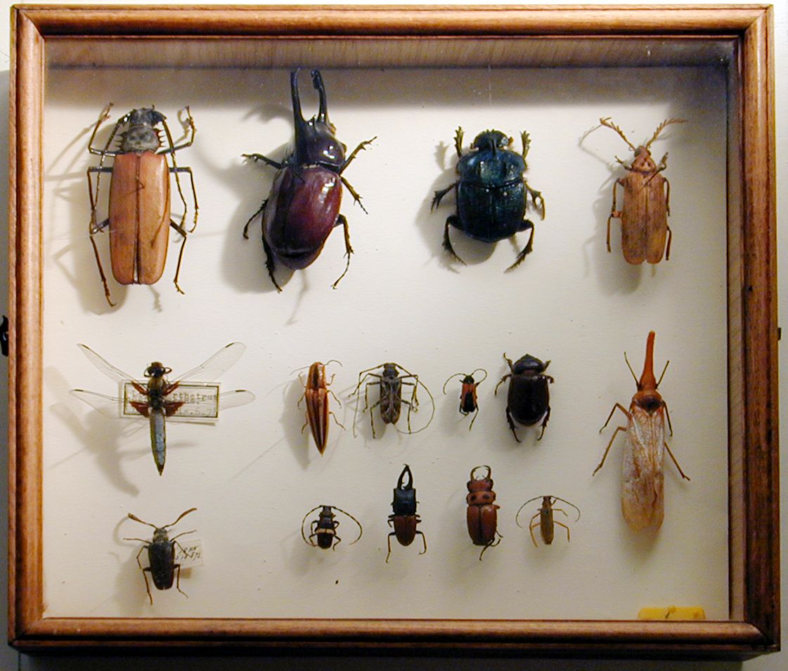
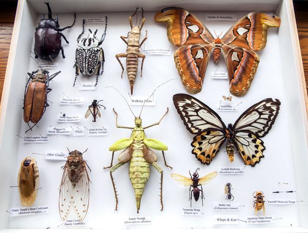
I went back through my collection of bugs and using the cabinet images as my guide I created a rudimentary layout of insects and boxes for their scientific names to be added in later. I decided to choose screen printing as my printing method for this brief. Practically speaking, screen printing is a technique a feel confident with and in order to produce multiple prints using something I am already familiar with seems like the best option. I was keen to avoid lino printing and foiling, usually the results of the outcome vary drastically and although this can occur with screen printing it's easier to avoid these mistakes.

From this guide I would then trace over the various colour sections to create my black and white print layers, which I would go on to expose my screens with. The first thing I tried was to trace the imagery digitally, however vectors did not suit the detailed and organic style I had in mind to properly represent an entomology cabinet so I decided to hand trace the black and white layers in order to keep the details intact.


There were a few difficulties that came with hand drawing these layers. The first of course was accuracy, getting each stroke right with a pen first time took a lot of concentration. The second was the type, I am not good with handwriting and getting the spacing right first time for each name box I used another layer of tracing paper to write the names out in pencil making sure the spacing and the spelling was right. It also took a considerable amount of time and searching to make sure all the scientific names I had found were in fact the correct names.


After completing these layers, which I had wanted to expose my screens directly off of I found out that the size of the final print had changed, shrinking by 6 cm width and length. I could have started over and printed out a new layout, however to save time I scanned my images in using high brightness and contrast settings in order to retain as much detail as possible. I then shrunk the designs and printed them out on paper.


The scanning had affected the quality of the image, some of the thinner lines had faded rather drastically, I was concerned that they wouldn't expose properly being too dark and thin for them to translate onto the screen. So I went back over the lines, re outlining the image with a slightly thicker pen, this brought back in some of the more intricate details without compromising the overall detail of image or the exposure quality of the print.


Monday 14 March 2016

OUGD603: GF Smith- Research


For the brief there was no set theme or direction so to give us a jump off point for the image a group of us came up with a collective theme to based our designs on. The theme we chose was contemporary archive, inspired by the description our tutor gave about the final look and feel of the exhibition.


From this topic I initially jumped to an archive within a museum and landed on the idea of an entomology archive cabinets. With the image being framed it could look similar to the glass casing used in entomology, also lots of insects, bugs and beetles being coloured bright yellow similar to my assigned colour it made sense to use this as the basis for my image.


To start my research I looked into entomology collections and how they are arranged/laid out.


From this I began researching into yellow insects for the contents of my cabinet.


catacanthus incarnatus 


Mexican Bean Beetle


Wasp

Umbrella Yellow Stick Insect


Yellow Lady Bird


Trichodes Ornatus

Desert Locust


Potter Wasp


Hispine Beetle


Paraselenis


Gasteracantha Orb Spider


Papilio Thoas


Murgantia histrionica

Cucumber Beetle

Golden Ringed Dragonfly


Colias Croceus


Yellow Black Hoverfly


Yellow Weevil

Black and Yellow Garden Spider

polilla amarilla

Yellow Spotted Millipede


OUGD603: GF Smith- Brief

Produce an image using traditional print processes on GF Smith stock of your designated colourplan. Print 5 copies of the final design using any print technique of your choosing (screen, lino, woodblock, foiling, embossing, spot varnish etc) one of which will be displayed in the Leeds Print Festival alongside other colourplan colours and designs produced by other designers, the other four copies will be sold in Colours May Vary.

Dimensions of the final design: 297mm x 297 mm

My designated Colourplan: Factory Yellow


Wednesday 9 March 2016

OUGD603: Penguin Design Award- Development


The typeface I chose is century gothic, a modernised version of Twentieth Century, a typeface created around the same time that art nouveau was highly popular so it ties neatly into the style of the design. I produced some filigree shapes inspired by the patterns used on the covers and within the nouveau style to balance the text on the page. I added the 'leaf' as a suggestion towards the shape of a vagina, just to push the vagina and body hair concept further.


After experimenting with different colours and layouts I settled on the soft green. This colour is present in a lot of nouveau images and it also adds a feeling of nature and the natural world to the design, a feature also often used in nouveau, after a quick crit with a few people the colour was also selected as the favourite. When I first saw the image in green the first thing that came to mind was 'lady garden', one of the nicknames used for the vagina, this isn't necessarily part of the concept but just an inside joke for me.


When it came to adding the extra information onto the design at first I struggled to balance all of the content onto the image without it become overcrowded. I was able to add the quotes to the front cover but wasn't able to make space for the 'galaxy book award of the year' especially with so much of the space taken up by the decorative pubes. So I looked back into my visual research and decided to add a flowing banner, the content could over flow into the green and still remain legible.


The addition of the banner really made the front cover pop more and added an extra element to the design. It was a happy accident out of necessity that worked out well.


Creating the back cover and the spine was relatively easy. I kept the back cover a reflected and simplified version of the front cover and used condensed design elements from the front in the spine. Finally, being rather happy with everything I prepared the file for submission and entered it into the penguin design award.