The process of producing the finished paper and cards was arduous. Firstly for some idiotic reason I believed that using an A3 screen to create a repeated design would be easier than one large design. This was at a point where I was unsure whether to use continuous rolls or sheets of paper, and I believed that (though on reflection if I had used either it would've made sense to use an A2 or A1 screen). It was only when I started printing, using sheets that I realised how much work I had made for myself. Firstly I discovered a problem with 'ghosting', when printing on a single sheet and moving the design along to print again the ink from the previous pull would stick to the screen and cause a half tone ghosting look so I scrapped those sheets and started over.
Second problem. To combat ghosting I would leave each sheet to dry before printing the next section, this took up a tremendous amount of time, each sheet required six pulls and caused the screen to block occasionally wasting more time. Time however wasn't the biggest issue, alignment was, each sheet took so long to align that the screen would block up. The alignment had to be done by hand, six times for each sheet and ended up producing really unprofessional looking products with mis matched printing and patchy looking outlines. Also the following day three of my screens had been taken despite still being within date. After this I chose to re-expose new A2 screens and start over once again.
Finally I managed to produce finished designs. Though I did have to pull 4 times for the robin design and six times for the mistletoe design the final products were completed over three days with the matching cards (which were a breeze in comparison) produced in half a day. The final designs weren't 100% perfect but they still contained all the character I had wanted them to printed on recycled brown paper and card as I had wanted them to.
The whole printing experience brought home how much I still have to learn about screen printing and that no one is ever 100% perfect with the process. There will always be mistakes, and if you want to produce 30 sheets of wrapping paper bring 50 pieces of paper just in case.
On Wednesday I received a college wide email about producing some packaging for milkshake syrup mixes. Having never tackled packing before I decided this was something I wanted to explore through different briefs this year so I called them up and arranged a meeting to discuss ideas.
On the phone prior to the meeting he spoke about wanting to create a 50's diner look with his inspiration being heavily influenced by a packet of strawberry milkshake creme oreos. He liked the Americanised look and the use of the type, the image of the milkshake glass and the image of the fruit. So I sketched a few ideas and potential label layouts before we met for discussions.
After meeting and going through my ideas he explained that the packaging was not a label but a heat wrapped plastic label that would cover the entire bottle. He also make clear that he wanted something very similar to the oreo packet including the angle of the glass and the style of the image. I had suggested a vectorised style but he wanted 'realistic and slightly animated' which I'm not sure how to achieve or whether I can achieve it. So I sketched out a few more layouts and designs and although what he says he wants is clear I still think he has a specific look but no actual idea what the final product should look like, which worries me a little.
Although I asked him for the required information, the blurb and what was needed on the mix bottle I received very little so I'll start with attempting to produce the image of the glass and the fruit in the style he's requested to see if I can actually achieve it before continuing with the rest of the label.
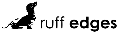
To start the long process of creating a look for the exhibition and promotional material I began with a name and logo design. In my weekly crit box session I spoke about my ideas and pitched the name 'Ruff Edges', the idea was received well. I wanted to play with and celebrate the idea of imperfection linking the brand to the printing processes and the dogs. Ruff or rough edges can relate both to the imperfect look that screen printing fabric produces as well as the rough edges many of the dogs posses. The mis-spelling of ruff adds a touch of humour that makes the whole experience more relatable and strongly connects the identity to dogs.
For the look of the logo I wanted to push the concepts of imperfection, the printing process and dogs to create a strong link between the name and the visuals. To me the best way to present this was by creating a dog silhouette using a paint/print texture to create an imperfect shape.
I messed around with some paint and scanned the result to create a realistic vectorised texture and then translated this texture into the existing silhouettes to create a rough, painted look. I chose to use the font century gothic to contrast the roughness of the icon and create a balance between text and image. I felt it was important to create a brand that was 'cute' but in no way girly, something that can link strongly to dogs but still appeal to a male market.
After trying various layouts and pairing between texture, text and dogs I presented my ideas for feedback. The overall consensus was that the dachshund/sausage dog created the strongest image and was the most recongisable species from a simplified icon.
Although most of my feedback was positive after taking some time away from this project I had begun to dislike my logo. I felt the simplification of a detailed outline made the image look a lot like clip art and that it had lost the clean yet textured look I had wanted. In fact the vectorised paint didn't exactly look like paint or a texture anymore so I went back to tweak slightly and produced a more simplified, cleaner drawing. I did however keep the dachshund shape as my feedback had suggested.
With this new simplified look I had to find a more organic way of adding texture to create the 'roughness' essential to the concept of ruff edges. To achieve this I took my image into photoshop and layered various different textures including; a stamp effect, which looked too fake like with the paint, a couple of canvas effects, which were far too subtle, and finally a paper texture which oddly gives the same look and patchy effect as a screen print. The paper texture was received as the strongest in a few casual feedback sessions and so I went on to use that one. Also in one of these casual sessions it someone pointed out that having lighter text next to bolder text really threw the image out of balance. So to return some stability to the image I made all the characters bold complimenting the boldness of the illustration, the roughness of the texture used within and the cleanliness of the line work, all together they sing the visual song of perfect imperfection.
After some further feedback it was suggested to me to push the flower/plant design and the 'y' even more. I did a few tests and examples but I really wasn't feeling the overall look, everything I tried was too complicated or unprofessional and so I wanted to pull away from this and revert back to one of my preferred previous ideas.
Taking the offset square design I had worked on previously I added in gradients and drop shadows to give it a more professional feel and played around with placement of text and how the text logo would function.
After experimenting and developing I held a crit with a few people. They liked the drop shadow saying tat it was a good representation of a full three-dimensional person whose problems are real tangible things. However there were some issues, it was questioned why I chose blue, although blue can be considered a calming colour it's cold and still gender specific. They also argued that the use of a sharp box made the icons unwelcoming and almost 'boxing' the individual in and that using and highlight 'be' took away from the you, which should be the main focus of the design.
I made some alterations based on this feedback. I changed the colour from blue to yellow, a colour that's not only gender neutral but also very positive and bright. In the full logo I shifted the focus from be to you bringing the main theme back to the user and the individual. I also rounded the corners in the icon to make it more approachable and changed the 'be' to a y. Not only does this link strongly to the whole brand and the individual but it also 'breaks the box' showing the user that they don't have to be confined to a norm, that they can break out of their containers and truly be themselves. I think the new logo is a very inspiring and refreshing, it matches the tone of the app and offers a positive feeling to its users.
Coming up with the idea for a charity exhibition was a pretty instantaneous brain wave however, it's proving a lot more difficult to come up with a brand and presence for the submission, promotion and look of the whole thing. So I've decided to look into pre existing charity promotion campaigns for some inspiration.
Stand up to Cancer
Stand up to cancer, a partnership between channel 4 and cancer research and one of the most recent additions in a long line of TV based charity promotion events/extravaganzas. This campaign burst onto the scenes around four years ago and gains more and more momentum each year.
There are many reasons for it's success from mass celebrity involvement and endorsement to some of the best video and TV based advertisements going including the 2014 SU2C advert 'It's Payback Time'.
The campaign has also been a rousing success because of the proactive stance it has taken, where as most charities play on the sob stories to twang the heart strings SU2C (and also race for life in recent years) have taken a more positive angle on the subject of cancer. When talking about the 2014 advert heads of 4Creative, John Allison and Chris Bovill said: “We wanted to create something that would empower people to stand up and throw cash in cancer's face. We did this by literally giving cancer a face. An unpleasant, pathetic, terrified and destroyable face. Then what better way to show the epic destruction of cancer than by utilising all the tropes the modern disaster has to offer. In your face cancer.”
In terms of communication and branding the strong empowering message is translated in all areas of the design. From bold uppercase letters standing strong, to inspiring powerful imagery depicting scientists and fundraisers as super heroes everything about the brand is meant to communicate action, strength and positivity.
This kind of tone is more likely to get people involved, instead of presenting problems they are communicating potential solutions making people feel like what they do and the money they donate can make a difference.
The Big Knit
The Big Knit, a partnership of Age UK and Innocent, is a yearly charity event that's been running since 2003. The event asks people to knit tiny hats to be placed on the top of tiny innocent smoothie bottles. These bottles are then sold and 25p from each bottle goes to Age UK to help elderly people keep warm over winter.
The whole event works because it is nothing short of adorable, it just is. Tiny collectable hats, each one unique and hand made all to go towards a good cause. It works for me, every year I buy up bottle after bottle of smoothie just to collect the tiny hats because I love them. As one of the big knit's main contributors said, “The Big Knit is an idea that makes you smile. How can you not smile at little hats on bottles?”
The tone of voice is friendly and positive with a touch of humour and it successfully plays on it's cuteness. It has been received well and continues to work and attract audiences due to it's collectable and positive nature. People want tiny hats and people like to think they are helping. Instead of giving 25p to a collection tub the donator gets something from their good deed, they get a tiny adorable little hat. The branding plays on this, as well as innocents existing brand, by using their chunky, lower case friendly font, coupled with simple illustrations of wool and hats, all made to produce a smile and look like they're not taking themselves to seriously. The innocent brand translates well into a creative promotions campaign, by coming across as simple they can easily gain trust and momentum.
As far as promotion goes they use TV adverts (their current campaign has been the same campaign they've used for the past few years) and by using their own products. It's clever and it saves on producing more posters and promotional material.
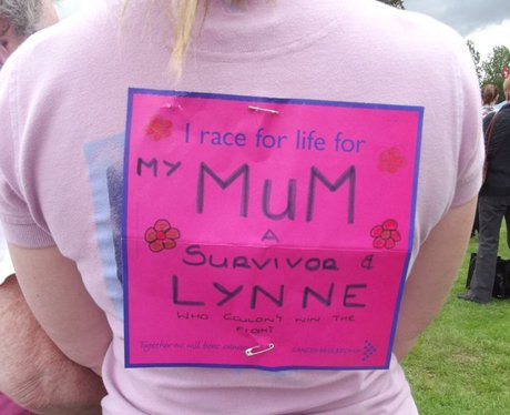
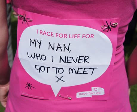
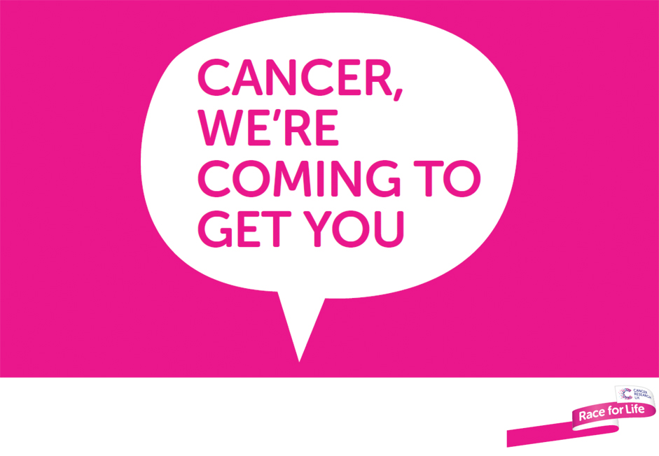
Race for Life
Race for life is a female based running event with many held all across the UK. They certainly make the female aspect obvious with everyone drenched in pink but take a very powerful and positive stance, sometimes bordering on the comedic, with famous offensive tag lines including 'In your face cancer, you berk'.
Other than the stand out pink one of the most notable aspects of RFL is the personalised messages. Each runner can customise, create and write a 'banner' to be worn on their backs proclaiming who they run for. This personal angle coupled with the empowering feeling makes an audience feel that every step ran have a physical affect on cancer. It is essentially a more physical, more female voice that SU2C employs, a very motivating campaign and event that makes people really feel like they are making a difference.