Once I had the logo ready I began creating the prints. The first thing to decide would be the style of my image, I looked into different illustrators whose work I admire- illustrators whose work has been translated into a sellable commodity just as I am to do with the cards.

Liz Climo
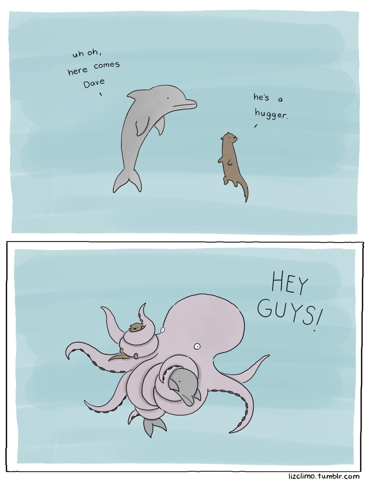

Liz's work has been successfully sold in books, calendars, prints and cards. Her cute and funny style is incredibly popular with a wide audience- mostly young and young adult females. There is a sense of humour in her work that makes her designs more appealing than just depicting animals in an adorable way. I love her simplistic style- it's easy to translate into screen printed cards with her use of bold block colours.
Angela Che


Angela Che is a more detail orientated illustrator though she has had success in selling prints in the form of cards (depicted left) which appear to be screen printed and have a vast appeal. Even though her usual style of illustration can be argued to targeting a female audience her stripped back cards have a more open audience. Though, what is gained in simplicity and audience appeal is lost in personality within the work. The designs feel flat, not just physically but in character. There is very little to latch on in terms of something to connect with in these design which I feel Climo achieves in a far more successful way.
Rebecca Sugar


Sugar's work usually focuses on creating character prints- characters from stories she's had a hand in designing including Steven Universe and Adventure Time. That aside her style is a vastly appealing one, very bright and positive. Bizarrely she's has just as much appeal with men as she does with women, perhaps this is down to the popularity of her shows and the uniqueness of the characters she depicts, however I believe that it's in part down to her style. Although a lot of her imagery can be described as adorable, it can also be described as cool- thus widening her appeal.


From researching into successful illustrative styles I now had an idea of the style I wanted to implement- something with a touch of humour and a simplistic, positive style. After I had discovered this I began to consider what will be the subject of my prints. With Ruff Edges being the title of the collection I knew the designs had to be dog based and I wanted to create two contrasting prints. I decided that to improve maximum appeal I would produce one illustrative print and one illustrative typographic print.

The illustrative print draws greatly from Climo's work, creating a simply drawn character and adding a touch of humour to the design with the inclusion of 'fabulous'.

The typographic design I drew to mirror letterpress based typography pieces, however I drew the letters in a similar style to my three illustrators, making certain it was obvious this type was produced by hand. This meant including imperfections and wonky lines to add that essential personality to a very two dimensional image that I felt was lacking in Che's card prints.
No comments:
Post a Comment