
I began the digital development by selecting a type face. I wanted to use a clean san serif preferably a geometric one to best represent the shape of the pods and also to reflect the modern stylising of the products and the current website. I chose fonts that were wide and extended suggesting reliability and strength. The font I ended up selecting for the designs was Gill Sans.


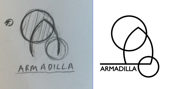
With my font chosen I produced simple line vector versions of my sketched out designs and paired them up with the type, making a few experiments and changes to layout but keeping the design fairly simple. I didn't want to push the layouts too far as the logo will be used for commercial purposes but I aimed to produce something unique and interesting.

I selected a simple colour pallet using the different shades from the wood as my inspiration. I wanted to display a very natural looking set of colours to tie the design back to the companies ecological and environmental principles.


As a quick experimentation I used the colour pallet alongside various shapes just to see how the logos can work in different ways. As for now I will wait until our group meets again before I push any of these designs further to make sure I'm heading in a good direction.
No comments:
Post a Comment