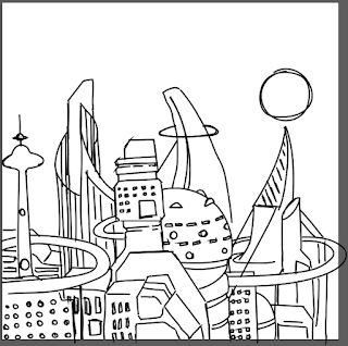
After listening to the song a few times I picked up on a lyric 'shifting ground' which sparked off the idea of a commute and a busy city environment. However the style of the song felt so futuristic to me so I pulled the two ideas together and decided to create a futuristic/science fiction style city scape.
Following on from my rougher more free style of illustration I decided to use a brush tool in illustrator to outline my work. I feel using the pen tool would loose the hand sketched quality of the drawing, plus the way I sketch does not relate well to straight lines. I did attempt to use the brush tool in photoshop, however it was very difficult to get the line work right, I had to go over lines again and again, and when I did the lines remained very thin and difficult to work with.
After outlining the piece in illustrator I transferred it into photoshop when I added some 'filled in sections'. These areas kept the image from fading into the background and also kept the look and feel of a hand drawn image. The slight offsetting of the white sections from the line work transformed the image in a more three dimensional looking piece whilst retaining the simplicity of flat vector work. The background colour choice was obvious, it had to be blue. I wanted to use a very deep and dark blue and have the line work contrast with bright white. This gave the image a feeling of night time and the city a sense of illumination. I was somewhat pleased with the final image and so when to prepare it for submission.
However I encountered a problem. I had been working, unknowingly, at a very low resolution and so when I changed it to 300 dpi the work became very, very blurred, very noticeably blurred. Because I had merged my two layers featuring the white spaces and the line work there was little I could do to salvage the image that didn't result in starting over. I attempted a few different things but ended up shrinking the image down until the blurriness was unnoticeable.
By doing this I ended up creating a much stronger layout than I had originally intended, one that made good use of the empty space. This new layout I felt suited the song better, the city and futuristic ideas were still there but now I had added the 'clearest' element to the image. Respecting the empty space also made the design feel more graphic design inspired rather than purely illustrative, this submission better contrasts the Dream 3 design. I shifted the moon up to balance the image out and, now working at the correct resolution, prepared the image and submitted it to secret 7.


No comments:
Post a Comment