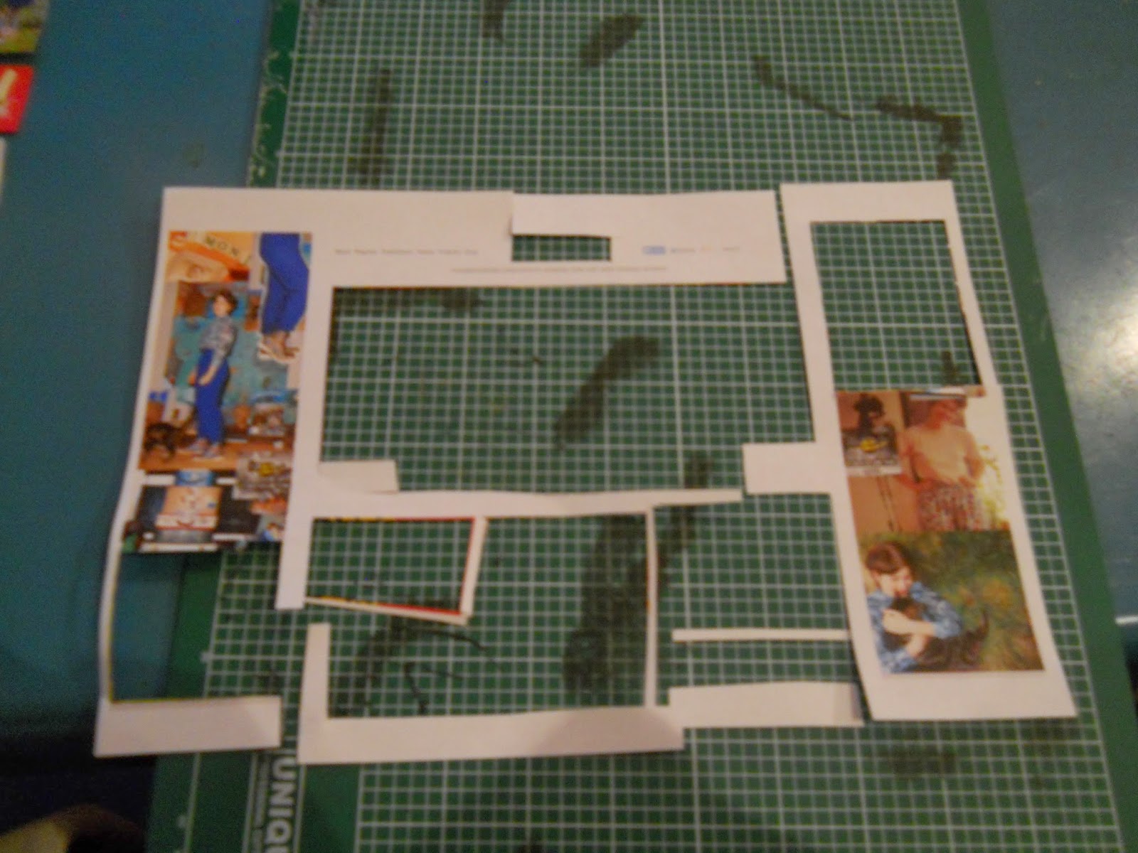
The task is to study the layout hierarchies within different publications. By removing the most eye grabbing parts of the page one by one allows us to identify how graphic designers intend an eye to travel across the page.
This time it's webpages.
It's Nice That
Colour draws attention instantly and pulls the eye across the page in all directions. It was funny how when all intact, my eye was drawn in quite different directions as to when I removed the most attention drawing item. I feel the key factor in these hierarchy decisions was the intensity of the colour, it sprung out to me before anything else, resulting in a very colour heavy beginning and a text heavy end to the hierarchy.


No comments:
Post a Comment