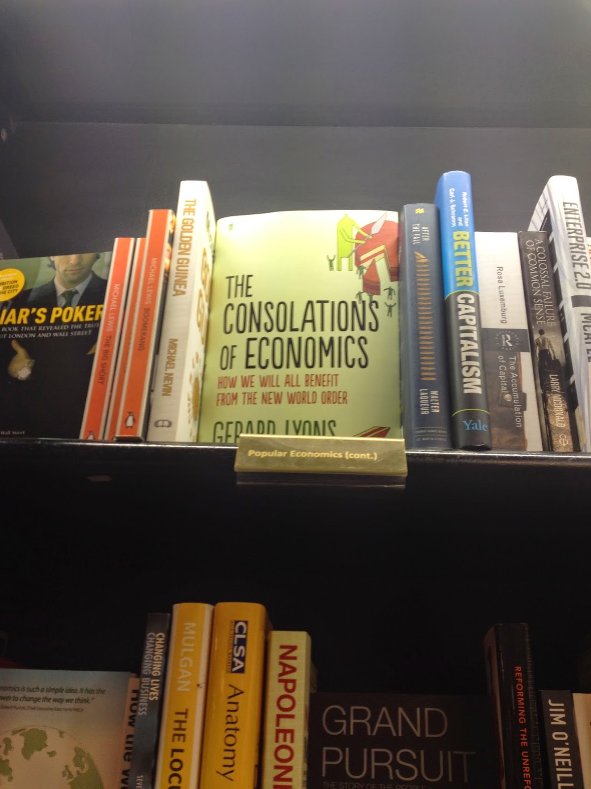
For this brief so far I've come up with some ideas, scrapped those, come up with a few more and then gotten stumped. So I decided; as a way to inspire myself, to go and look at examples of economic non fiction books currently in production. It made me realise that covers for this genre are so much better than I had imagined with styles of all types. I took some pictures of my favourites to inspire me later on in my ideas process.
I had honestly expected really dull and simple or tacky covers but found an annoyingly good composition of designs. My relaxed demeanour towards this brief was suddenly shattered- I need to think of a really good idea and put more pressure on myself.
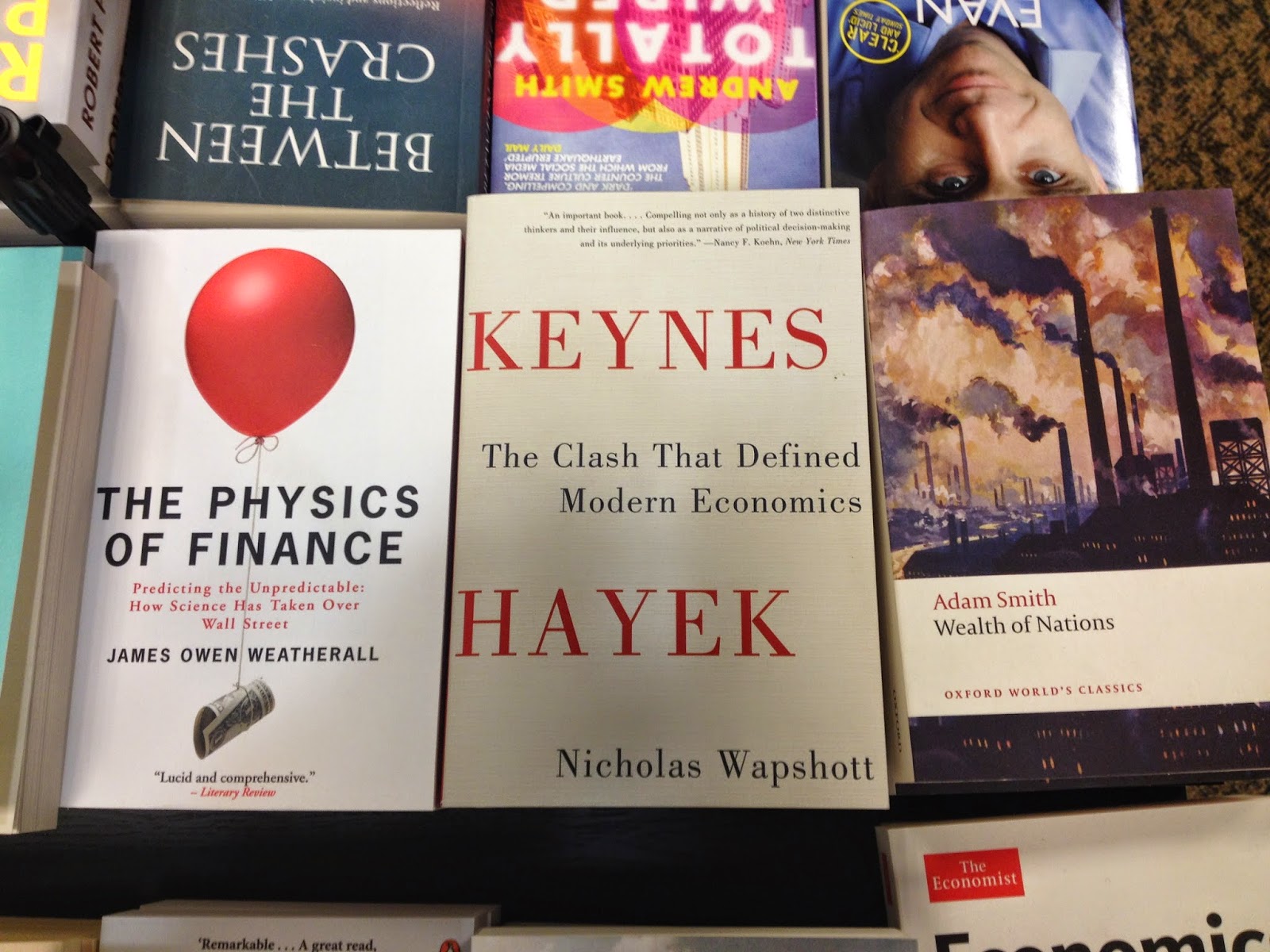
To fit in with the current covers on the shelves I feel a simple and clean design is preferred over a messy over complicated ones. The styles that particularly caught my eye were ones that used clean lines, simple shapes and roughly three colours max.
Either way- I need to go back to the sketch book once more.

Very bold shapes, very dramatic text.

I enjoyed the use of illustration with this design- simple use of detail.

I adore the simplicity of this design- it isn't trying to be something it's not.
Looooverly hand rendered style type- makes it more personal.

I think its a rhino… either way I enjoy the use of type, one bold colour and silhouette.


Simple, one stab you in the face cover, foiled type- you just want to touch that eye candy.

Love the bold vectorised illustration, strong sense of movement with this design.

Makes me think of a Saul Bass poster.


Wonderful visualisation of the title.


No comments:
Post a Comment