To inspire what I can achieve out of my own campaign visually, I had a look through existing campaigns and their use of graphic design.


It was a sad thing to realise how many UK campaigns rely on strong scare tactics within their posters and advertising. So many of the images I found were billboard sized posters slating the other party and warning the public of the terrible world they would inhabit if the opposition gained power. I think especially in hindsight it's really interesting to see how little substance these posters have outside of scare mongering. I am very against the conservatives politically but their design works, they have strong messages and a powerful impact, but so many of them mean so little after election day (especially with the 'year for change' not cutting the NHS poster, how well that worked out...). Although these campaigns have a high impact I definitely want to stay away from the negative tone of voice. In this campaign I cannot slander the opposition (not that I would want to anyway) and I really want to promote a positive message for myself as a candidate.

I would have never believed I would be relying on American political campaign graphics as a strong inspiration for my own campaign. And I swore to myself I wouldn't look into the Obama imagery, as it is so overly popular and has been done to death. But there is no denying it was one of the first American campaigns to really use graphic design to it's advantage and it placed the candidate in a positive light, rather than slander the opposition.
Whilst searching through Obama based graphics I came across a dissertation produced by Jamie Foulston from the Prague College School of Art and Design. In this dissertation he went through and broke down the success of the Obama campaign and the influence graphic design had in his winning of the presidency. Here are some sections that I found particularly useful:

The logo: In his dissertation Foulston explains that the balance of red and blue made the logo design feel more neutral and could therefore appeal to both republicans and democrats. Also the composition of the logo, a sun rising over a ploughed field, related back to the heart of Obama's campaign- hope, change and new beginnings. The rising sun gives the logo a positive and bright feeling, it also relates to hard work, and the working man with the use of the ploughed and farmed field.


The Typeface: Obama was not an experience politician and many felt this would be a weakness for the would-be president. So the design team used as many 'traditional all-American' icons to make the candidate feel closely connected to politics and America's political history. Many of the typefaces were inspired by type found on the American constitution and the bill of rights. Tying these traditional, historical typefaces with bold, new, and strong Gotham gave the campaign a historical feel along with a new exciting and bold statement.


The Versatility: Designer Sol Sender, who created the Obama logo also made a wide variety of logo uses, including placing the logo in each of the state names and customising the designer to appeal to different target markets. This tweaking and customisation meant that the initial target audience could be vastly increased with the logo being customised for more personal messages. The wide range of appeal and specific targeting lead to a greater number of people falling into the Obama camp.

The Experience: Alongside the typeface designers also chose to use other iconic American images to make Obama appear more experienced including the presidential seal. The use of this seal subliminally fed the idea to Americans that Obama is presidential material. Seeing him stand and speak at a podium similar to the official one makes it easier to translate the idea of him really standing and speaking as president.

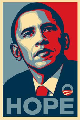
The Bold Poster: This 'Hope' poster is probably the most memorable element from Obama's campaign. Shepard Fairey was inspired by strong political posters from history such as Russian, communist propaganda imagery. The bold colours and simplicity of the design made the images stand out and stay in people's minds. The 'Hope' poster uses a similar style for a similar effect, of course with the addition of blue to give the whole design a far more American feel. The real strength with this image however, is simply because there was nothing else like it, positive, strong and stand out.
No comments:
Post a Comment