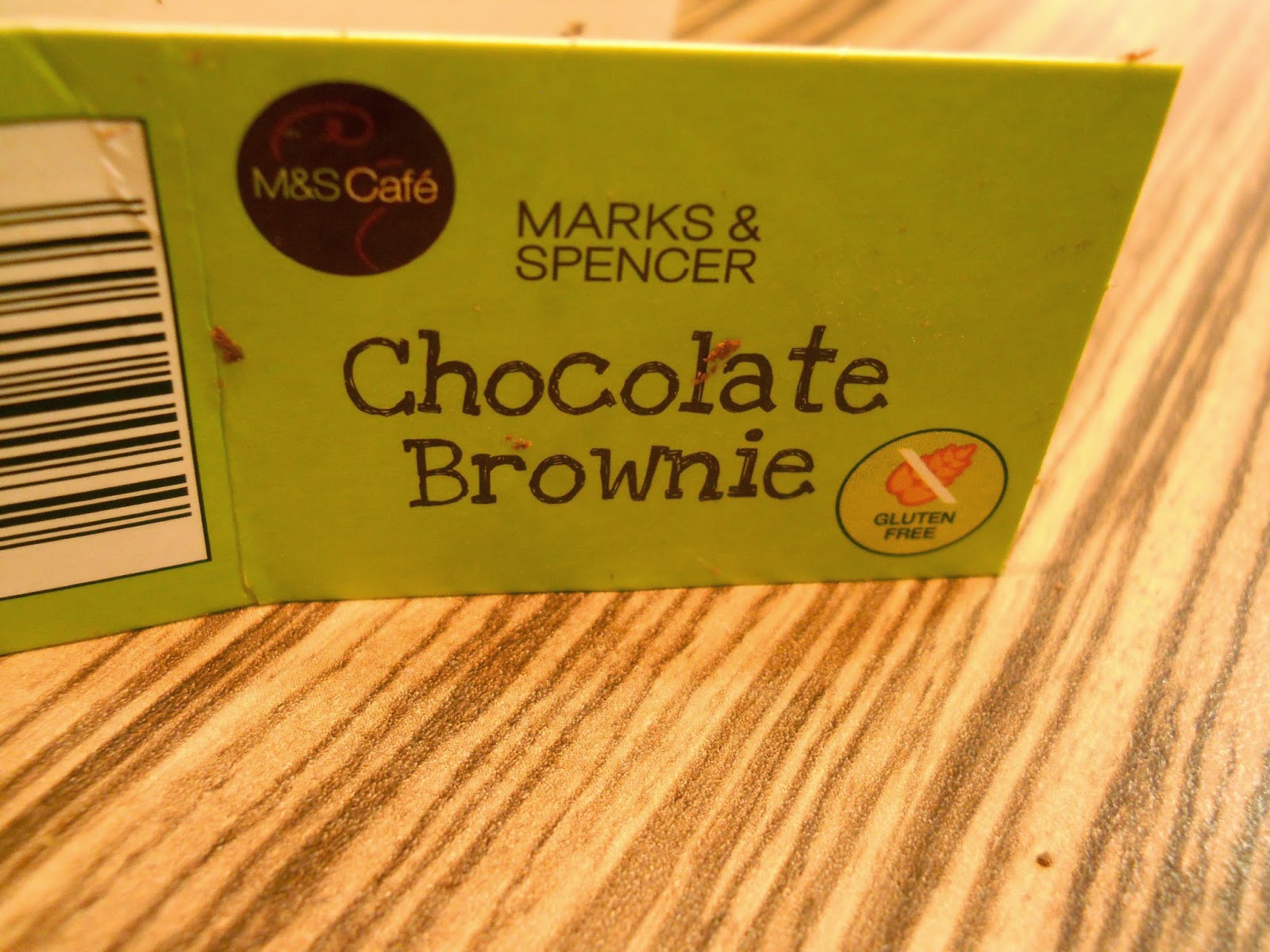
This fun uneven type
has glyphs all at odd angles giving the type an odd character. It’s a slab
serif, even width stems and strokes with straight serifs at the end, however
unlike most serif fonts it shows little to none of its formal character.
Instead the quirkiness of the x height and the angled letters add to the fun
and childlike nature of the type.

No comments:
Post a Comment