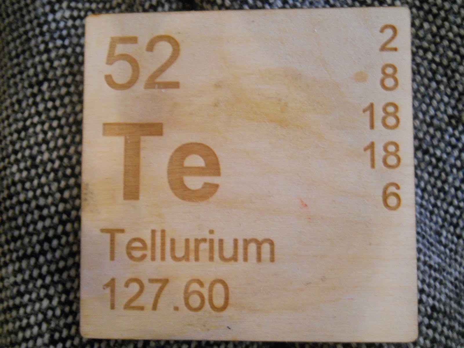
This font, which looks an awful lot like helvetica/arial is mimicking the font used on the periodic table of elements. It's gothic, san serif and neutral, gothic fonts have a great tendency to not have previous historical connotations attached to them unlike Roman or Block fonts an this is precisely why it is used. It's simple and minimal, there to do it's job of communication, if we think of different type faces as various tones of voice, this would be an unbiased and basic tone, if it had any at all. It's why it was used in it's original scientific context (what is being communicated takes priority over how it is communicated), however it now has the connection of science to it, hence why it has been used in the context of a periodic table coaster.
No comments:
Post a Comment