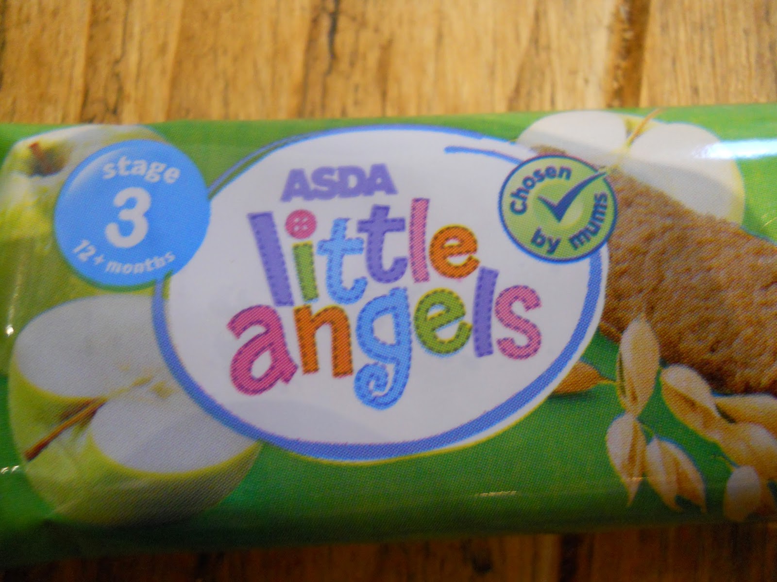
The chunky uneven
characters used in this type have a distinctly childish and playful character;
the bright colours used for each letter strengthen this further. It’s a san
serif typeface that displays hints of script stylising with its uneven
baseline, the angled glyphs and the uneven stroke widths- this just gives it
more of that funny youthful character usually found in products designed for
children. The entire idea of this type is that it’s supposed to be aimed at
children being multicoloured and ‘fun’ looking, however this is really
connoting what parents think should represent childishness- simply put, it’s
designed for what the moms and dads think childlike type should be.
No comments:
Post a Comment